12 Spatial Poisson models applied to plant diversity
本章では、空間的相関を考慮したGLMの分析例を紹介する。
12.1 Introduction
本章では、気候及び地形がカナリア諸島にあるラ・パルマ島の植物種数、特に固有種数に与える影響を調べた Irl et al. (2015) のデータを用いる。島の890地点について多年生の維管束植物の有無(総数、総固有種数など)が測定されている。
12.2 Data exploration
12.2.1 Sampling locations
データは以下の通り。データには緯度と経度が記録してあるが、これらはUTM形式なので実際の緯度と経度に直す必要がある。
nSIE: プロットごとの固有種数(= 応答変数)
CR_CAN: カナリア諸島のclimate rarity indices
CR_LP: ラ・パルマ島のclimate rarity indices
INTRA_VAR: 年内の降水量のばらつき
INTER_VAR: 年ごとの降水量のばらつき
MAT: 年間平均気温
MAP: 年間平均降水量
RSI: 降水量の季節性指標
TCI: 地形指標
macro:マクロアスペクト(半径5km以内のグリッドセルあたりの平均アスペクト)
lp <- read_delim("data/LaPalma.txt")

## sfクラスに変換
lpcoords <- st_as_sf(lp,
                     coords = c("Longitude", "Latitude"),
                     crs = "+proj=utm +zone=28")

## 緯度経度に変換
lonlat <- st_transform(lpcoords, crs = "+proj=longlat")

## 元のデータフレームに緯度と経度を追加
lp %>%
  mutate(lon = st_coordinates(lonlat)[,1],
         lat = st_coordinates(lonlat)[,2]) -> lp

datatable(lp,
          options = list(scrollX = 40),
          filter = "top")
地図上にデータポイントをプロットすると以下のようになる。
## Reading layer `lapalma' from data source
##   `C:\Users\Tsubasa Yamaguchi\Desktop\R_studies\practice\Spatial-temporal_analysis\shpfile\lapalma.shp'
##   using driver `ESRI Shapefile'
## Simple feature collection with 1 feature and 136 fields
## Geometry type: POLYGON
## Dimension:     XY
## Bounding box:  xmin: 206384.5 ymin: 3150659 xmax: 233949.4 ymax: 3195713
## Projected CRS: WGS 84 / UTM zone 28N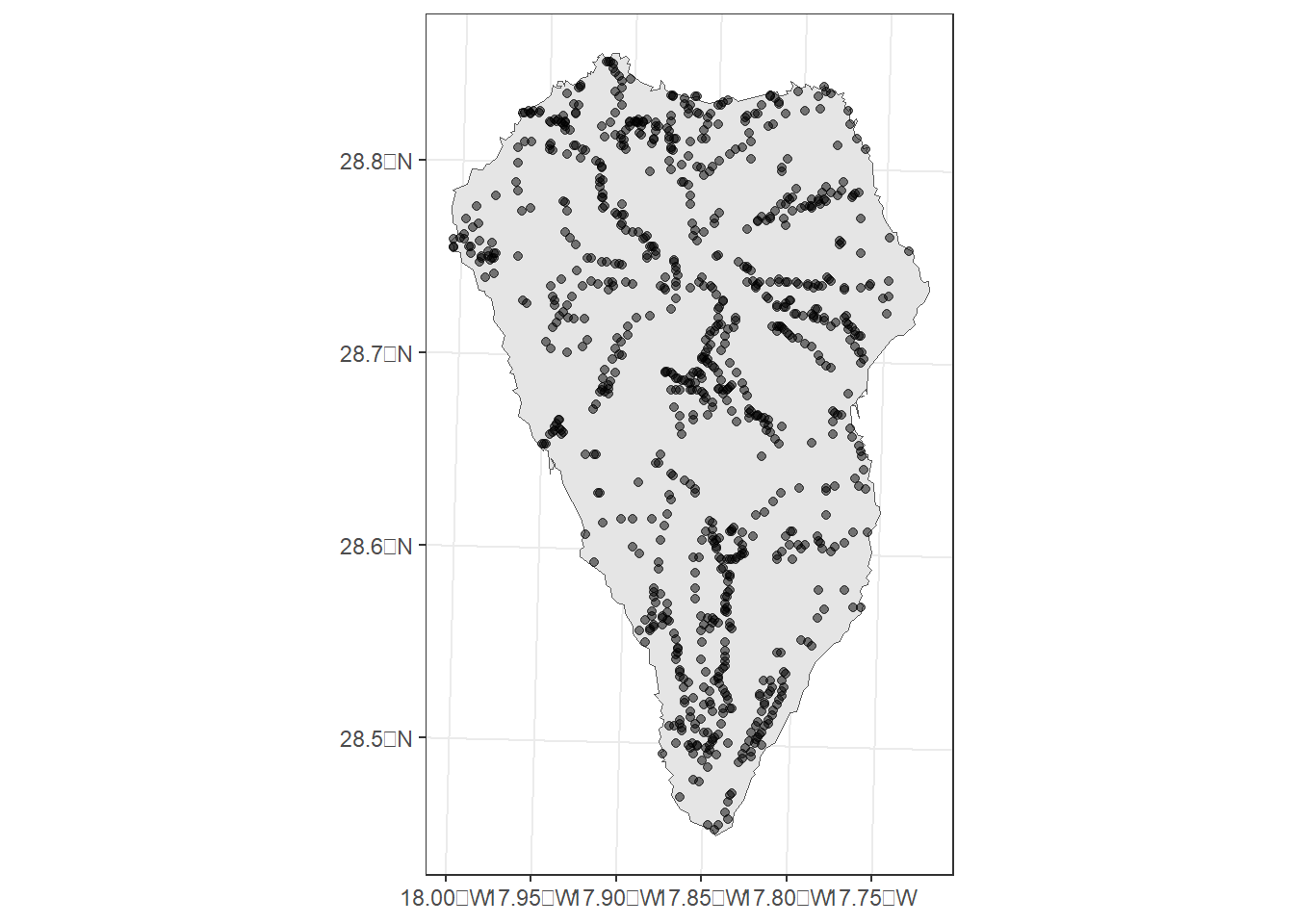
12.2.2 Outliers
外れ値がないかを確かめるためにdotplotを描いてみたところ、外れ値はなさそうだった。
lp %>%
  select(CR_CAN:pAE, -SR, -nAE, -pSIE, -pAE) %>%
  mutate(n = 1:n()) %>%
  pivot_longer(1:16) %>%
  ggplot(aes(x = value, y = n))+
  geom_point(alpha = 0.6,
             shape = 1)+
  facet_rep_wrap(~name, repeat.tick.labels = TRUE,
                 scales = "free")+
  theme_bw()+
  theme(aspect.ratio = 0.8)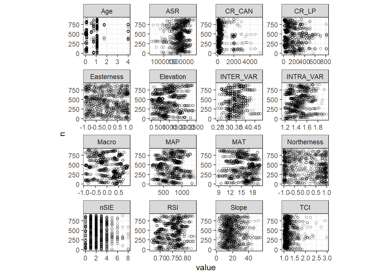
12.2.3 Collinearity
変数間に多重共線性がないかを確認するため、ポワソン分布のGLMを実行してVIFを確認してみる。その結果、MATとElevationがかなり高いVIFを持つことが分かった。
m13_vif <- glm(nSIE ~ CR_CAN + CR_LP + Elevation + INTRA_VAR + INTER_VAR + MAT + MAP
                + RSI + ASR + Easterness + Age + Macro + Northerness + Slope + TCI,
                family = "poisson", data = lp)

check_collinearity(m13_vif)この2つを除いてもう一度VIFを計算したところ、以下のようになった。以後、最もVIFが高い変数を除いてモデルを回し、VIFを計算しなおすという作業を全ての変数のVIFが3を下回るまで繰り返す。まずMacroを取り除く。
m13_vif2 <- glm(nSIE ~ CR_CAN + CR_LP +  INTRA_VAR + INTER_VAR  + MAP
                + RSI + ASR + Easterness + Age + Macro + Northerness + Slope + TCI,
                family = "poisson", data = lp)

check_collinearity(m13_vif2)続いて、ASRのVIFが最も高くなったのでこれを取り除く。
m13_vif3 <- glm(nSIE ~ CR_CAN + CR_LP +  INTRA_VAR + INTER_VAR  + MAP
                + RSI + ASR + Easterness + Age  + Northerness + Slope + TCI,
                family = "poisson", data = lp)

check_collinearity(m13_vif3)次に、RSIが最も高くなったのでこれを取り除く。
m13_vif4 <- glm(nSIE ~ CR_CAN + CR_LP +  INTRA_VAR + INTER_VAR  + MAP
                + RSI + Easterness + Age  + Northerness + Slope + TCI,
                family = "poisson", data = lp)

check_collinearity(m13_vif4)最後に、INTRA_VARのみVIFが3を超えているのでこれを取り除く。
m13_vif5 <- glm(nSIE ~ CR_CAN + CR_LP +  INTRA_VAR + INTER_VAR  + MAP
                +  Easterness + Age  + Northerness + Slope + TCI,
                family = "poisson", data = lp)

check_collinearity(m13_vif5)
これで、VIFが3を超える変数はなくなった。よって、以下の変数を説明変数としてモデリングを行う。
m13_vif6 <- glm(nSIE ~ CR_CAN + CR_LP + INTER_VAR + MAP
                +  Easterness + Age  + Northerness + Slope + TCI,
                family = "poisson", data = lp)

check_collinearity(m13_vif6)
12.2.4 Relationships
説明変数と応答変数(nSIE)との関連をプロットしたところ、強い関連はなさそうだ。いくつかの変数とは非線形な関係がありそう?
lp %>%
  select(CR_CAN, CR_LP, INTER_VAR, MAP, Easterness, Age, Northerness, Slope, TCI, nSIE) %>%
  pivot_longer(1:9) %>%
  ggplot(aes(x = value, y = nSIE))+
  geom_point()+
  geom_smooth(color = "red4",
              fill = "pink3")+
  facet_rep_wrap(~name, repeat.tick.labels = TRUE,
                 scales = "free")+
  theme_bw()+
  theme(aspect.ratio = 0.8)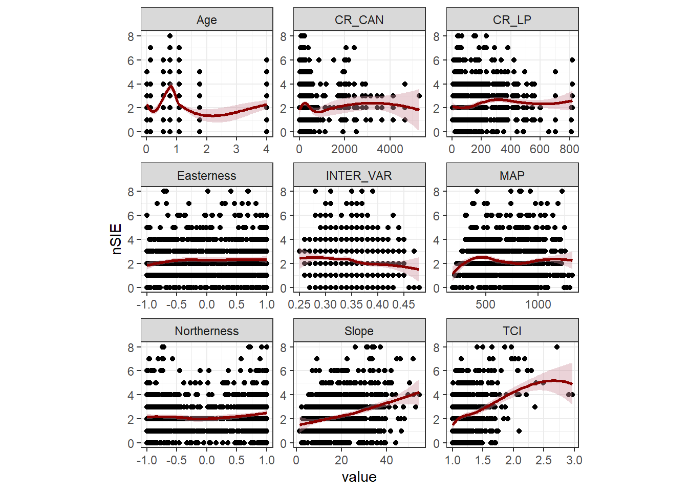
12.2.5 Number of zeros
応答変数にゼロが多すぎると問題が生じることがあるが、本データにはそこまで多くのゼロはなく(9.55%)、問題はないと思われる。
## [1] 0.0955056212.3 Model formulation
まず、空間的な相関を考慮しないポワソンGLMを実行し、問題がないかを確認する。モデル式は以下の通り。なお、切片と回帰係数は省略している。
\[
\begin{aligned}
&nSIE_i \sim P(\mu_i)\\
&E(nSIE_i) = \mu_i \; and \; var(nSIE_i) = \mu_i \\
&log(\mu_i) = crcan + crlp + interval + map + age + slope + tci
\end{aligned}
\]
12.4 GLM results
それでは、INLAでモデルを実行する。
m13_1 <-inla(nSIE ~ crcan.std + crlp.std + intervar.std + map.std + age.std + slope.std + tci.std + Easterness + Northerness,
             family = "poisson",
             control.predictor = list(compute = TRUE),
             control.compute = list(config = TRUE),
data = lp)まず、過分散の有無を確認するため分散パラメータを算出する(第9.1.3.1節参照)。分散パラメータは0.876…であり、過分散にはなっていないことが分かる(むしろ過少分散?)。ひとまず、ここでは過少分散を無視してポワソン分布で分析を続ける。
mu <- m13_1$summary.fitted.values$mean
E1 <- (lp$nSIE - mu)/sqrt(mu)
N <- nrow(lp)
p <- length(m13_1$names.fixed)

phi <- sum(E1^2)/(N-p)
phi
## [1] 0.8759609続いて、ポワソン残差と説明変数の関係をプロットしたところ、明確に非線形のパターンはないように見える。
lp %>%
  mutate(resid = E1) %>%
  select(CR_CAN, CR_LP, INTER_VAR, MAP, Easterness, Age, Northerness, Slope, TCI, resid) %>%
  pivot_longer(1:9) %>%
  ggplot(aes(x = value, y = resid))+
  geom_point(shape = 1)+
  geom_smooth(color = "red4",
              fill = "pink3")+
  facet_rep_wrap(~name, repeat.tick.labels = TRUE,
                 scales = "free")+
  theme_bw()+
  theme(aspect.ratio = 0.8)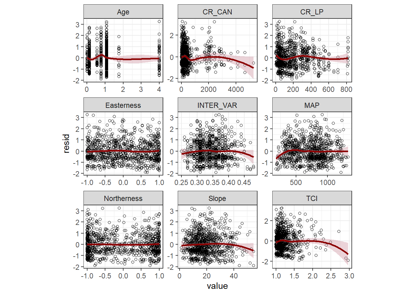
最後に、ピアソン残差に空間的な相関があるかを確かめるためバリアグラムを描く。バリオグラムは明確に2.5kmくらいまで空間的相関がありそうなことを示している。
lp %>%
  mutate(X.km = lp$Longitude/1000,
         Y.km = lp$Latitude/1000) -> lp

vario13_1 <- data.frame(resid = E1,
                        lon = lp$X.km,
                        lat = lp$Y.km)

sp::coordinates(vario13_1) <- c("lon", "lat")

vario13_1 %>%
  variogram(resid ~ 1, data = .,
            cressie = TRUE,
            ## 距離が150km以下のデータのみ使用
            cutoff = 10,
            ## 各距離範囲カテゴリの範囲
            width = 0.2) %>%
  ggplot(aes(x = dist, y = gamma))+
  geom_point()+
  theme_bw()+
  theme(aspect.ratio = 1)+
  coord_cartesian(ylim = c(0,1))+
  geom_smooth(color = "black")+
  labs(y = "semivariogram")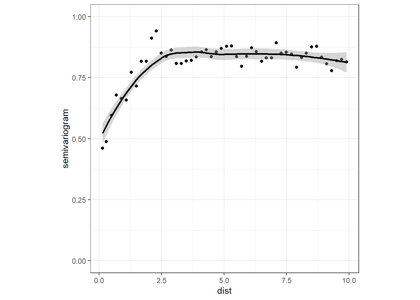
12.5 Adding spatial correlation to the model
12.5.1 Model formulation
そこで、空間的相関を考慮したモデルを実行する。モデル式は以下のとおりである。空間相関を考慮するのでEasternessとNorthernessは説明変数から除く。
\[
\begin{aligned}
&nSIE_i \sim P(\mu_i)\\
&E(nSIE_i) = \mu_i \; and \; var(nSIE_i) = \mu_i \\
&log(\mu_i) = crcan + crlp + interval + map + age + slope + tci + u_i
\end{aligned}
\]
12.5.2 Mesh
メッシュの適切なサイズを検討するため、各サンプリングポイント間の距離とその累積割合をプロットした。ほとんど(約70%)のポイントは20km以下しか離れていない。
dist_lp <- dist(cbind(lp$X.km, lp$Y.km)) %>% as.matrix()
diag(dist_lp) <- NA
dist_lp.vec <- as.vector(dist_lp) %>% na.omit()

data.frame(dist = dist_lp.vec) %>%
  ggplot(aes(x = dist))+
  geom_histogram(alpha = 0,
                 color = "black",
                 binwidth = 1)+
  theme_bw()+
  theme(aspect.ratio = 1)+
  labs(title = "A", x = "Distances between sites",
       y = "Frequency") -> p1

data.frame(x = sort(dist_lp.vec),
           y = 1:length(dist_lp.vec)/length(dist_lp.vec)) %>%
  ggplot(aes(x =x, y = y))+
  geom_line()+
  theme_bw()+
  theme(aspect.ratio = 1)+
  labs(title = "B", x = "Distances between sites",
       y = "Cumlutive proportion") -> p2

p1 + p2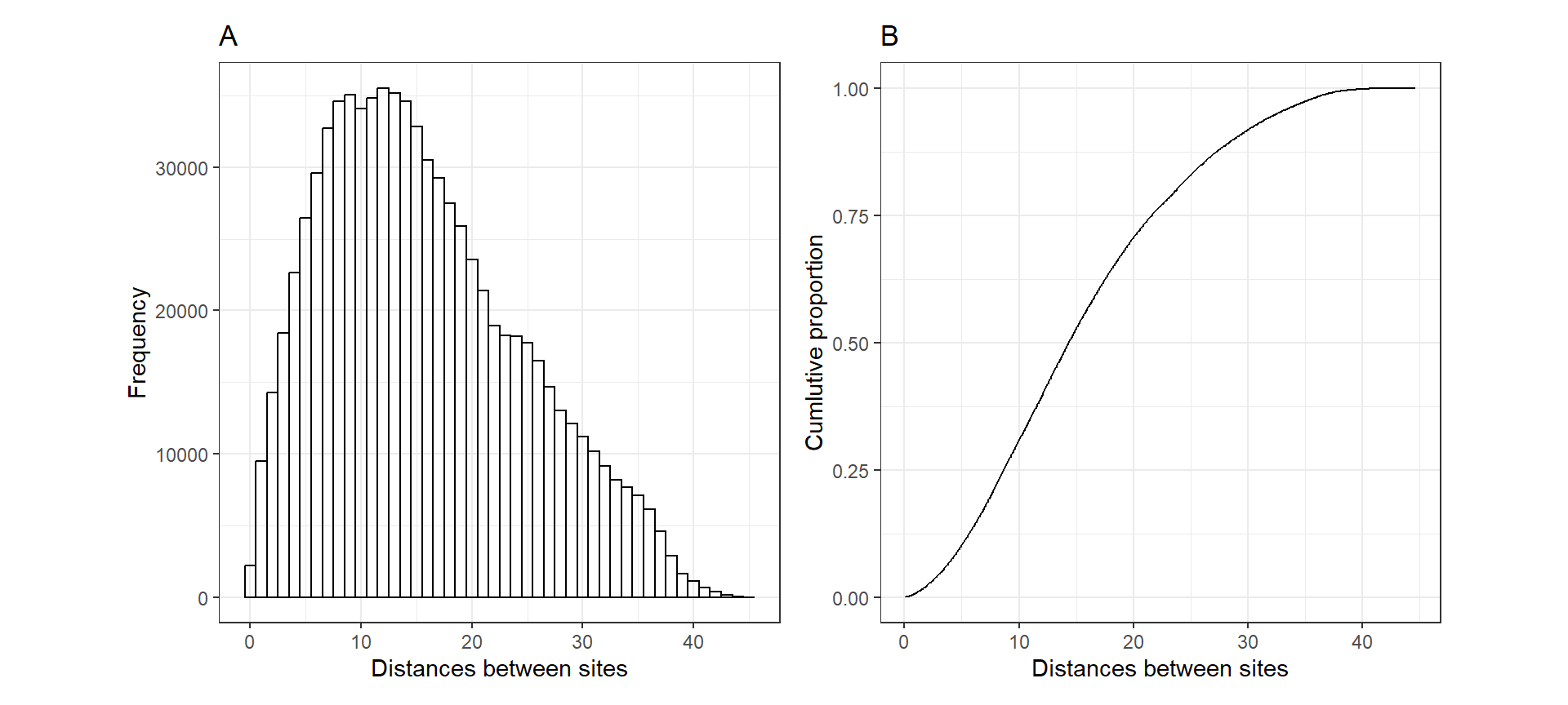
図12.1: A: Histogram of distances between the 890 sites on La Palma. B: Cumulative proportion of distances versus distance.
以上から、本分析では以下のメッシュを作成した。本分析の場合、海上に植物が生育することはないので、メッシュを内側と外側に分けない。
Loc13_2 <- cbind(lp$X.km, lp$Y.km)
bound13_2 <- inla.nonconvex.hull(Loc13_2)
mesh13_2 <- inla.mesh.2d(loc = Loc13_2,
boundary = bound13_2,
max.edge = c(1.5))
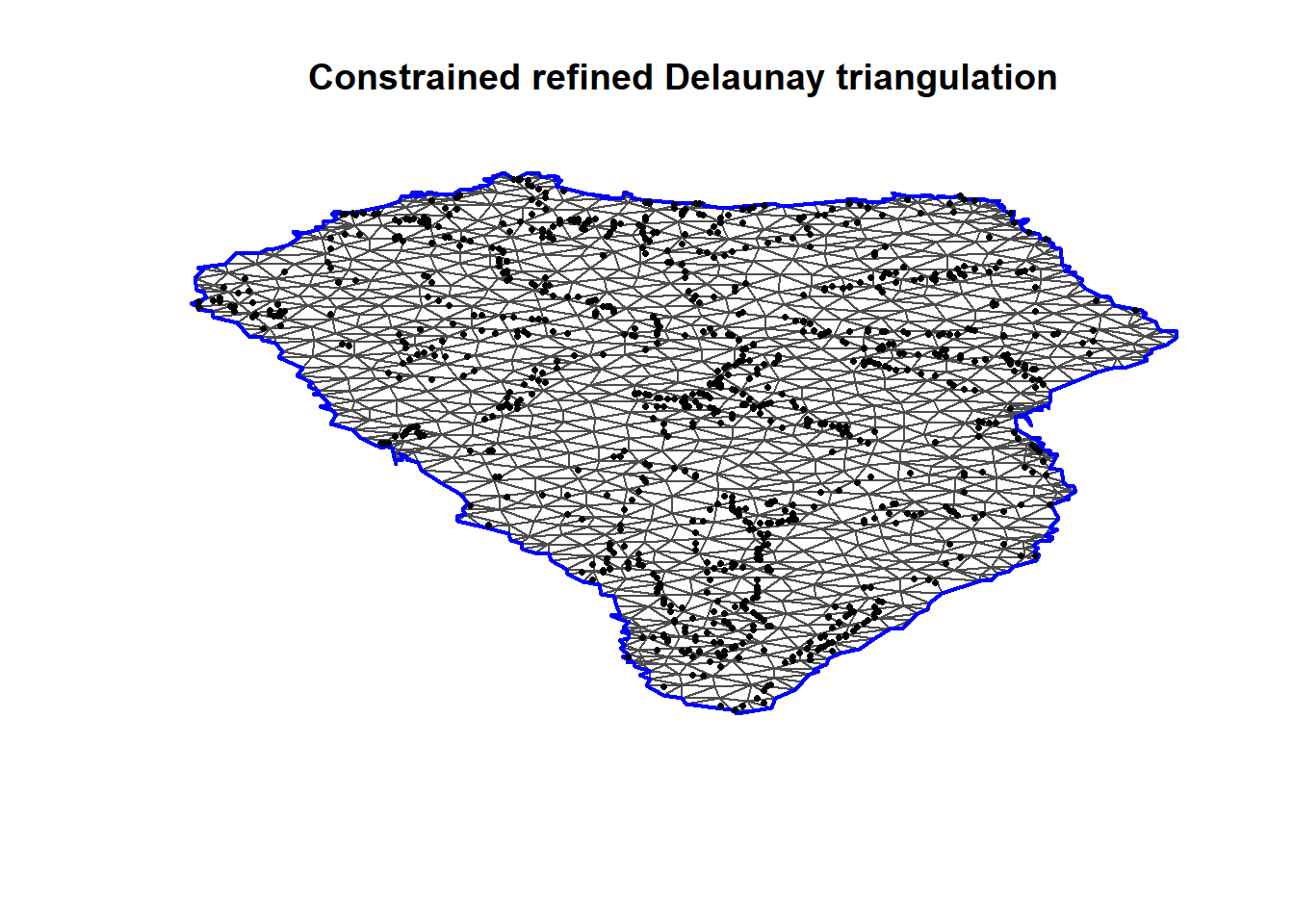
plot(mesh13_2, main = "", asp=1)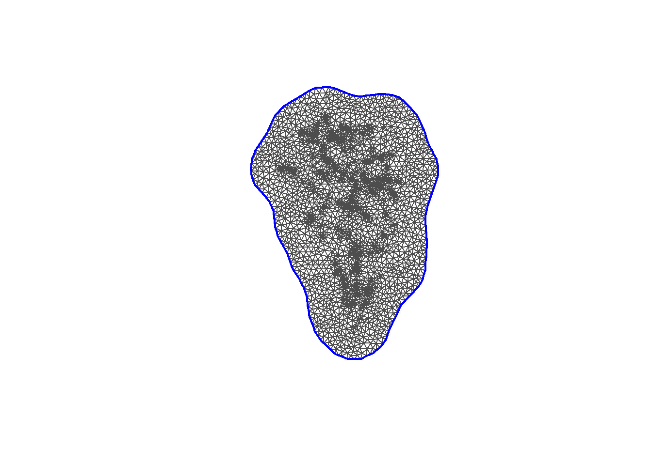
メッシュには3304個の頂点が含まれる。
## [1] 3304しかし、このメッシュには島外の海の領域が含まれてしまっている。そのため、島の輪郭の外にメッシュが存在しないようにする。
まず、島のshpファイルを読み込み、データフレームに変換する。
## OGR data source with driver: ESRI Shapefile
## Source: "C:\Users\Tsubasa Yamaguchi\Desktop\R_studies\practice\Spatial-temporal_analysis\shpfile\lapalma.shp", layer: "lapalma"
## with 1 features
## It has 136 fieldsデータフレームの緯度と経度は島の輪郭を表している。これをcoastlineというオブジェクトに格納する。
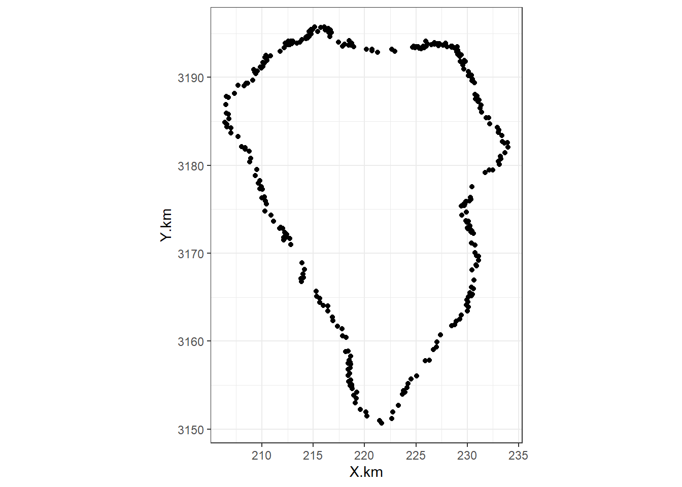
輪郭の座標は反時計回りでないといけないので、緯度と経度の順番を逆にする必要がある。
coastline_rev <- coastline %>%
  arrange(desc(order)) %>%
  select(-order)

coastline <- coastline %>%
  select(-order)
以下のようにして島の輪郭をメッシュの輪郭とするメッシュを作成する。
mesh13_2b <- inla.mesh.2d(loc.domain = coastline,
                          max.edge = 1.5,
                          boundary = inla.mesh.segment(coastline_rev))
作成されたメッシュは以下の通り。
頂点の数は1192個である。
## [1] 1192なお、輪郭が時計回りのままだとメッシュが島の外側に作られてしまう。
mesh13_2c <- inla.mesh.2d(loc.domain = coastline,
                          max.edge = 1.5,
                          boundary = inla.mesh.segment(coastline))

plot(mesh13_2c)
points(x = lp$X.km, y = lp$Y.km, col = 1, pch = 16, cex = 0.5)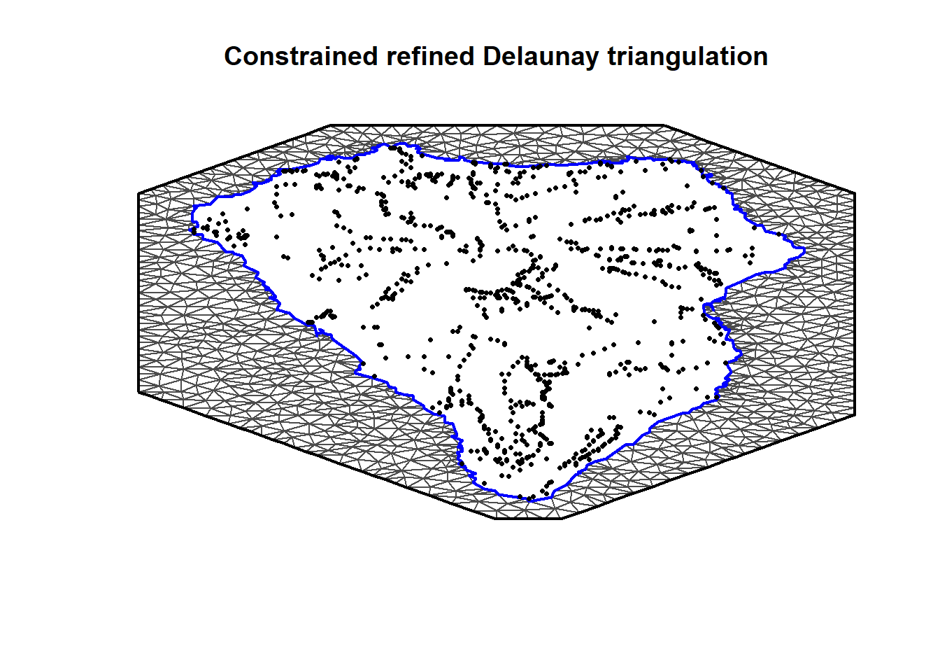
12.5.3 Projector matrix
続いて、\(a_{ik}\)を定義する。前章までで学んだように、\(a_{ik}\)はランダム\(w_k\)とランダム切片\(u_i\)を結びつけるものである。
\[ u_i = \Sigma_{k=1}^{1192} a_{ik} \times w_k \tag{10.7} \]
メッシュmesh13_2bの\(a_k\)は以下のように計算できる。\(a_{ik}\)を含む行列\(\bf{A}\)は890行×1192列である。
## [1] 890 119212.5.6 Stack
stackを定義する。まずは\(\bf{X}\)を準備する。今回は前章と違いInterceptをXの中に入れる。
N <- nrow(lp)
X13_2 <- data.frame(Intercept = rep(1,N),
                    crcan.std = lp$crcan.std,
                    crlp.std = lp$crlp.std,
                    intervar.std = lp$intervar.std,
                    map.std = lp$map.std,
                    age.std = lp$age.std,
                    slope.std = lp$slope.std,
                    tci.std = lp$tci.std)

X13_2 <- as.data.frame(X13_2)
それでは、stackを定義する。
12.5.8 Run R-INLA
それではモデルを実行する。
m13_2a <- inla(f13_2a,
               family = "poisson",
               data = inla.stack.data(stack13_2),
               control.compute = list(dic = TRUE, waic = TRUE),
               control.predictor = list( A = inla.stack.A(stack13_2)))

m13_2b <- inla(f13_2b,
               family = "poisson",
               data = inla.stack.data(stack13_2),
               control.compute = list(dic = TRUE, waic = TRUE),
               control.predictor = list( A = inla.stack.A(stack13_2)))
DICとWAICを用いてモデル比較を行うと、空間相関を考慮した方がはるかにいいことが分かる。
waic13_2 <- c(m13_2a$waic$waic, m13_2b$waic$waic)
dic13_2 <- c(m13_2a$dic$dic, m13_2b$dic$dic)
modelcomp13_2 <- cbind(waic13_2, dic13_2)
rownames(modelcomp13_2) <- c("Poisson GLM", "Poisson GLM + SPDE")

modelcomp13_2
## waic13_2 dic13_2
## Poisson GLM 3044.033 3044.927
## Poisson GLM + SPDE 2974.355 2994.56012.5.9 Inspect results
それでは、推定された結果の比較を行う。それぞれのモデルの固定効果の事後平均と95%確信区間を図示したのが図12.2である。いずれのパラメータも、空間相関を考慮したモデルの方が95%確信区間が大きくなっている。このことは、空間相関を無視して分析を行うと誤った結論を導いてしまうことを示している。
m13_2a$summary.fixed %>%
  rownames_to_column(var = "Parameter") %>%
  mutate(model = "m13_2a") %>%
  bind_rows(m13_2b$summary.fixed %>%
              rownames_to_column(var = "Parameter") %>%
              mutate(model = "m13_2b")) %>%
  ggplot(aes(x = model, y = mean))+
  geom_point(size = 1.5)+
  geom_hline(yintercept = 0,
             linetype = "dashed")+
  geom_errorbar(aes(ymin = `0.025quant`, ymax = `0.975quant`),
                width = 0.2)+
  facet_rep_wrap(~Parameter, repeat.tick.labels = TRUE,
                 scales = "free")+
  theme_bw()+
  theme(aspect.ratio = 1)+
  labs(x = "")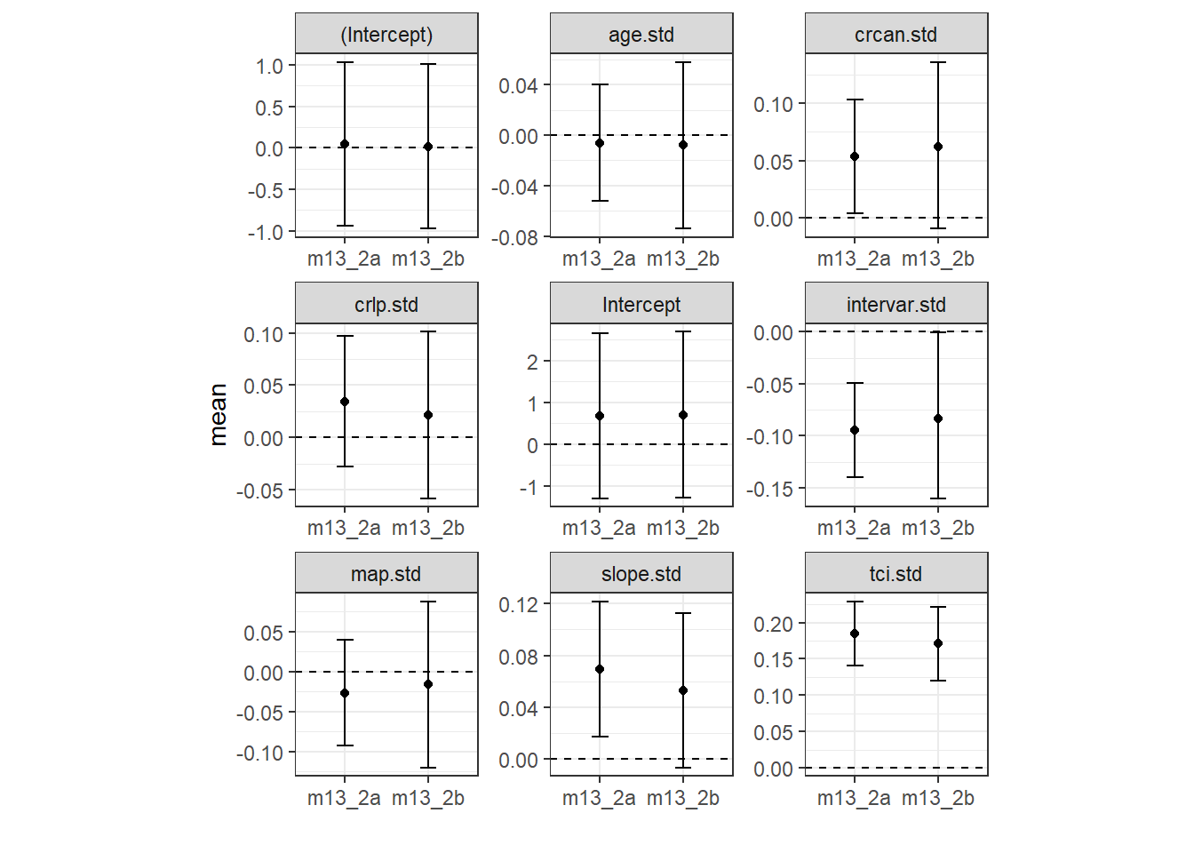
図12.2: Results of the Poisson GLM witho ut spatial correlation and the model with spatial correlation.
続いて、それぞれのモデルのバリオグラムを描いて空間相関の問題が解決されているか検討する。まず、各モデルの予測値とピアソン残差を計算する。
## μの予測値が含まれている範囲を計算
index <- inla.stack.index(stack13_2, tag = "Fit")$data

mu13_2a <- m13_2a$summary.fitted.values[index, "mean"]
mu13_2b <- m13_2b$summary.fitted.values[index, "mean"]

E13_2a <- (lp$nSIE - mu13_2a)/sqrt(mu13_2a)
E13_2b <- (lp$nSIE - mu13_2b)/sqrt(mu13_2b)各モデルのバリオグラムをプロットしたのが以下の図12.3である。空間相関を考慮したモデルの方が空間相関は弱まっているものの、まだ少しだけ残っている。
## 空間相関なし
resid13_2a <- data.frame(resid = E13_2a,
                         lon = lp$X.km,
                         lat = lp$Y.km)

sp::coordinates(resid13_2a) <- c("lon", "lat")

vario13_2a <- variogram(resid ~ 1, data = resid13_2a,
                        cressie = TRUE,
                        cutoff = 10,
                        width = 0.2) %>%
              mutate(model = "GLM")

## 空間相関あり
resid13_2b <- data.frame(resid = E13_2b,
                         lon = lp$X.km,
                         lat = lp$Y.km)

sp::coordinates(resid13_2b) <- c("lon", "lat")

vario13_2b <- variogram(resid ~ 1, data = resid13_2b,
                        cressie = TRUE,
                        cutoff = 10,
                        width = 0.2) %>%
              mutate(model = "Spatial GLM")

## 図示
vario13_2a %>%
  bind_rows(vario13_2b) %>%
  ggplot(aes(x = dist, y = gamma))+
  geom_point()+
  theme_bw()+
  theme(aspect.ratio = 1)+
  coord_cartesian(ylim = c(0,1))+
  geom_smooth(color = "black")+
  facet_rep_wrap(~ model, repeat.tick.labels = TRUE)+
  labs(y = "semivariogram")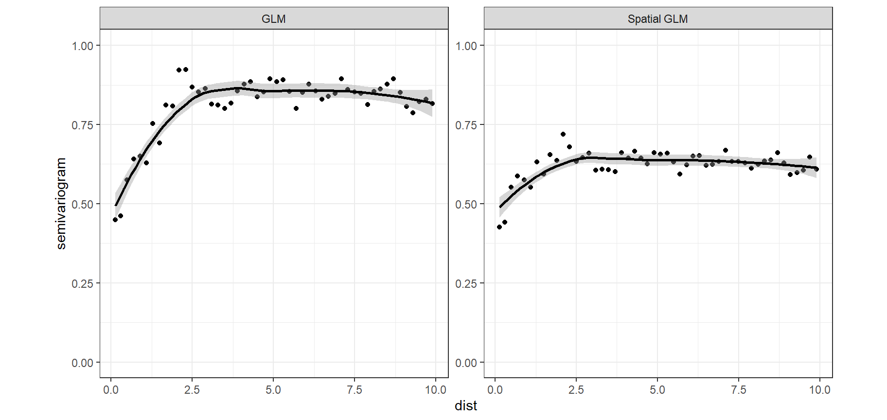
図12.3: Sample-variograms of the Pearson residuals for the Poisson GLM (left panel) and the model with spatial correlation (right panel).
12.5.9.1 Plotting interpolated wk
次に、推定されたランダム場\(w_k\)の事後中央値と標準偏差を地図上にプロットする。まず推定された\(w_k\)を取り出す。
次にこれを地図上に作図するためのグリッドを作成してその上に\(w_k\)の値を対応させる。このグリッドは100×100である。
wproj <- inla.mesh.projector(mesh13_2b)
w.pm100_100 <- inla.mesh.project(wproj, w.pm)
w.sd100_100 <- inla.mesh.project(wproj, w.sd)
最後に、これを作図する。うまく空間的相関を表せていそう。標準偏差はほとんどが0.2くらいでばらつきが小さい。
expand.grid(X.km = wproj$x,
         Y.km = wproj$y) %>%
  mutate(w.pm = as.vector(w.pm100_100),
         w.sd = as.vector(w.sd100_100)) -> w_df

w_df %>%
  drop_na() %>%
  pivot_longer(3:4) %>%
  ggplot(aes(x = X.km, y = Y.km))+
  geom_raster(aes(fill = value))+
  theme_bw() +
  scale_fill_gradientn(colors = rainbow(30, alpha = 0.5))+
  facet_rep_wrap(~ name)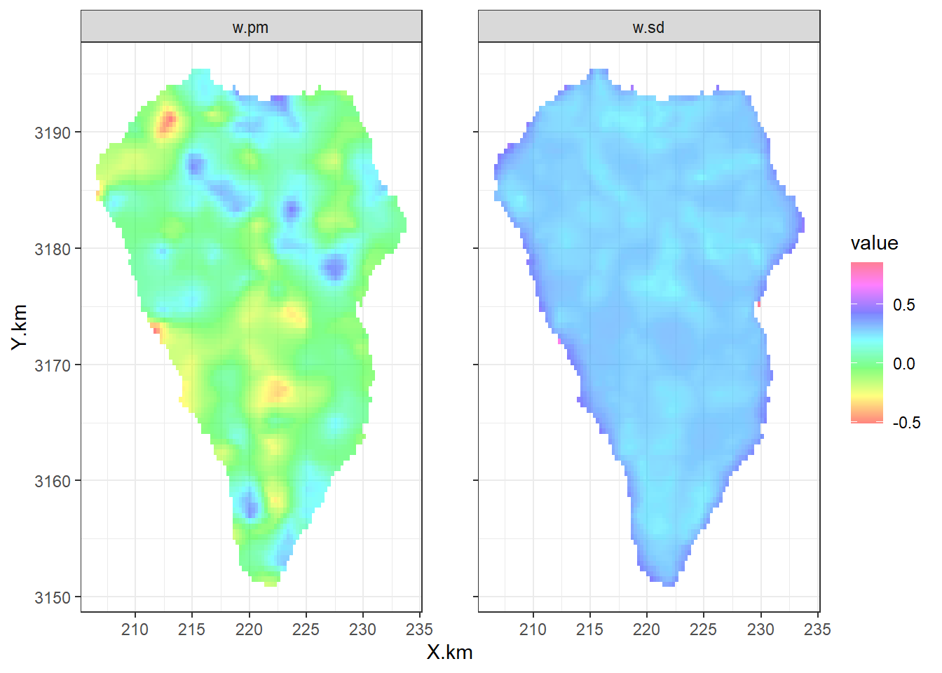
12.5.9.2 Plotting the random intercepts ui
続いて、ランダム切片\(u_i\)を地図上にプロットする。\(u_i\)を得る方法はいくつかある。一つは前章(11.16)でやったように\(\bf{u} = \bf{A} \times \bf{w}\)であることを利用して手動で計算する方法である。もう一つは以下のようにINLAの関数を利用する方法である。どちらもまったく同じ値が得られる。
u.proj <- inla.mesh.projector(mesh13_2b, loc = Loc13_2)
u.pm <- inla.mesh.project(u.proj,
m13_2b$summary.random$w$mean)それでは地図上に作図する。\(w_k\)が負のところからは負の\(u_i\)が、\(w_k\)が正のところからは正の\(u_i\)が得られていることが分かる。
data.frame(X.km = lp$X.km,
           Y.km = lp$Y.km,
           u = u.pm) %>%
  replace_na(list(u = 0)) %>%
  ggplot(aes(x = X.km, y = Y.km))+
  geom_polygon(data = lp_df,
               fill = NA, color = "black",
               linewidth = 1)+
  geom_tile(data = w_df %>% drop_na(),
              aes(fill = w.pm))+
  geom_point(aes(shape = u > 0))+
  scale_shape_manual(values = c(1,16))+
  theme_bw() +
  coord_fixed(ratio = 1)+
  scale_fill_gradient2(high = muted("red"), low = muted("yellow"), mid = "white",
                       midpoint = 0)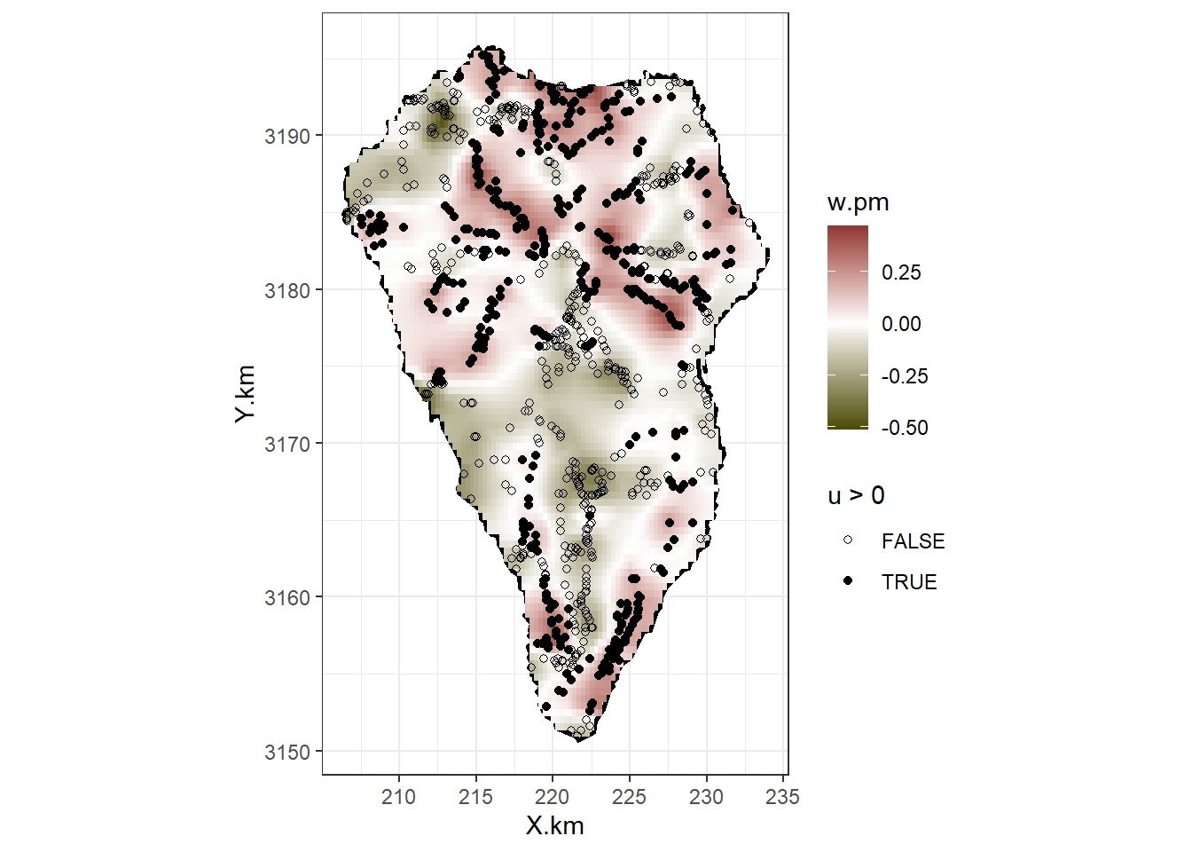
図12.4: Ma p of La Palma with posterior mean values of the spatial random effects u i, and the spatial random field w k. The closed circles represent positive u i values and the open circles are negative u is.
最後に、得られたパラメータからマテルン関数をプロットする。SPDEの結果を得るにはinla.spde2.result関数を用いる。\(\kappa, \sigma_u\)とレンジの事後平均は以下の通り。レンジはおよそ2.37kmだった。
spfi.w <- inla.spde2.result(inla = m13_2b,
                            name = "w",
                            spde = spde13_2,
                            do_transfer = TRUE)

kappa <- inla.emarginal(function(x) x, spfi.w$marginals.kappa[[1]])
sigmau <- inla.emarginal(function(x) sqrt(x), spfi.w$marginals.variance.nominal[[1]])
range <- inla.emarginal(function(x) x, spfi.w$marginals.range.nominal[[1]])

c(kappa, sigmau, range)
## [1] 1.3384210 0.2835554 2.3743703これらの値からMatern関数を描画すると以下のようになる。
D <- as.vector(dist(mesh13_2b$loc[,1:2]))
d.vec <- seq(0, max(D), length = 100)
corM <- (kappa*d.vec)*besselK(kappa*d.vec,1)
corM[1] <- 1

data.frame(Distance = d.vec,
           Correlation = corM) %>%
  ggplot(aes(x = Distance, y = Correlation))+
  geom_line()+
  geom_vline(xintercept = range,
             linetype = "dashed")+
  geom_hline(yintercept = 0.1,
             linetype = "dashed")+
  coord_cartesian(xlim = c(0,11))+
  theme_bw()+
  theme(aspect.ratio = 1)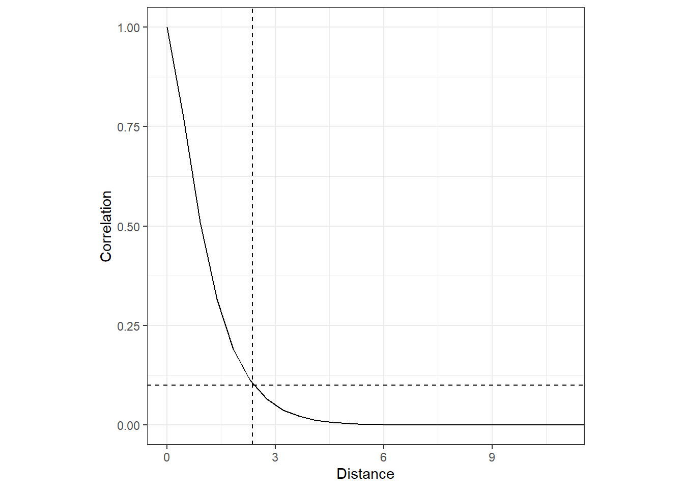
12.6 Simulating from the model
最後に、モデルがデータによく当てはまっているかを確認するため、モデルからデータをシミュレートし、それが実際のデータに合っているかを検討する。モデルからデータをシミュレートするにはcontrol.compute = list(config = TRUE)とする必要がある。
m13_2c <- inla(f13_2b,
               family = "poisson",
               data = inla.stack.data(stack13_2),
               control.compute = list(config = TRUE),
control.predictor = list( A = inla.stack.A(stack13_2)))続いて、モデルの事後同時分布から各パラメータの値をサンプリングする(第7.5.5.2節を参照)。ここでは試しに1つのみサンプリングする。
得られたオブジェクトには、サンプリングされた各データポイントの平均\(\mu_i\)の値(APredictor)や\(w_k\)(w)、そして回帰係数などが含まれている。
サンプリングされた固定効果のパラメータは以下のとおりである。つまり、3634から3641行目までがこれらのパラメータの値がある行である。
sim_test[[1]]$latent %>%
  data.frame() %>%
  rownames_to_column(var = "Par") %>%
  mutate(n = 1:n()) %>%
  rename(value = 2) %>%
filter(str_detect(Par, c("Intercept|crcan.st|crlp.std|intervar.std|map.std|age.std|slope.std|tci.std")))サンプリングされた\(w_k\)は以下の通り。2422から3633行目までがこれらのパラメータの値がある行である。
sim_test[[1]]$latent %>%
  data.frame() %>%
  rownames_to_column(var = "Par") %>%
  mutate(n = 1:n()) %>%
  rename(value = 2) %>%
  filter(str_detect(Par, c("w"))) %>%
  datatable() %>%
formatRound(2, digits = 3)よって、事後同時分布からサンプリングされた値を用いて計算した各ポイント(\(s_i\))の平均値\(\mu_i\)の値は以下のように計算できる(\(log(\mu_i) = \bf{X} \times \bf{\beta} + A \times w\)より)。
## 固定効果
beta <- sim_test[[1]]$latent[3634:3641]
## wk
w <- sim_test[[1]]$latent[2442:3633]
## muの計算
mu_sim <- exp(as.matrix(X13_2) %*% beta + as.matrix(A13_2) %*% w)なお、inla.posterior.sample(n = 1, result = m13_2c)で得られたオブジェクトの最初の890行はこうした計算をしなくても\(log(\mu_i)\)の値を返してくれる。以下より全く同じ値が得られていることが分かる。
data.frame(mu = mu_sim,
           mu2 = exp(sim_test[[1]]$latent[1:890])) %>%
  datatable() %>%
formatRound(1:2, digits = 3)事後同時分布からのサンプリングによって得られた\(\mu_i\)を用いてデータをシミュレートすると、得られる値の分布は以下のようになる。
y_sim <- rpois(n = 890, lambda = mu_sim)

data.frame(x = y_sim) %>%
  ggplot()+
  geom_histogram(aes(x = x),
                 size = 0.2)+
  theme_bw()+
  theme(aspect.ratio = 1)+
  scale_x_continuous(breaks = seq(0,12,1))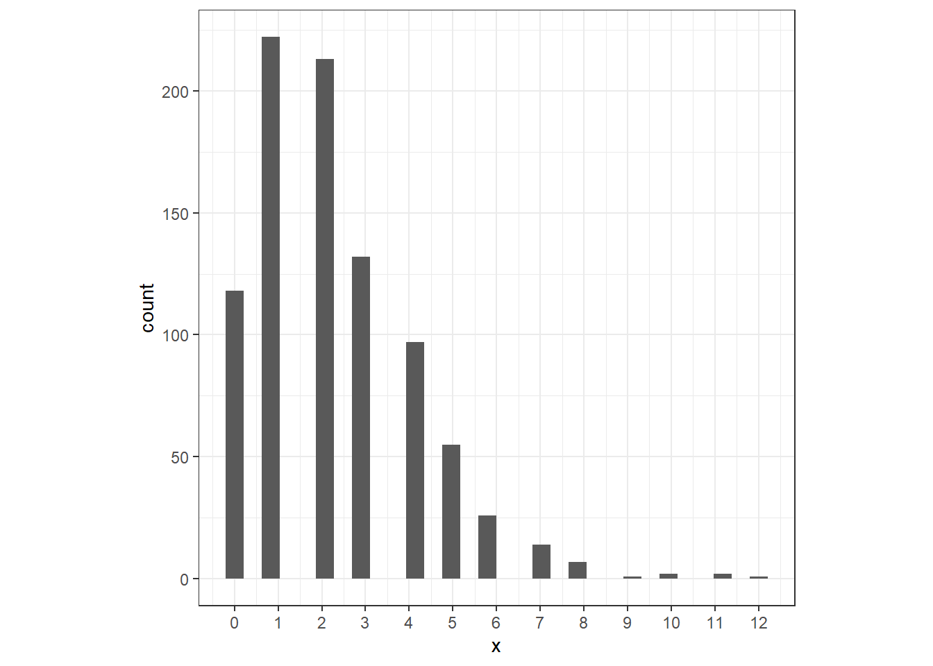
それでは、これと同じことを1000回繰り返して得られた分布と実際のデータの分布を比較することで、モデルがデータによく当てはまっているかを検討しよう。以下に、1000回事後同時分布からサンプリングを行ってシミュレーションをしたときに得られた平均分布と実際のデータの分布を同じ図に示した。
モデルからシミュレートされた値は実データに比べてゼロが多く1が少ないことが分かる。また、実データは9以上のデータがないのに対してシミュレーションでは9以上のデータがある。
post_mu <- matrix(ncol = 1000, nrow = nrow(lp))
y_sim <- matrix(ncol = 1000, nrow = nrow(lp))

### 1000回シミュレーションを行う。
for(i in 1:1000){
  sim <- inla.posterior.sample(n = 1, result = m13_2c)
  post_mu[ ,i] <- exp(sim[[1]]$latent[1:890])
  y_sim[,i] <- rpois(n = 890, lambda = post_mu[,i])
}

### 集計
y_sim %>%
  data.frame() %>%
  pivot_longer(1:1000) %>%
  group_by(value, name) %>%
  summarise(n = n()) %>%
  ungroup() %>%
  group_by(value) %>%
  summarise(freq = mean(n)) %>%
  ungroup() %>%
  mutate(type = "Simulated") %>%
  rename(nSIE = value) -> freq_sim

lp %>%
  group_by(nSIE) %>%
  summarise(freq = n()) %>%
  ungroup() %>%
  mutate(type = "Real")-> freq_data

freq_sim %>%
  bind_rows(freq_data) %>%
  ggplot(aes(x = nSIE, y = freq))+
  geom_col(aes(fill = type),
           position = position_dodge2(preserve = "single"))+
  theme_bw()+
  theme(aspect.ratio = 0.8)+
  scale_x_continuous(breaks = seq(0,23,1))+
  labs(y = "Frequencies")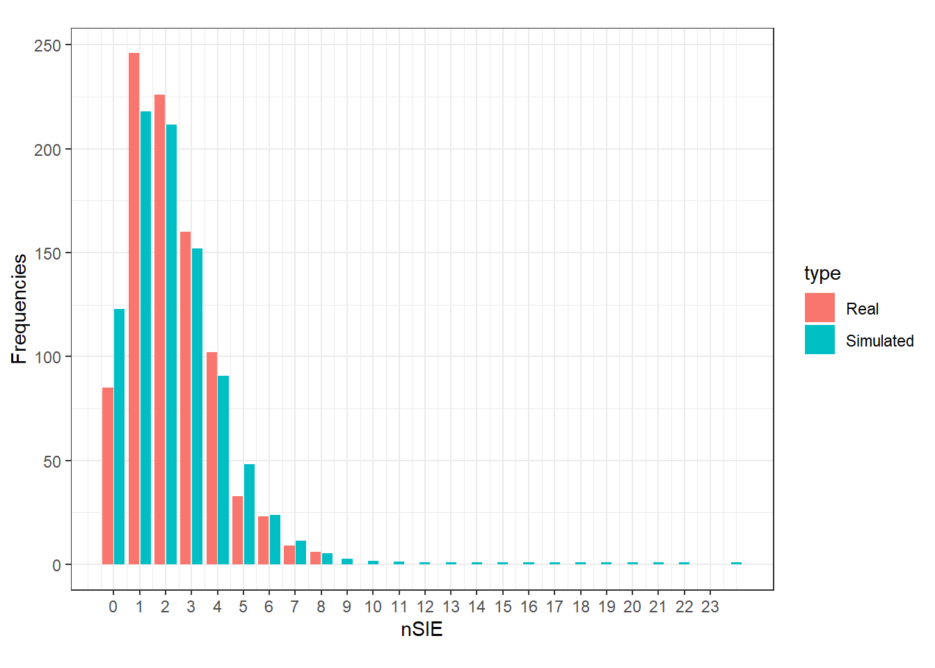
12.7 What to write in a paper
モデルではまだ残差に空間的な相関が残っていた。これについてさらに詳しく調べるため、バリオグラムを4方向に分割してみた(図12.5)。その結果、北東方向のバリオグラムは他の方角のものよりも強い空間相関を示しているように見える。これは、大きな火山が二つある島の地理的な特徴を反映しているのだろう。
vario13_2b <- variogram(resid ~ 1, data = resid13_2b,
                        cressie = TRUE,
                        cutoff = 10,
                        width = 0.2,
                        alpha = c(0, 45, 90, 135)) %>%
              mutate(dir = as.factor(dir.hor))

vario13_2b %>%
  ggplot(aes(x = dist, y = gamma))+
  geom_point()+
  theme_bw()+
  theme(aspect.ratio = 1)+
  coord_cartesian(ylim = c(0,1))+
  geom_smooth(color = "black")+
  facet_rep_wrap(~ dir.hor, repeat.tick.labels = TRUE)+
  labs(y = "semivariogram")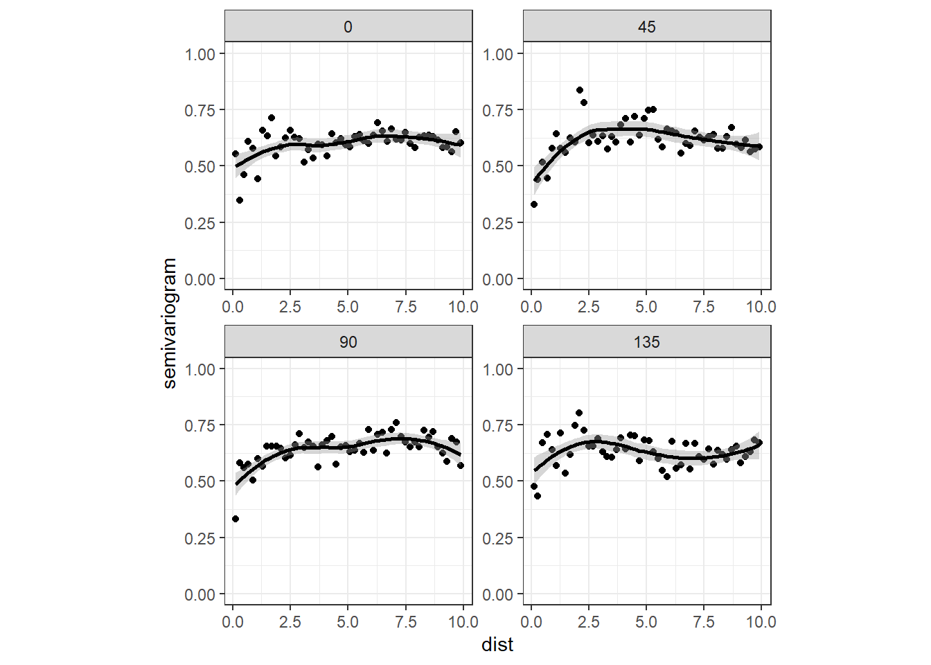
図12.5: Sample variogram of the Pearson residuals obtained by the model in Equation (13.2). The panels with the labels ‘0’, ‘45’, ‘90’, and ‘135’ represent the sample variograms in northern, northeastern, eastern, and southeastern directions respectively. This is the same as 180, 225, 270,and 315 degrees respectively.
このように、方角によって空間相関のパターンが違うことをanisotropic(異方性)があるという。INLAにはこうした異方性を考慮してMatern関数のパラメータ推定を行うことができる方法も存在する(Lindgren and Rue 2015)。