11 God Spiked the Integers
11.1 Binomial regression
二項分布のGLMはデータの表現によって2通りある(モデル自体は全く同じ)。
Logistic regression
応答変数を0と1で表現する場合。Aggregated binomial regression
同じ共変量についての試行をまとめる場合。この場合0からnまでの値をとる。
11.1.1 Logistic regression
Silk et al. (2005) のチンパンジーを対象とした向社会的選択課題を例に見ていく。チンパンジーは相手がいるときにのみ向社会的な選択をするのかを調べるため、condition(相手の有無)とoption(左右どちらが高社会的選択か)の交互作用を見ていく。
# データ読み込み
data("chimpanzees")
d <- chimpanzees
head(d)
## actor recipient condition block trial prosoc_left chose_prosoc pulled_left
## 1 1 NA 0 1 2 0 1 0
## 2 1 NA 0 1 4 0 0 1
## 3 1 NA 0 1 6 1 0 0
## 4 1 NA 0 1 8 0 1 0
## 5 1 NA 0 1 10 1 1 1
## 6 1 NA 0 1 12 1 1 1d %>%
distinct(prosoc_left, condition) %>%
mutate(description =
c("Two food items on right and no partner",
"Two food items on left and no partner",
"Two food items on right and partner present",
"Two food items on left and partner present"))%>%
kable(caption = "4つの実験条件",
booktabs = TRUE) %>%
kable_styling(latex_options = "striped")| condition | prosoc_left | description |
|---|---|---|
| 0 | 0 | Two food items on right and no partner |
| 0 | 1 | Two food items on left and no partner |
| 1 | 0 | Two food items on right and partner present |
| 1 | 1 | Two food items on left and partner present |
パッと見た限りでは、相手がいるときといないときで向社会的な選択をする割合に大きな違いはなさそう。
d %>%
  group_by(condition, prosoc_left) %>%
  summarise(prop = mean(pulled_left),
            se = sd(pulled_left)/n()) %>%
  mutate(condition = ifelse(condition =="0","no partner","partner"),
         prosoc_left = ifelse(prosoc_left=="0","right","left")) %>%
  ggplot(aes(x=prosoc_left, y = prop))+
  geom_col(aes(fill = condition),
           position=position_dodge(0.95))+
  geom_errorbar(aes(ymin = prop-se,ymax=prop+se,
                    fill = condition),
                position=position_dodge(0.95),
                width = 0.2)+
  theme(aspect.ratio=1)+
  labs(fill="condition",x = "which was prosocial",
       y = "proportion of choosing left")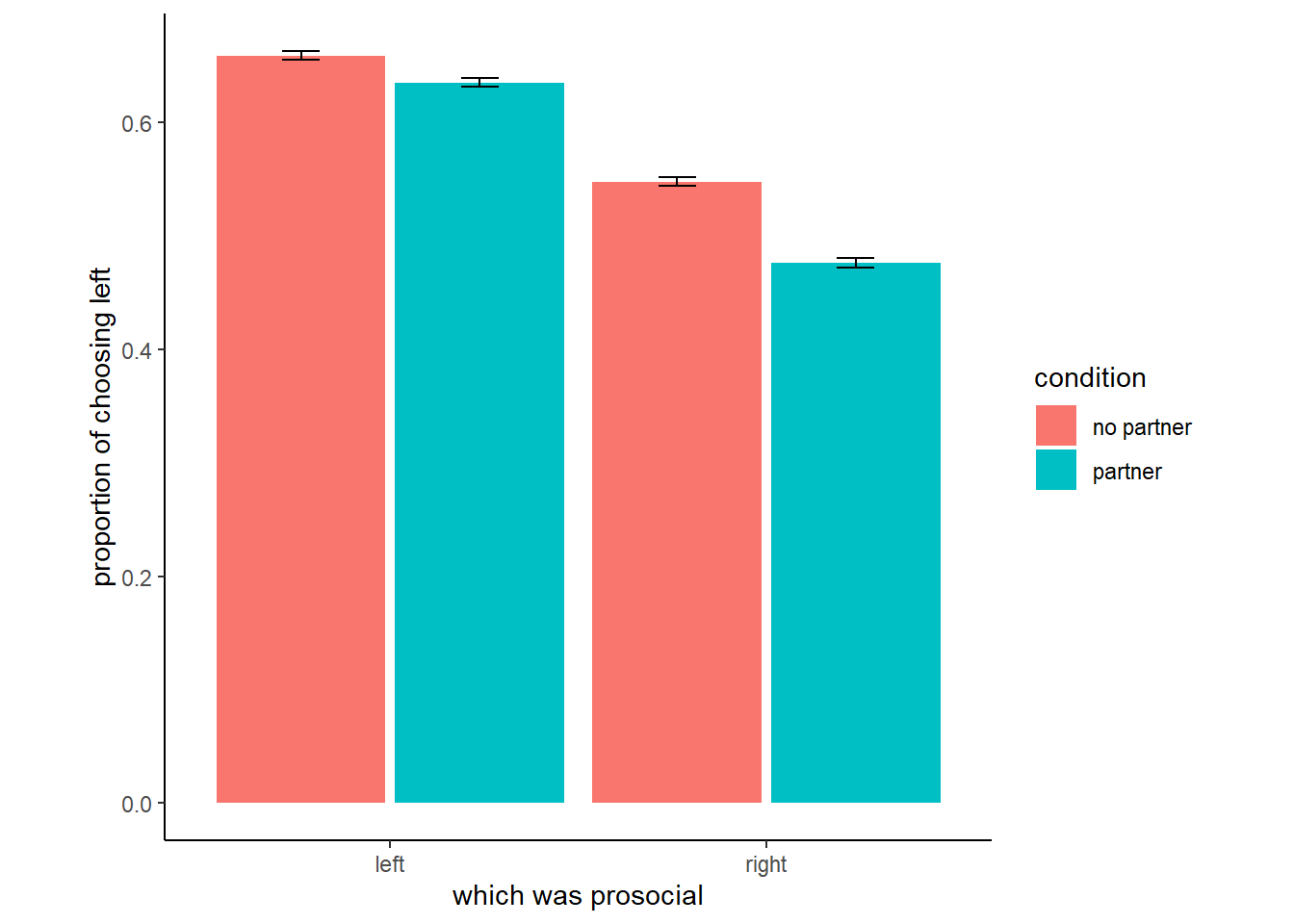
図11.1: 実験データの図示
これまで同様、ダミー変数は使わずindicator variableを用いる。
d <-
  d %>%
  mutate(treatment = factor(1+prosoc_left+2*condition)) %>%
  mutate(labels = factor(treatment,
                         levels = 1:4,
                         labels = c("r/n", "l/n", "r/p", "l/p")))

d %>%
  count(condition,prosoc_left, treatment) %>%
  kable(caption = "各実験条件のサンプル数",
        booktabs = TRUE) %>%
kable_styling(latex_options = "striped")| condition | prosoc_left | treatment | n |
|---|---|---|---|
| 0 | 0 | 1 | 126 |
| 0 | 1 | 2 | 126 |
| 1 | 0 | 3 | 126 |
| 1 | 1 | 4 | 126 |
今回のモデル式は以下の通り。
\[
\begin{aligned}
L_{i} &\sim Binomial(1,p_{i})\\
logit(p_{i}) &= \alpha_{ACTOR[i]} + \beta_{TREATMENT_{i}}\\
\alpha_{j} &\sim to \ be \ determined\\
\beta_{k} &\sim to \ be \ determined
\end{aligned}
\]
事前分布はどのようにするのが適切だろうか。まずは、切片だけしかないモデルを考えて試してみる。
\[
\begin{aligned}
L_{i} &\sim Binomial(1,p_{i})\\
logit(p_{i}) &= \alpha\\
\alpha &\sim Normal(0,10)
\end{aligned}
\]
b11.1 <-
  brm(data = d,
      ## family = "bernoulli"でも可
      family = binomial,
      pulled_left | trials(1) ~ 1,
      prior(normal(0, 10), class = Intercept),
      seed = 11,
      sample_prior = TRUE,
      file = "output/Chapter11/b11.1")
標準偏差が10のとき、事前分布は0と1の近くに集中していることが分かる。これは、奇妙なことである。
今度は、標準偏差が1.5の場合を考える。今度は、うまく全体に広がっていることが分かる。
b11.1b <- brm(data = d,
      family = binomial,
      pulled_left | trials(1) ~ 1,
      prior(normal(0, 1.5), class = Intercept),
      seed = 11,
      sample_prior = TRUE,
file = "output/Chapter11/b11.1b")bind_rows(prior_samples(b11.1),
prior_samples(b11.1b)) %>%
mutate(p = inv_logit_scaled(Intercept),
w = factor(rep(c(10, 1.5), each = n() / 2),
levels = c(10, 1.5))) %>%
ggplot(aes(x=p, fill =w))+
geom_density(alpha=3/4, adjust =0.1, size=0,
color = NA)+
scale_fill_manual(expression(italic(w)),
values = c("grey", "lightblue"))+
labs(title = expression(alpha%~%Normal(0*", "*italic(w))))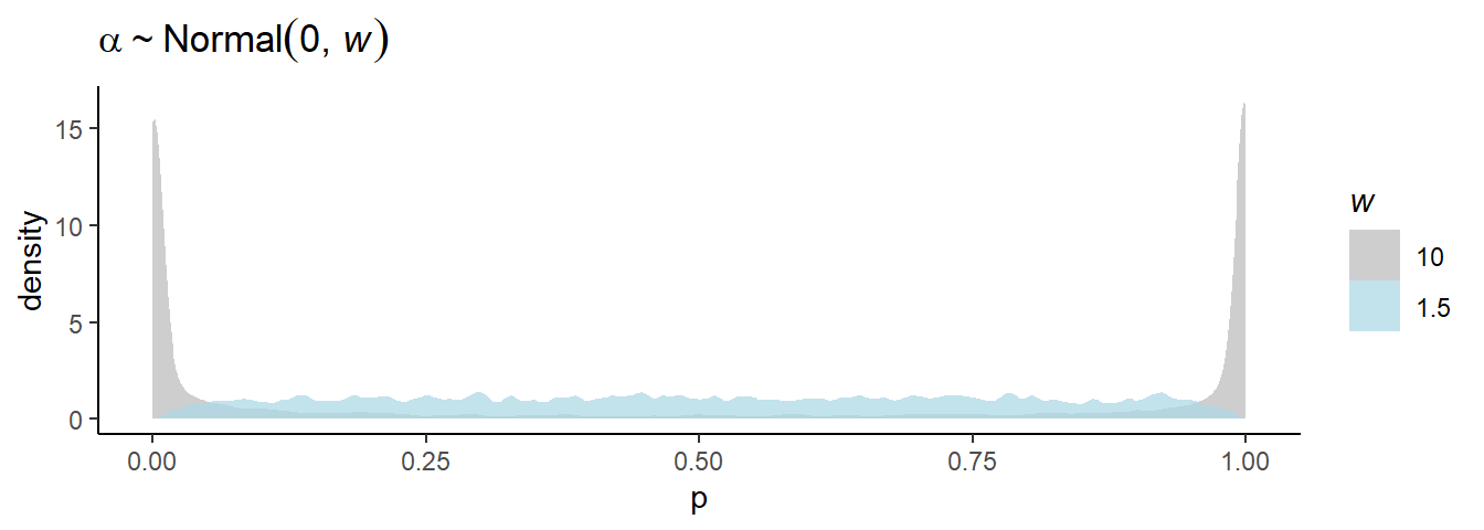
図11.2: 標準偏差による切片の事前分布からのサンプリングの違い
それでは、標準偏差1.5でモデルを回してみる。まず、treatmentのみを説明変数に入れるモデルを考える。説明変数の係数の事前分布としては、ひとまず平均0、標準偏差10と0.5の正規分布を考える。なお、brmsの事前分布の指定は単に事後分布を得るだけであればよりシンプルにかけるが、すべての条件について事前分布からのサンプルを得たければ、下記のように書く必要がある。
If all you want to do is fit the models, you wouldn’t have to add a separate prior() statement for each level of treatment. You could have just included a single line, prior(normal(0, 0.5), nlpar = b), that did not include a coef argument. The problem with this approach is we’d only get one column for treatment when using the prior_samples() function to retrieve the prior samples. To get separate columns for the prior samples of each of the levels of treatment, you need to take the verbose approach, above.
# w = 10
b11.2 <- brm(data = d,
      family = binomial,
      bf(pulled_left | trials(1) ~ a + b,
         a ~ 1,
         b ~ 0+ treatment,
         nl = TRUE),
      prior=c(prior(normal(0, 1.5), nlpar = a),
              prior(normal(0, 10), nlpar = b,
                    coef = "treatment1"),
              prior(normal(0, 10), nlpar = b,
                    coef = "treatment2"),
              prior(normal(0, 10), nlpar = b,
                    coef = "treatment3"),
              prior(normal(0, 10), nlpar = b,
                    coef = "treatment4")),
      seed = 11,
      sample_prior = TRUE,
      file = "output/Chapter11/b11.2")

# w = 0.5
b11.3 <- brm(data = d,
      family = binomial,
      bf(pulled_left | trials(1) ~ a + b,
         a ~ 1,
         b ~ 0+treatment,
         nl = TRUE),
      prior=c(prior(normal(0, 1.5), nlpar = a),
              prior(normal(0, 0.5), nlpar = b,
                    coef = "treatment1"),
              prior(normal(0, 0.5), nlpar = b,
                    coef = "treatment2"),
              prior(normal(0, 0.5), nlpar = b,
                    coef = "treatment3"),
              prior(normal(0, 0.5), nlpar = b,
                    coef = "treatment4")),
      seed = 11,
      sample_prior = TRUE,
file = "output/Chapter11/b11.3")treatmentが1と2のときの違いを可視化してみる。標準偏差が10のときは、やはり0と1のところに集中していて考えられにくい。一方、0.5の場合はうまく低い値に集まっている。
prior <-
  bind_rows(prior_samples(b11.2),
            prior_samples(b11.3)) %>%
  mutate(w= factor(rep(c(10, 0.5), each = n() / 2),
                     levels = c(10, 0.5)),
         p1 = inv_logit_scaled(b_a + b_b_treatment1),
         p2 = inv_logit_scaled(b_a + b_b_treatment2)) %>%
  mutate(diff = abs(p1 - p2))

prior %>%
  ggplot(aes(x=diff, fill = w))+
  geom_density(size=0, alpha=3/4, adjust = 0.1,
                 color=NA)+
  scale_fill_manual(expression(italic(w)),
                    values = c("lightsalmon4","orange"))+
  labs(title = expression(alpha%~%Normal(0*", "*italic(w))),
       x = "prior diff between treatments")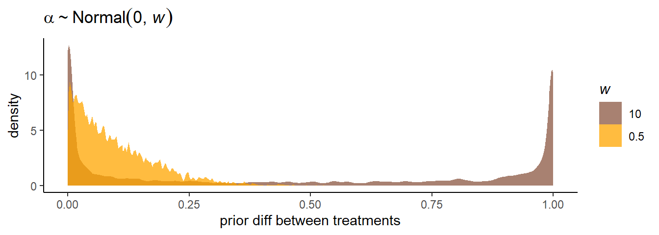
図11.3: 標準偏差による事前分布からのサンプリングの違い
#平均
prior %>%
  group_by(w) %>%
  summarise(mean = mean(diff)) %>%
  mutate(mean = round(mean,2)) %>%
  kable(caption = "標準偏差が10と0.5のときのtreatment1と2の違いの平均",
        booktabs = TRUE) %>%
kable_styling(latex_options = "striped")| w | mean |
|---|---|
| 10 | 0.48 |
| 0.5 | 0.10 |
ちなみに、モデルによるtreatment1~4の平均は以下の通り。
posterior_samples(b11.3) %>%
  pivot_longer(b_b_treatment1:b_b_treatment4) %>%
  mutate(treatment = str_remove(name, "b_b_treatment"),
         mean= inv_logit_scaled(b_a_Intercept + value)) %>%
  group_by(treatment) %>%
  mean_qi(mean) %>%
  kable(digits =2, caption = "モデルb11.3の結果",
        booktabs = TRUE) %>%
kable_styling(latex_options = "striped")| treatment | mean | .lower | .upper | .width | .point | .interval |
|---|---|---|---|---|---|---|
| 1 | 0.55 | 0.47 | 0.63 | 0.95 | mean | qi |
| 2 | 0.65 | 0.57 | 0.73 | 0.95 | mean | qi |
| 3 | 0.49 | 0.41 | 0.57 | 0.95 | mean | qi |
| 4 | 0.63 | 0.55 | 0.71 | 0.95 | mean | qi |
個体名も含めたモデルを回す。
d %>%
  mutate(actor = factor(actor))->d

b11.4 <- brm(data = d,
      family = binomial,
      bf(pulled_left | trials(1) ~ a + b ,
         a ~ 0+ actor,
         b ~ 0+ treatment,
         nl = TRUE),
      prior=c(prior(normal(0, 1.5), nlpar = a),
              prior(normal(0, 0.5), nlpar = b)),
      seed = 11,
      sample_prior = TRUE,
file = "output/Chapter11/b11.4")posterior_summary(b11.4) %>%
data.frame() %>%
rownames_to_column(var="parameters") %>%
filter(parameters !="lp__", parameters !="prior_b_a",
parameters !="prior_b_b") %>%
kable(digits=2, caption = "モデルb11.4の結果",
booktabs = TRUE) %>%
kable_styling(latex_options = "striped")| parameters | Estimate | Est.Error | Q2.5 | Q97.5 |
|---|---|---|---|---|
| b_a_actor1 | -0.46 | 0.32 | -1.09 | 0.16 |
| b_a_actor2 | 3.89 | 0.74 | 2.60 | 5.46 |
| b_a_actor3 | -0.76 | 0.33 | -1.42 | -0.11 |
| b_a_actor4 | -0.76 | 0.33 | -1.39 | -0.12 |
| b_a_actor5 | -0.47 | 0.33 | -1.10 | 0.19 |
| b_a_actor6 | 0.47 | 0.33 | -0.17 | 1.09 |
| b_a_actor7 | 1.94 | 0.43 | 1.15 | 2.80 |
| b_b_treatment1 | -0.03 | 0.28 | -0.56 | 0.52 |
| b_b_treatment2 | 0.49 | 0.29 | -0.07 | 1.05 |
| b_b_treatment3 | -0.37 | 0.29 | -0.94 | 0.18 |
| b_b_treatment4 | 0.38 | 0.28 | -0.17 | 0.94 |
| lprior | -16.75 | 1.65 | -20.48 | -14.05 |
まずは、各個体の左を引く確率をtreatmentの効果を考えずに見てみる。個体ごとの左右の選好にかなり違いがあることが分かる。特に個体2はほとんど左しか選択していない。
posterior_samples(b11.4) %>%
  pivot_longer(contains("actor"))%>%
  mutate(probability = inv_logit_scaled(value),
         actor = factor(str_remove(name, "b_a_actor"),
                        levels = 7:1)) %>%
  ggplot(aes(x=probability, y = actor))+
  geom_vline(xintercept=0.5, linetype=3)+
  stat_pointinterval(.width = .95, size = 1)+
  scale_x_continuous(limits = 0:1)+
  ylab(NULL) +
  xlab(expression(alpha))+
  theme(axis.ticks.y = element_blank())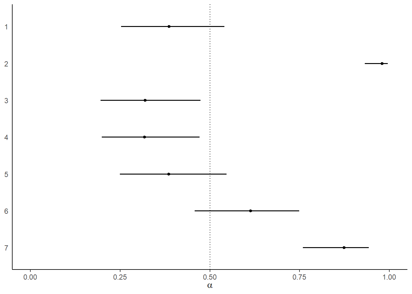
図11.4: モデルによって推定された各個体が左を選択する確率。エラーバーは95%信用区間を表す。
次は、個体のばらつきの影響を除いたうえで、各treatmentにおける選択確率についてみてみる。
tx <- c("R/N", "L/N", "R/P", "L/P")

posterior_samples(b11.4) %>%
  dplyr::select(contains("treatment")) %>%
  set_names("R/N","L/N","R/P","L/P") %>%
  pivot_longer(everything())%>%
  mutate(probability = inv_logit_scaled(value),
         treatment = factor(name, levels = tx)) %>%
  mutate(treatment = fct_rev(treatment)) %>%
  ggplot(aes(x=probability, y = treatment))+
  geom_vline(xintercept=0.5, linetype=3)+
  stat_pointinterval(.width = .95, linewidth = 1)+
  scale_x_continuous(limits = 0:1)+
  ylab(NULL) +
  xlab(expression(beta))+
  theme(axis.ticks.y = element_blank())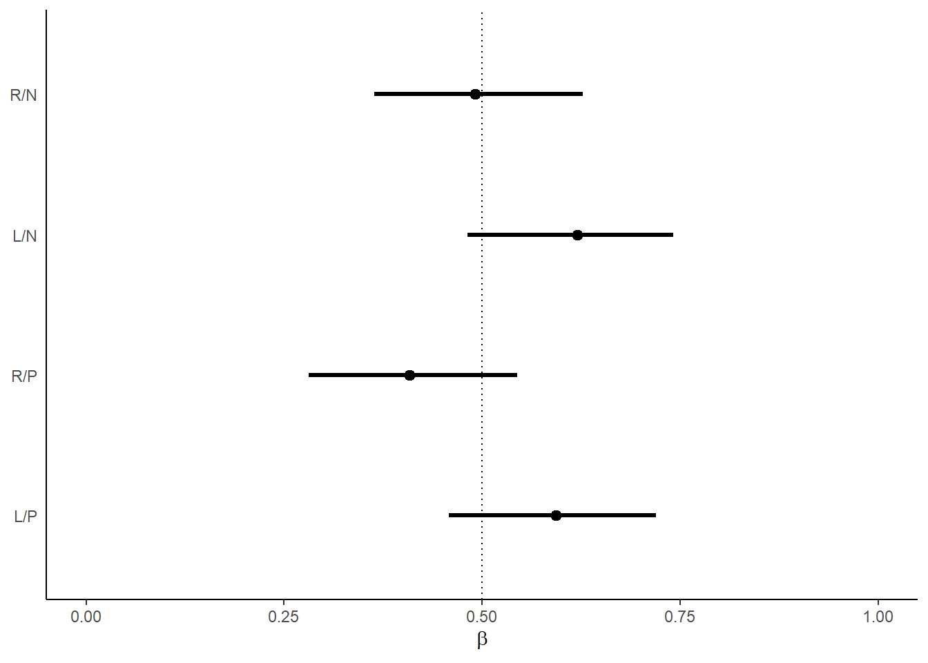
図11.5: モデルによって推定された各条件で左が選択される確率。エラーバーは95%信用区間を表す。
最後に、treatment1と3、treatment2と4の差を見ることで、相手がいるときといないときで向社会的選択をする割合に違いがみられたか調べる。
db13は、右側が向社会的選択のときに、相手がいないときよりいるときに左側を選択することがどれだけ多くなるかを示している(ただし、係数の大小を比較しているだけということに注意)。わずかに左を選択することが多くなっているが、そこまで大きな効果はない。
db14は逆に左側が向社会的選択のときに、相手がいないときよりいるときに左側を選択することがどれだけ多くなるかを示している。今度は、むしろいないときの方がわずかだが向社会的選択をしていたことを示している。
posterior_samples(b11.4) %>%
  mutate(db13 = b_b_treatment1 - b_b_treatment3,
         db24 = b_b_treatment2 - b_b_treatment4) %>%
  pivot_longer(db13:db24) %>%
  mutate(diffs = factor(name, levels = c("db24", "db13")))%>%
  ggplot(aes(x = value, y = diffs)) +
  geom_vline(xintercept = 0, linetype=3)+
  stat_pointinterval(.width = .95, linewidth = 1)+
  scale_x_continuous(breaks = seq(-0.5,1,0.5))+
  ylab(NULL) +
  xlab("difference")+
  theme(axis.ticks.y = element_blank())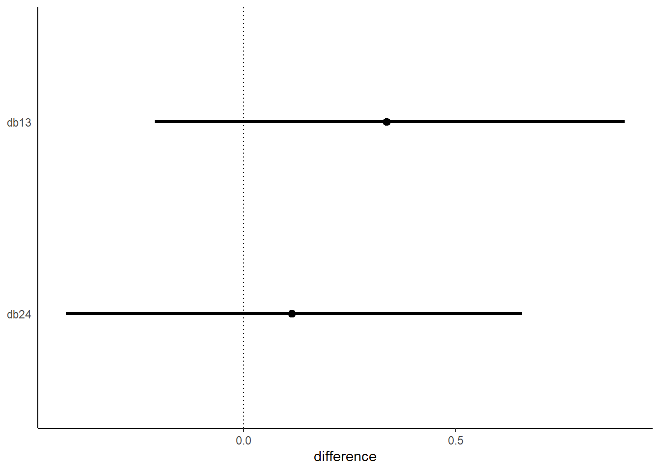
図11.6: 相手がいないときと相手がいるときの係数の推定値の差。上は右側が向社会的選択の場合、下は左側が向社会的選択の場合を示している。
最後に、実際のデータとモデルによる予測結果を図示する。
nd <-
  d %>%
  distinct(actor, treatment, labels, condition, prosoc_left)

d %>%
  group_by(actor, labels) %>%
  summarise(prop = mean(pulled_left)) %>%
  left_join(nd, by=c("actor","labels")) %>%
  mutate(condition = factor(condition)) %>%
  ggplot(aes(x=labels, y =prop ))+
  geom_hline(yintercept=0.5, linetype=3)+
  geom_line(aes(group=prosoc_left),size=1/4,color="navy")+
  geom_point(aes(shape=condition),
             size=2.5, show.legend=FALSE, color="navy")+
  scale_shape_manual(values=c(1,16))+
  labs(subtitle = "observed proportions") -> p1

fitted(b11.4, newdata = nd) %>%
  data.frame() %>%
  bind_cols(nd) %>%
  mutate(condition = factor(condition)) %>%
  ggplot(aes(x=labels, y =Estimate))+
  geom_hline(yintercept=0.5, linetype=3)+
  geom_line(aes(group=prosoc_left),size=1/4,color="black")+
  geom_pointrange(aes(ymin = Q2.5, ymax = Q97.5,
                      shape=condition),
             fatten=2, show.legend=FALSE, color="black")+
  scale_shape_manual(values=c(1,16))+
  labs(subtitle = "posterior predictions") ->p2

(p1/p2)&
  scale_y_continuous("proportion left lever",
                     breaks = c(0, .5, 1), limits = c(0, 1))&
  xlab(NULL) &
  facet_wrap(~ actor, nrow = 1, labeller = label_both)&
  theme(axis.ticks.x = element_blank(),
strip.background = element_blank()) 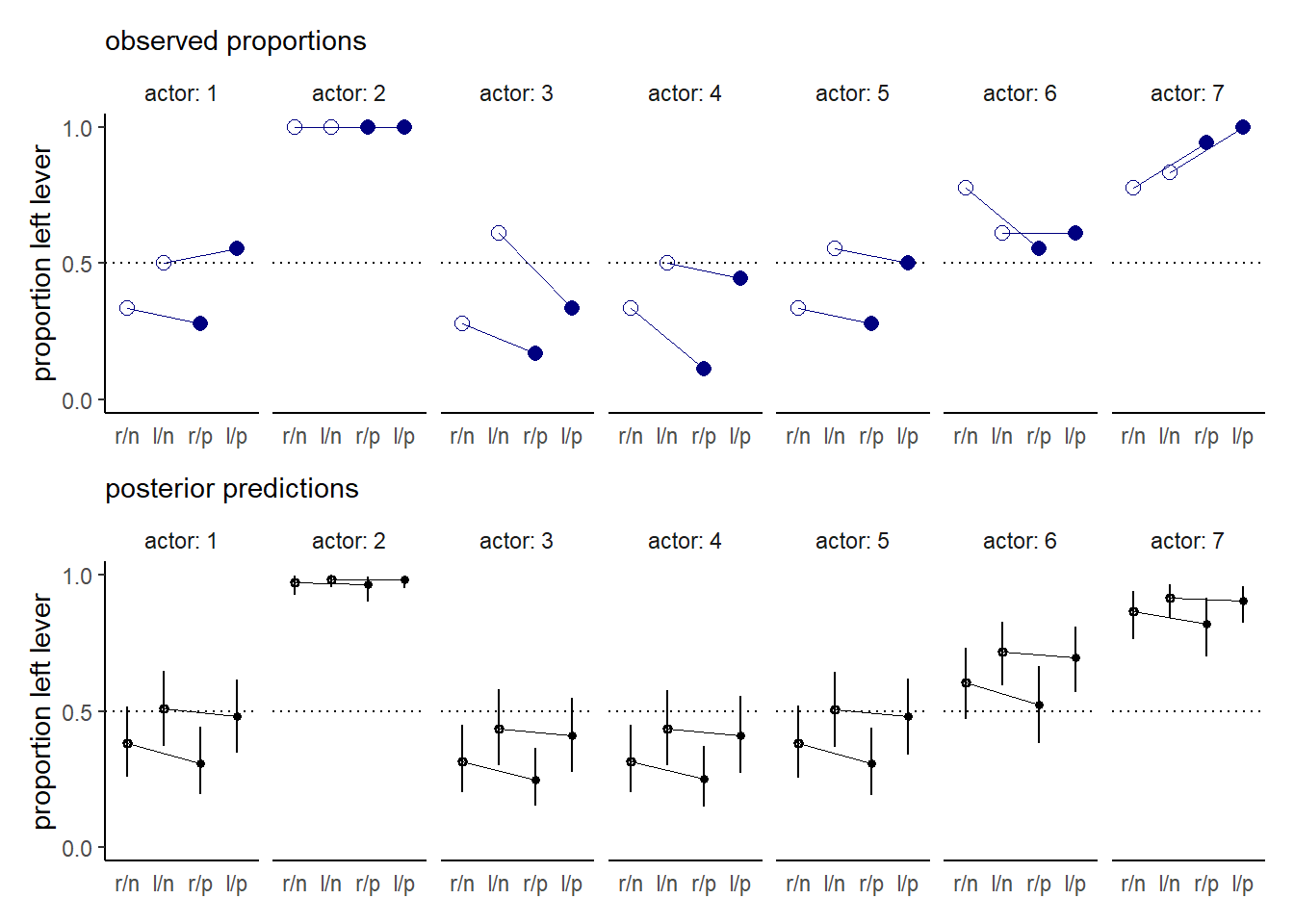
図11.7: 実際のデータとモデルによる予測結果。白抜きは相手がいない条件を、塗りつぶしは相手がいる条件を表す。下図のエラーバーは95%信用区間を表す。
なお、モデルは相手の有無と向社会的選択の場所(左右)を別々の変数としてモデリングすることもできる。
d %>%
  mutate(side = factor(prosoc_left +1),
         cond = factor(condition+1),
         actor=factor(actor)) -> d

b11.5 <-
  brm(data = d,
      family = binomial,
      bf(pulled_left | trials(1) ~ a + bs + bc,
         a ~ 0 + actor,
         bs ~ 0 + side,
         bc ~ 0 + cond,
         nl = TRUE),
      prior = c(prior(normal(0, 1.5), nlpar = a),
                prior(normal(0, 0.5), nlpar = bs),
                prior(normal(0, 0.5), nlpar = bc)),
      iter = 2000, warmup = 1000, chains = 4, cores = 4,
      seed = 11,
      backend = "cmdstanr",
      file = "output/Chapter11/b11.5")
比較すると、ほとんど変わらないことがある。すなわち、交互作用は予測をほとんど向上させていないことが分かる。
b11.4 <- add_criterion(b11.4, c("waic","loo"))
b11.5 <- add_criterion(b11.5, c("waic","loo"))

loo_compare(b11.4, b11.5) %>%
  print(simplify=F)
## elpd_diff se_diff elpd_loo se_elpd_loo p_loo se_p_loo looic se_looic
## b11.5 0.0 0.0 -265.5 9.6 7.9 0.4 531.0 19.2
## b11.4 -0.6 0.6 -266.1 9.5 8.5 0.4 532.2 18.9ちなみに図示してもほとんど違いがないことが分かる。
nd <-
  d %>%
    distinct(actor, treatment, labels, cond, side)

fitted(b11.5, newdata = nd) %>%
  data.frame() %>%
  bind_cols(nd) %>%
  mutate(condition = factor(cond)) %>%
  ggplot(aes(x=labels, y =Estimate))+
  geom_hline(yintercept=0.5, linetype=3)+
  geom_line(aes(group=side),size=1/4,color="black")+
  geom_pointrange(aes(ymin = Q2.5, ymax = Q97.5,
                      shape=condition),
             fatten=2, show.legend=FALSE, color="black")+
  scale_shape_manual(values=c(1,16))+
  labs()+
  facet_wrap(~actor, nrow=1)+
  scale_y_continuous("proportion left lever",
breaks = c(0, .5, 1), limits = c(0, 1))+
  xlab(NULL)+
  theme(axis.ticks.x = element_blank(),
        strip.background = element_blank())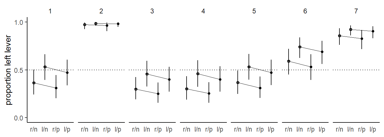
図11.8: 交互作用がないモデルでの予測値。白抜きは相手がいない条件を、塗りつぶしは相手がいる条件を表す。下図のエラーバーは95%信用区間を表す。
11.1.2 Relative shark and absolute deer
先ほどは説明変数が左を選択する確率にどのような影響を与えるかというabsolute effectに着目した。一方で、relative effect(相対的な影響)に着目することもできる。例えば、比例オッズ(proportional odds)を見ることで、相対的な効果について論じることができる。
先ほどの例でいえば、treatmentが2から4に変わったときの比例オッズ比は、0.93。
posterior_samples(b11.4) %>%
  mutate(proportional_odds =exp(b_b_treatment4 - b_b_treatment2)) %>%
  mean_qi(proportional_odds) %>%
  kable(caption = "treatmentが2から4に変わったときの比例オッズ比",
        booktabs=TRUE) %>%
kable_styling(latex_options = "striped")| proportional_odds | .lower | .upper | .width | .point | .interval |
|---|---|---|---|---|---|
| 0.9288517 | 0.5182757 | 1.521362 | 0.95 | mean | qi |
これは、オッズが8%減少することに相当する。ただし、比例オッズが大きい(小さい)かによって結果に大きな影響を及ぼすとは限らない点は注意が必要である。例えば、10000人に1人の割合でかかる病気になるオッズが5倍になったとしても、4人増えるだけなので大きな効果があるとは言えない。 一方で、因果推論をする場合には相対的な効果が重要な場合もある。例えば、サメとシカを比べると実際はシカの方がヒトが死亡する確率を上昇させている(絶対的な効果)。しかし、海にいるときで条件づけるならば、サメはシカよりもはるかに危険である(相対的な効果)。目的によってこれらを使い分ける必要がある。
11.1.3 Aggregated binomial: Chimpanzees again, condensed
先ほどのデータは、引く順番を気にしなければ、各説明変数の組み合わせごとに何回左のレバーを引いたかというデータに変換することもできる。
d %>%
  group_by(actor, treatment, side, cond) %>%
  summarise(sum = sum(pulled_left),
trial = n()) -> d2kable(d2, caption = "各個体が各treatmentで引いた合計回数",
booktabs=TRUE) %>%
kable_styling(latex_options = "striped")| actor | treatment | side | cond | sum | trial |
|---|---|---|---|---|---|
| 1 | 1 | 1 | 1 | 6 | 18 |
| 1 | 2 | 2 | 1 | 9 | 18 |
| 1 | 3 | 1 | 2 | 5 | 18 |
| 1 | 4 | 2 | 2 | 10 | 18 |
| 2 | 1 | 1 | 1 | 18 | 18 |
| 2 | 2 | 2 | 1 | 18 | 18 |
| 2 | 3 | 1 | 2 | 18 | 18 |
| 2 | 4 | 2 | 2 | 18 | 18 |
| 3 | 1 | 1 | 1 | 5 | 18 |
| 3 | 2 | 2 | 1 | 11 | 18 |
| 3 | 3 | 1 | 2 | 3 | 18 |
| 3 | 4 | 2 | 2 | 6 | 18 |
| 4 | 1 | 1 | 1 | 6 | 18 |
| 4 | 2 | 2 | 1 | 9 | 18 |
| 4 | 3 | 1 | 2 | 2 | 18 |
| 4 | 4 | 2 | 2 | 8 | 18 |
| 5 | 1 | 1 | 1 | 6 | 18 |
| 5 | 2 | 2 | 1 | 10 | 18 |
| 5 | 3 | 1 | 2 | 5 | 18 |
| 5 | 4 | 2 | 2 | 9 | 18 |
| 6 | 1 | 1 | 1 | 14 | 18 |
| 6 | 2 | 2 | 1 | 11 | 18 |
| 6 | 3 | 1 | 2 | 10 | 18 |
| 6 | 4 | 2 | 2 | 11 | 18 |
| 7 | 1 | 1 | 1 | 14 | 18 |
| 7 | 2 | 2 | 1 | 15 | 18 |
| 7 | 3 | 1 | 2 | 17 | 18 |
| 7 | 4 | 2 | 2 | 18 | 18 |
b11.4は以下のように書き換えることができる。
b11.6 <- brm(data = d2,
      family = binomial,
      bf(sum | trials(trial) ~ a + b ,
         a ~ 0+ actor,
         b ~ 0+ treatment,
         nl = TRUE),
      prior=c(prior(normal(0, 1.5), nlpar = a),
              prior(normal(0, 0.5), nlpar = b)),
      seed = 11,
      sample_prior = TRUE,
      backend = "cmdstanr",
      file = "output/Chapter11/b11.6")
推定結果はほとんど変わらないことが分かる。
text <-
  tibble(value = c(1.4, 2.6),
         name  = "b_a_actor7",
         fit   = c("b11.6", "b11.4"))

bind_rows(posterior_samples(b11.4),
          posterior_samples(b11.6)) %>%
  mutate(fit = rep(c("b11.4", "b11.6"), each = n() / 2)) %>%
  pivot_longer(b_a_actor1:b_b_treatment4) %>%
  ggplot(aes(x = value, y = name, color = fit)) +
  stat_pointinterval(.width = .95, size = 2/3,
                  position = position_dodge(width = 0.5)) +
  scale_color_manual(values = c("orange2","deepskyblue4")) +
  geom_text(data = text,
            aes(label = fit),
            position = position_dodge(width = 2.25)) +
  labs(x = "posterior (log-odds scale)",
       y = NULL) +
  theme(axis.ticks.y = element_blank(),
        legend.position = "none")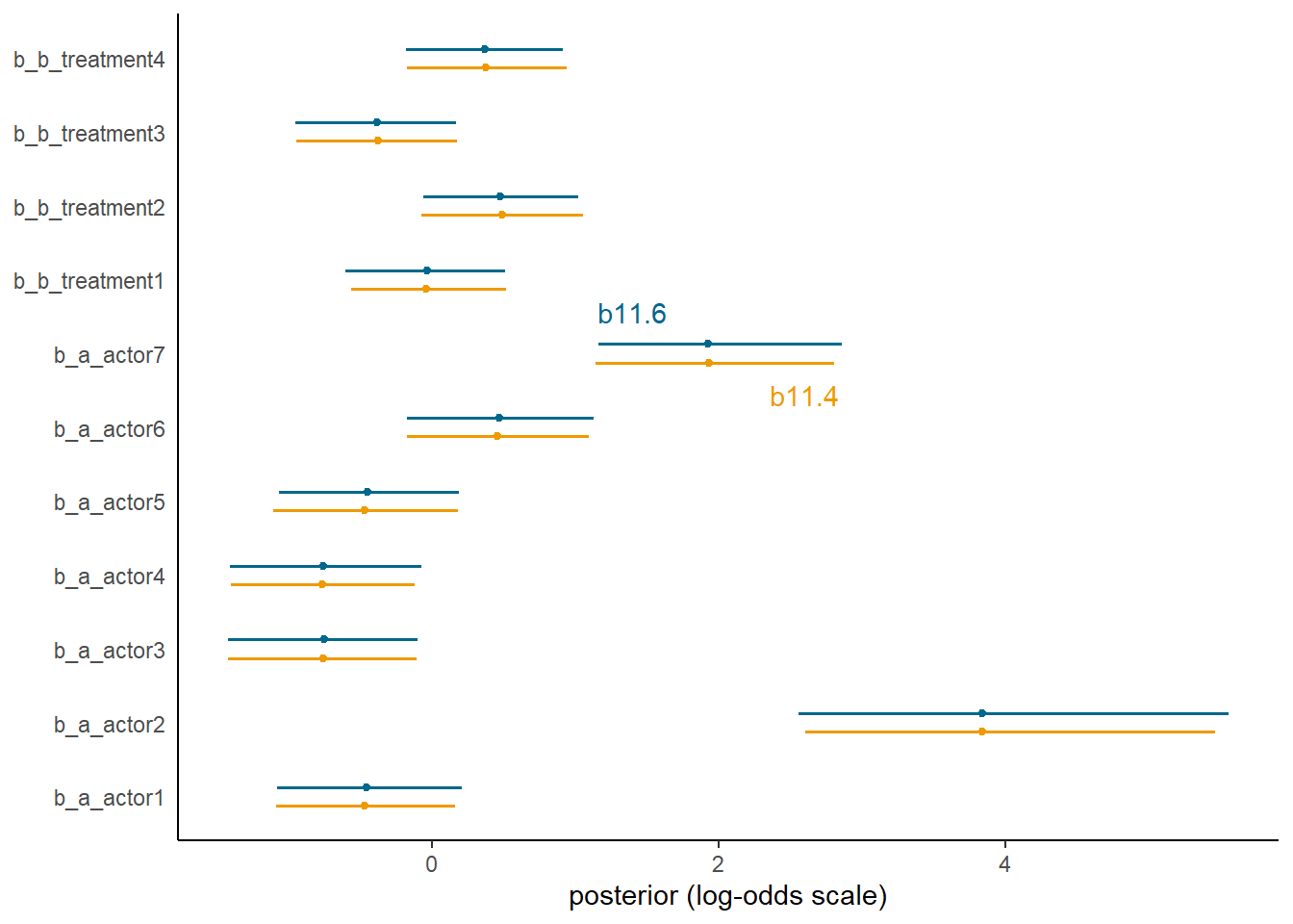
図11.9: b11.4とb11.6の比較
データ数が違うので、PSISやWAICを比べることはできない。
b11.6 <- add_criterion(b11.6, c("waic","loo"))loo_compare(b11.4, b11.6)また、今回のモデルでは\(pareto-k\)についてエラーメッセージが出ている。これはb11.6ではよりデータを集約しているため、LOOCVのときにより多くのデータ(今回は18個)を一度に抜いているようなものだからである。これにより、一部のデータがより影響力を持つようになってしまう。よって、PSISを計算するならば0/1のデータについてモデリングする方が望ましい。
11.2 Aggregated binomial: Graduate school admittions.
先ほどは毎回同じ試行回数(18)だったが、そうでない場合もある。以下では、UCバークレーの6つの研究科の入試における合否データを用いる。
data(UCBadmit)
d3 <- UCBadmit
str(d3)
## 'data.frame': 12 obs. of 5 variables:
## $ dept : Factor w/ 6 levels "A","B","C","D",..: 1 1 2 2 3 3 4 4 5 5 ...
## $ applicant.gender: Factor w/ 2 levels "female","male": 2 1 2 1 2 1 2 1 2 1 ...
## $ admit : int 512 89 353 17 120 202 138 131 53 94 ...
## $ reject : int 313 19 207 8 205 391 279 244 138 299 ...
## $ applications : int 825 108 560 25 325 593 417 375 191 393 ...性別によって合格率に差があるかを見たい。
\[
\begin{aligned}
A_{i} &\sim Binomial(N_{i}, p_{i})\\
logit(p_{i}) &= \alpha_{GID{i}}\\
\alpha_{j} &\sim Normal(0,1.5)
\end{aligned}
\]
モデルを回す。
d3 %>%
  mutate(gid = factor(applicant.gender, levels=c("male","female")),
         case = factor(1:n())) -> d3

b11.7 <- brm(data = d3,
      family = binomial,
      admit | trials(applications) ~ 0 + gid,
      prior= prior(normal(0, 1.5), class = b),
      seed = 11,
      backend = "cmdstanr",
      file = "output/Chapter11/b11.7")
男の方が合格率が高い。
posterior_summary(b11.7) %>%
  data.frame() %>%
  rownames_to_column(var = "parameters") %>%
  filter(parameters !="lp__") %>%
  kable(digits =2, caption = "モデルb11.7の結果",
        booktabs = TRUE) %>%
kable_styling(latex_options = "striped")| parameters | Estimate | Est.Error | Q2.5 | Q97.5 |
|---|---|---|---|---|
| b_gidmale | -0.22 | 0.04 | -0.30 | -0.14 |
| b_gidfemale | -0.83 | 0.05 | -0.93 | -0.73 |
| lprior | -2.81 | 0.02 | -2.85 | -2.78 |
対数オッズと確率の差の事後分布をみてみると、やはりどちらも男の方が高い。
posterior_samples(b11.7) %>%
  dplyr::select(-lp__) %>%
  mutate(diff_a = b_gidmale - b_gidfemale,
         diff_p = inv_logit_scaled(b_gidmale)-
                  inv_logit_scaled(b_gidfemale)) %>%
  pivot_longer(contains("diff")) %>%
  group_by(name) %>%
  mean_qi(value, .width=.89) %>%
  kable(digits =2, caption = "男女における対数オッズと確率の差",
        booktabs = TRUE) %>%
kable_styling(latex_options = "striped")| name | value | .lower | .upper | .width | .point | .interval |
|---|---|---|---|---|---|---|
| diff_a | 0.61 | 0.51 | 0.72 | 0.89 | mean | qi |
| diff_p | 0.14 | 0.12 | 0.16 | 0.89 | mean | qi |
モデルの結果を図示する。実際には2つの研究科でのみ男性の合格率が高くなく、モデルの推定結果はデータとかなりずれていることが分かる。
nd <- crossing(dept = c("A","B","C","D","E","F"),
               gid = factor(c("male","female"), levels = c("male","female"))) %>%
      mutate(applications = d3$applications)

fitted(b11.7, newdata = nd) %>%
  data.frame() %>%
  dplyr::select(-Est.Error) %>%
  set_names("ci_mean", "ci_l","ci_u") %>%
  bind_cols(nd) %>%
  mutate(case = 1:n()) -> fit11.7

text <-
  d3 %>%
  group_by(dept) %>%
  summarise(case  = mean(as.numeric(case)),
            admit = mean(admit / applications) + .05)

#plot
d3 %>%
  ggplot(aes(x=case))+
  geom_point(aes(y = admit/applications), color = "navy",
             shape=16)+
  geom_line(aes(y = admit/applications,group=dept),
            color = "navy", size=0.7)+
  geom_text(data = text,
            aes(y = admit, label = dept))+
  geom_pointinterval(data = fit11.7,
                     aes(y = ci_mean/applications,
                         ymin = ci_l/applications,
                         ymax = ci_u/applications),
                     shape = 1, size=4)+
  scale_y_continuous("Proportion admitted", limits = 0:1) +
  ggtitle("Posterior validation check") +
  theme(axis.ticks.x = element_blank())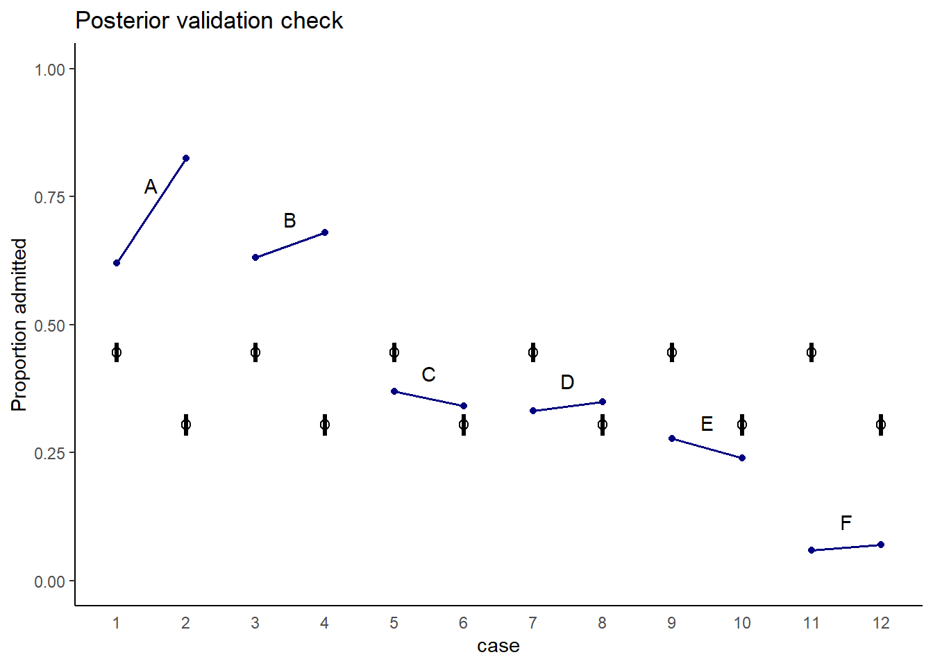
図11.10: 実測値とモデルb11.7による予測値。青が実測値、黒がモデルによる予測値を表す。
これは、研究科ごとに合格率に大きな違いがあり、女性は合格率の低い研究科に応募する割合が多いからである。
d3 %>%
  group_by(dept) %>%
  mutate(prop = applications/sum(applications)) %>%
  dplyr::select(dept, gid, prop) %>%
  pivot_wider(names_from = dept,
              values_from = prop) %>%
  kable(digits=2, caption="研究科ごとの応募者の男女比",
        booktabs = TRUE) %>%
kable_styling(latex_options = "striped")| gid | A | B | C | D | E | F |
|---|---|---|---|---|---|---|
| male | 0.88 | 0.96 | 0.35 | 0.53 | 0.33 | 0.52 |
| female | 0.12 | 0.04 | 0.65 | 0.47 | 0.67 | 0.48 |
そこで今度は、研究科による合格率の違いを考慮に入れたモデルを考える。
\[
\begin{aligned}
A_{i} &\sim Binomial(N_{i}, p_{i})\\
logit(p_{i}) &= \alpha_{GID{i}} + \delta_{DEPT_{i}}\\
\alpha_{j} &\sim Normal(0,1.5)\\
\delta_{j} &\sim Normal(0,1.5)
\end{aligned}
\]
b11.8 <- brm(data = d3,
      family = binomial,
      bf(admit | trials(applications) ~ 0 + a + d,
         a ~ 0 + gid,
         d ~ 0 + dept,
         nl = TRUE),
      prior= c(prior(normal(0, 1.5), nlpar = a),
               prior(normal(0, 1.5), nlpar = d)),
      seed = 11,iter = 4000, warmup=1000,
      backend = "cmdstanr",
      file = "output/Chapter11/b11.8")
結果を見てみると、男女で違いはないことが分かる。むしろ女性の方が少し合格率は高い。
posterior_summary(b11.8) %>%
  data.frame() %>%
  rownames_to_column(var = "parameters") %>%
  filter(parameters!="lp__") %>%
  kable(digits=2, caption="モデルb11.8の結果",
        booktabs = TRUE) %>%
kable_styling(latex_options = "striped")| parameters | Estimate | Est.Error | Q2.5 | Q97.5 |
|---|---|---|---|---|
| b_a_gidmale | -0.54 | 0.51 | -1.57 | 0.46 |
| b_a_gidfemale | -0.44 | 0.52 | -1.48 | 0.56 |
| b_d_deptA | 1.12 | 0.52 | 0.12 | 2.16 |
| b_d_deptB | 1.08 | 0.52 | 0.08 | 2.12 |
| b_d_deptC | -0.14 | 0.52 | -1.14 | 0.89 |
| b_d_deptD | -0.17 | 0.52 | -1.17 | 0.87 |
| b_d_deptE | -0.61 | 0.52 | -1.63 | 0.43 |
| b_d_deptF | -2.17 | 0.53 | -3.20 | -1.10 |
| lprior | -12.86 | 0.68 | -14.67 | -12.19 |
posterior_samples(b11.8) %>%
  mutate(diff_a = b_a_gidmale - b_a_gidfemale,
         diff_p = inv_logit_scaled(b_a_gidmale) -
           inv_logit_scaled(b_a_gidfemale)) %>%
  pivot_longer(contains("diff")) %>%
  group_by(name) %>%
  mean_qi(value, .width=.89) %>%
  kable(booktabs = TRUE) %>%
kable_styling(latex_options = "striped")| name | value | .lower | .upper | .width | .point | .interval |
|---|---|---|---|---|---|---|
| diff_a | -0.0975503 | -0.2277221 | 0.0324701 | 0.89 | mean | qi |
| diff_p | -0.0218389 | -0.0520788 | 0.0071217 | 0.89 | mean | qi |
おそらく、因果関係をグラフィカルモデルで表すと以下のようになる。
library(ggdag)

dag_coords <-
  tibble(name = c("G", "D", "A"),
         x    = c(1, 2, 3),
         y    = c(1, 2, 1))

dagify(D ~ G,
       A ~ D + G,
       coords = dag_coords) %>%

  ggplot(aes(x = x, y = y, xend = xend, yend = yend)) +
  geom_dag_text(color = "black") +
  geom_dag_edges(edge_color = "black") +
  scale_x_continuous(NULL, breaks = NULL) +
  scale_y_continuous(NULL, breaks = NULL) +
  theme_bw()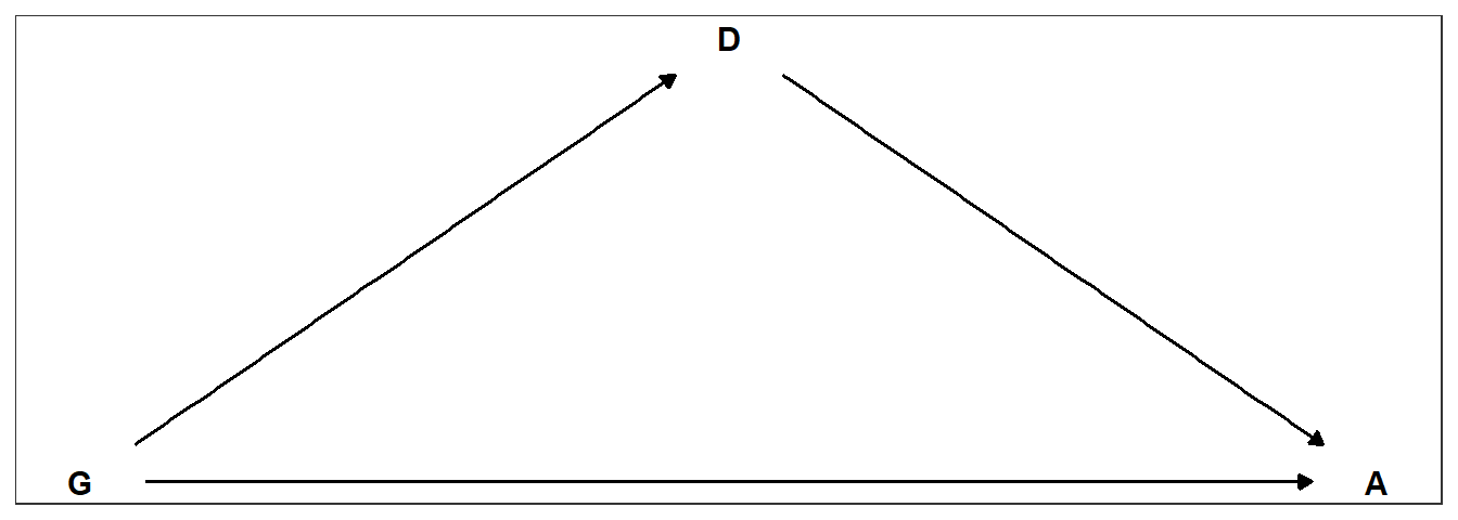
図11.11: 性別と研究科による合格率の違いについての因果関係。Gは性別、Dは研究科、Aは合格率を表す。
今度は実測値とモデルの予測値はよくあっていることが分かる。
fitted(b11.8, newdata = nd) %>%
  data.frame() %>%
  dplyr::select(-Est.Error) %>%
  set_names("ci_mean", "ci_l","ci_u") %>%
  bind_cols(nd) %>%
  mutate(case = 1:n()) -> fit11.8

#plot
d3 %>%
  ggplot(aes(x=case))+
  geom_point(aes(y = admit/applications), color = "navy",
             shape=16)+
  geom_line(aes(y = admit/applications,group=dept),
            color = "navy", size=0.7)+
  geom_text(data = text,
            aes(y = admit, label = dept))+
  geom_pointinterval(data = fit11.8,
                     aes(y = ci_mean/applications,
                         ymin = ci_l/applications,
                         ymax = ci_u/applications),
                     color = "lightblue",
                     shape = 1, size=5, alpha = 2/3)+
  scale_y_continuous("Proportion admitted", limits = 0:1) +
  ggtitle("Posterior validation check") +
  theme(axis.ticks.x = element_blank())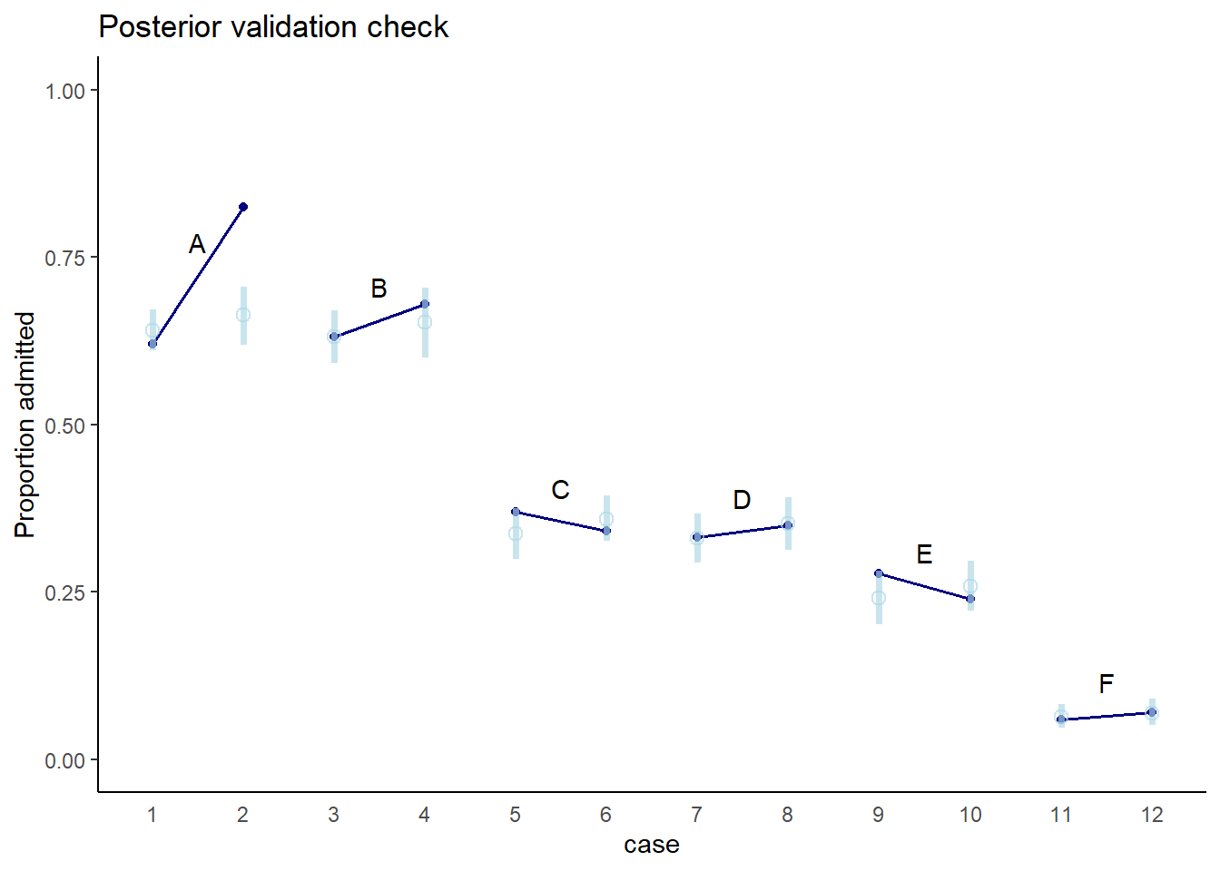
図11.12: 実測値とモデルによる予測値。青が実測値、水色がモデルによる予測値を表す。
しかし、これで性別が合格率に与える効果を正確に評価できたかは分からない。未観測の要因が関わっている可能性があるからである。例えば、もし共通の要因が研究科の選択と合格率の両方に影響を与えているとき(cf. 図11.13)、研究科で条件づけてしまうと性別と合格率の間に因果関係ではないパスが生じてしまう。
dag_coords <-
  tibble(name = c("G", "D", "A", "U"),
         x    = c(1, 2, 3, 3),
         y    = c(1, 2, 1, 2))

dagify(D ~ G + U,
       A ~ D + G + U,
       coords = dag_coords) %>%

  ggplot(aes(x = x, y = y, xend = xend, yend = yend)) +
  geom_point(x = 3, y = 2,
             size = 5, color = "orange") +
  geom_dag_text(color = "black") +
  geom_dag_edges(edge_color = "black") +
  scale_x_continuous(NULL, breaks = NULL) +
  scale_y_continuous(NULL, breaks = NULL) +
  theme_bw()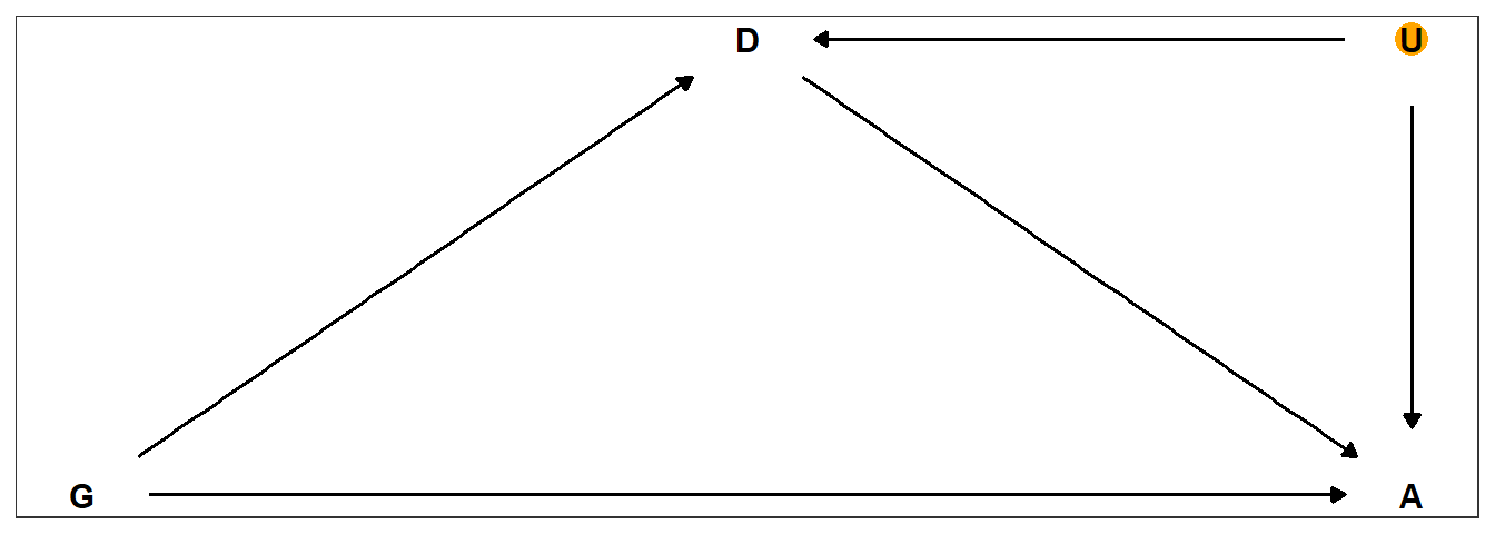
図11.13: 性別と研究科による合格率の違いについての因果関係。Gは性別、Dは研究科、Aは合格率を表す。
’b11.8’はover-parametalizedである(どちらかの性別をベースラインにしても同じ推定結果は得られる)。しかし、この方法は一方の性だけに事前分布が適用されることを防ぐことができるという利点がある。一方でパラメータ間の相関は強くなるので、それに注意が必要である。
11.3 Poisson regression
二項分布はnが大きく、pが小さいときに平均と分散が同じ値に収束する。例えば\(n=100000\)、\(p=0.001\)とときを考える。
n <- 1e5
p <- 1e-3

y <- rbinom(n,1000,p)
c(mean(y),var(y))
## [1] 1.001700 1.003667このようなとき、二項分布はポワソン分布に近づくことが知られており、試行回数Nが未知であったり大きいと考えられるときに有用である。ポワソン回帰では、通常log関数がリンク関数に用いられる。
11.3.1 Oceanic tool complexity
オセアニアにおける道具の地域差を調べる。理論的には、人口の多い地域の方が複雑な道具が開発されていると予想される。また集団間の交流が盛んなほど人口が多く、技術的進化が起こりやすいと予想される。Kline and Boyd (2010) のデータを分析していく。
data(Kline)
d4 <- Kline
kable(d4, caption = "オセアニアにおける道具数の地域差",
      booktabs = TRUE) %>%
kable_styling(latex_options = "striped")| culture | population | contact | total_tools | mean_TU |
|---|---|---|---|---|
| Malekula | 1100 | low | 13 | 3.2 |
| Tikopia | 1500 | low | 22 | 4.7 |
| Santa Cruz | 3600 | low | 24 | 4.0 |
| Yap | 4791 | high | 43 | 5.0 |
| Lau Fiji | 7400 | high | 33 | 5.0 |
| Trobriand | 8000 | high | 19 | 4.0 |
| Chuuk | 9200 | high | 40 | 3.8 |
| Manus | 13000 | low | 28 | 6.6 |
| Tonga | 17500 | high | 55 | 5.4 |
| Hawaii | 275000 | low | 71 | 6.6 |
# 変数変換
d4 %>%
  mutate(P = standardize(log(population)),
         cid = contact) -> d4
考えるのは人口と他地域との交流の交互作用を考えた以下のモデルである。
\[
\begin{aligned}
T_{i} &\sim Poisson(\lambda_{i})\\
log \lambda_{i} &= \alpha_{CID_{[i]}} + \beta_{CID_{[i]}} logP_{i}\\
\alpha_{j} &\sim to\ be\ determined\\
\beta_{j} &\sim to\ be\ determined\\
\end{aligned}
\]
どのような事前分布が適切だろうか。まず、切片のみのモデルを考え、切片の事前分布を平均0、標準偏差10の正規分布と平均3、あるいは標準偏差0.5の正規分布とする。
\(Normal(0,10)\)のとき、事前分布は0に集まっており、右に裾が長いことが分かる。これは明らかに不適当である。一方、\(Normal(3,0.5)\)はある程度広い範囲に広がっていることが分かる。
tibble(x       = c(3, 22),
       y       = c(0.055, 0.04),
       meanlog = c(0, 3),
       sdlog   = c(10, 0.5)) %>%
  tidyr::expand(nesting(x, y, meanlog, sdlog),
         number = seq(from = 0, to = 100, length.out = 200)) %>%
  mutate(density = dlnorm(number, meanlog, sdlog),
         group   = str_c("alpha%~%Normal(", meanlog, ", ", sdlog, ")")) %>%

  ggplot(aes(fill = group, color = group)) +
  geom_area(aes(x = number, y = density),
            alpha = 3/4, size = 0, position = "identity") +
  geom_text(data = . %>% group_by(group) %>% slice(1),
            aes(x = x, y = y, label = group),
            parse = TRUE,  hjust = 0) +
  scale_fill_manual(values = c("grey", "orange")) +
  scale_color_manual(values = c("grey", "orange")) +
  scale_y_continuous(NULL, breaks = NULL) +
  xlab("mean number of tools") +
  theme(legend.position = "none")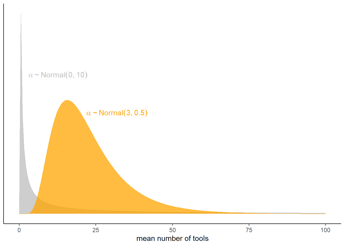
図11.14: 切片の事前分布の比較。
それでは、\(\beta\)の事前分布はどうすればよいだろうか。\(Normal(0,10\)と\(Normal(0,0.2)\)の場合を考える。\(Normal(0,10)\)のときには\(log(P)\)が0付近のときに道具数が極端に大きくなっていることが分かり、明らかに不適切。一方で\(Normal(0,0.2)\)のときはうまく様々な傾きを表現できている。
n <- 100
set.seed(123)

tibble(i = 1:n,
       a = rnorm(n, mean = 3, sd = 0.5)) %>%
  mutate(`beta%~%Normal(0*', '*10)`  = rnorm(n, mean = 0 , sd = 10),
         `beta%~%Normal(0*', '*0.2)` = rnorm(n, mean = 0 , sd = 0.2)) %>%
  pivot_longer(contains("beta"),
               values_to = "b",
               names_to = "prior") %>%
  tidyr::expand(nesting(i, a, b, prior),
         x = seq(from = -2, to = 2, length.out = 100)) %>%
 ggplot(aes(x = x, y = exp(a + b * x), group = i)) +
  geom_line(size = 1/4, alpha = 2/3,
            color = "black") +
  labs(x = "log population (std)",
       y = "total tools") +
  coord_cartesian(ylim = c(0, 100)) +
  facet_wrap(~ prior, labeller = label_parsed)+
  theme(strip.background = element_blank())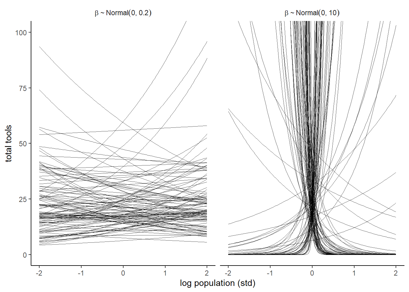
図11.15: 異なる標準偏差を持つbetaの事前予測分布。
\(Normal(0,0.2)\)を標準化する前のスケールとさらにlogを外したときのスケールで見てみる。一部極端な曲線はあるものの、概ねいい感じの範囲に収まっているといえる。
set.seed(11)

prior <-
  tibble(i = 1:n,
         a = rnorm(n, mean = 3, sd = 0.5),
         b = rnorm(n, mean = 0, sd = 0.2)) %>%
  tidyr::expand(nesting(i, a, b),
         x = seq(from = log(100), to = log(200000), length.out = 100))

# left
p3 <-
  prior %>%
  ggplot(aes(x = x, y = exp(a + b * x), group = i)) +
  geom_line(size = 1/4, alpha = 2/3,
            color = "black")+
  labs(subtitle = expression(beta%~%Normal(0*', '*0.2)),
       x = "log population",
       y = "total tools") +
  coord_cartesian(xlim = c(log(100), log(200000)),
                  ylim = c(0, 500))

p4 <-
  prior %>%
  ggplot(aes(x = exp(x), y = exp(a + b * x), group = i)) +
  geom_line(size = 1/4, alpha = 2/3,
            color = "black") +
  labs(subtitle = expression(beta%~%Normal(0*', '*0.2)),
       x = "population",
       y = "total tools") +
  coord_cartesian(xlim = c(100, 200000),
                  ylim = c(0, 500))

p3|p4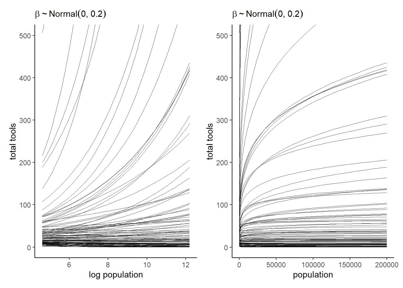
図11.16: 人口をもとのスケールに戻すと…
それでは、\(\alpha \sim Normal(3,0.5)\)、\(\beta \sim Normal(0,0.2)\)でモデルを回す。切片だけのモデルも一緒に回す。
b11.9 <- brm(
  data = d4,
  family = poisson,
  formula = total_tools ~ 1,
  prior = prior(normal(3, 0.5), class=Intercept),
  seed=8,
  backend = "cmdstanr",
  file = "output/Chapter11/b11.9"
)

b11.10 <- brm(
  data = d4,
  family = poisson,
  formula = bf(total_tools ~ 0 + a + b * P,
         a ~ 0 + cid,
         b ~ 0 + cid,
         nl = TRUE),
  prior = c(prior(normal(3, 0.5), nlpar=a),
            prior(normal(0, 0.2), nlpar=b)),
  seed=8,
  backend = "cmdstanr",
  file = "output/Chapter11/b11.10"
)両モデルを比較してみる。どちらもpareto-kの警告が出ていることに注意。当然ながらb11.10のほうがPSISが小さい。
b11.9 <- add_criterion(b11.9, "loo")
b11.10 <- add_criterion(b11.10, "loo")

loo_compare(b11.9, b11.10) %>%
  print(simplify = FALSE)
## elpd_diff se_diff elpd_loo se_elpd_loo p_loo se_p_loo looic se_looic
## b11.10 0.0 0.0 -42.4 6.6 6.7 2.6 84.8 13.1
## b11.9 -28.7 17.1 -71.1 17.2 8.6 3.9 142.3 34.4モデルb11.10では1点でpareto-kが0.7以上になっているようだ。
loo(b11.10) %>%
  pareto_k_table() %>%
  kable(caption = "モデルb11.10のpareto-k診断結果",
        booktabs = TRUE) %>%
kable_styling(latex_options = "striped")| Count | Proportion | Min. n_eff | |
|---|---|---|---|
| (-Inf, 0.5] | 6 | 0.6 | 1335.03581 |
| (0.5, 0.7] | 3 | 0.3 | 163.06339 |
| (0.7, 1] | 1 | 0.1 | 52.69866 |
| (1, Inf) | 0 | 0.0 | NA |
もっと詳しく見てみると、ハワイが大きな影響を与えていることが分かる。
tibble(culture = d4$culture,
       k       = b11.10$criteria$loo$diagnostics$pareto_k) %>%
  arrange(desc(k)) %>%
  mutate_if(is.double, round, digits = 2) %>%
  kable(caption = "それぞれの地域のpareto-k",
        booktabs = TRUE) %>%
kable_styling(latex_options = "striped")| culture | k |
|---|---|
| Tonga | 0.77 |
| Hawaii | 0.70 |
| Yap | 0.61 |
| Trobriand | 0.55 |
| Malekula | 0.49 |
| Tikopia | 0.37 |
| Lau Fiji | 0.31 |
| Chuuk | 0.27 |
| Santa Cruz | 0.26 |
| Manus | 0.16 |
それでは、pareto-kの値と共に結果を図示する。
cultures <- c("Hawaii", "Tonga", "Trobriand", "Yap")

nd <- crossing(cid = c("low","high"),
               P = seq(-1.5, 2.5, length.out=100))

fit11.10 <- fitted(b11.10, newdata = nd) %>%
  data.frame() %>%
  bind_cols(nd)

## 標準化したスケール
p5 <-
  fit11.10 %>%
  ggplot(aes(x = P, group = cid))+
  geom_smooth(aes(y = Estimate, ymin = Q2.5,
                  ymax = Q97.5,
                  linetype = cid,
                  fill = cid,
                  color = cid),
              stat = "identity",
              size=1.5, alpha=1/2)+
  geom_point(data = bind_cols(d4, b11.10$criteria$loo$diagnostics),
             aes(y = total_tools, size = pareto_k,
                 color = cid),stroke = 1.5)+
  scale_shape_manual(values = c(16,1))+
  scale_color_manual(values = c("lightblue3","orange3"))+
  scale_fill_manual(values = c("lightblue", "orange"))+
  geom_text_repel(data = bind_cols(d4, b11.10$criteria$loo$diagnostics) %>%
                    filter(culture %in% cultures) %>%
                    mutate(label = str_c(culture, " (", round(pareto_k,2), ")")),
                  aes(y = total_tools, label = label),
                  size=3, seed=11,color="black")+
  labs(x = "log population (std)",
       y = "total tools") +
  coord_cartesian(xlim = range(b11.10$data$P),
                  ylim = c(0, 80))+
  theme(legend.position = "none",
        aspect.ratio=1,
        axis.title = element_text(family ="Japan1GothicBBB"))

## もともとのスケールに戻す。
p6 <- fit11.10 %>%
  mutate(population = exp(P*sd(log(d4$population))+mean(log(d4$population)))) %>%
  ggplot(aes(x = population, group = cid))+
  geom_smooth(aes(y = Estimate, ymin = Q2.5,
                  ymax = Q97.5,
                  linetype = cid,
                  fill = cid,
                  color = cid),
              stat = "identity",
              size=1.5, alpha=1/2)+
  geom_point(data = bind_cols(d4, b11.10$criteria$loo$diagnostics),
             aes(y = total_tools, size = pareto_k,
                 color = cid),stroke = 1.5,alpha=1/2)+
  scale_shape_manual(values = c(16,1))+
  scale_color_manual(values = c("lightblue3","orange3"))+
  scale_fill_manual(values = c("lightblue", "orange"))+
  scale_x_continuous(breaks = seq(0,250000,by=50000))+
  coord_cartesian(xlim = c(0,270000),
                  ylim = c(0, 80))+
  theme(legend.position = "none",
        aspect.ratio=1,
        axis.title = element_text(family ="Japan1GothicBBB"))

p5+p6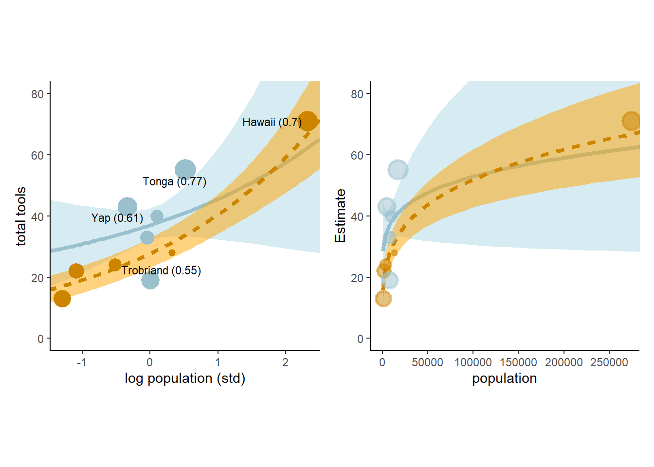
図11.17: オセアニア諸国の道具数に関するモデルb11.10の事後分布を用いた予測。水色は周辺諸国との交流頻度が高かった国を、オレンジは低かった国を表す。また、点の大きさはpareto-kの値を表す。
このモデルの予測値に従うと、他国との接触が多かった国は人口が多くなると、接触が少なかった国よりも道具数が少ないことになる。しかし、これはおかしな現象である。これが生じるのは、モデルが切片を自由なパラメータとしたからである。本来ならば人口が0ならば道具数も0でなければいけないが、b11.10はそのような制約を設けていない。
それでは、改良したモデルを考えてみよう。人口が増えるほど道具数も増えるが、その変化量は徐々に減っていくと考える。また、道具の数が多いほど新たに発明される道具の数も減ると考えられる。そこで、単位時間当たりの道具数の変化を以下のように定義する。なお、\(P\)は人口を、\(T\)は道具数を表す。
\[
\Delta T = \alpha P^B - \gamma T
\]
\(\Delta T\)が0になるとき、\(T = \frac{\alpha P^\beta}{\gamma}\)であることを利用し、以下のモデルを考える。
ここで、\(\alpha\)と\(\beta\)はCIDによって変化すると考える。
また、事後分布が正に限定されるよう、\(\alpha\)については指数をとった。
\[
\begin{aligned}
T_{i} &\sim Poisson(\lambda_{i})\\
\lambda_{i} &= exp(\alpha) P_{i}^\beta/\gamma
\end{aligned}
\]
brmsで実装する。
b11.11 <-
  brm(data = d4,
      family = poisson(link = "identity"),
      bf(total_tools ~ exp(a) * population^b / g,
         a + b ~ 0 + cid,
         g ~ 1,
         nl = TRUE),
      prior = c(prior(normal(1, 1), nlpar = a),
                prior(exponential(1), nlpar = b, lb = 0),
                prior(exponential(1), nlpar = g, lb = 0)),
      iter = 2000, warmup = 1000, chains = 4, cores = 4,
      seed = 11,
      control = list(adapt_delta = .95),
      backend = "cmdstanr",
      file = "output/Chapter11/b11.11")
結果とPSISを確認する。先ほどのモデルと大きくは変わらないがより妥当なモデルになっている。
b11.11 <- add_criterion(b11.11, criterion = "loo", moment_match = T)

loo_compare(b11.10, b11.11) %>%
  print(simplify = FALSE)
## elpd_diff se_diff elpd_loo se_elpd_loo p_loo se_p_loo looic se_looic
## b11.11 0.0 0.0 -40.7 6.0 5.3 1.9 81.3 11.9
## b11.10 -1.7 2.8 -42.4 6.6 6.7 2.6 84.8 13.1最後に結果を図示する。今度は(0,0)を通っていることに加えて、逆転は生じていない。
text <-
  distinct(d4, cid) %>%
  mutate(population  = c(210000, 72500),
         total_tools = c(59, 68),
         label       = str_c(cid, " contact"))

# redifine the new data
nd <-
  distinct(d4, cid) %>%
  tidyr::expand(cid,
         population = seq(from = 0, to = 300000, length.out = 100))

# compute the poster predictions for lambda
fitted(b11.11,
       newdata = nd,
       probs = c(.055, .945)) %>%
  data.frame() %>%
  bind_cols(nd) %>%
  ggplot(aes(x = population, group = cid))+
  geom_smooth(aes(y = Estimate, ymin = Q5.5,
                  ymax = Q94.5,
                  linetype = cid,
                  fill = cid,
                  color = cid),
              stat = "identity",
              size=1.5, alpha=1/2)+
  geom_point(data = bind_cols(d4, b11.11$criteria$loo$diagnostics),
             aes(y = total_tools, size = pareto_k,
                 color = cid),stroke = 1.5,
             alpha = 1/2)+
  scale_shape_manual(values = c(16,1))+
  scale_color_manual(values = c("lightblue3","orange3"))+
  scale_fill_manual(values = c("lightblue", "orange"))+
  scale_x_continuous(breaks = seq(0,250000,by=50000))+
  coord_cartesian(xlim = c(0,250000),
                  ylim = c(0, 80))+
  theme(legend.position = "none",
        aspect.ratio=1)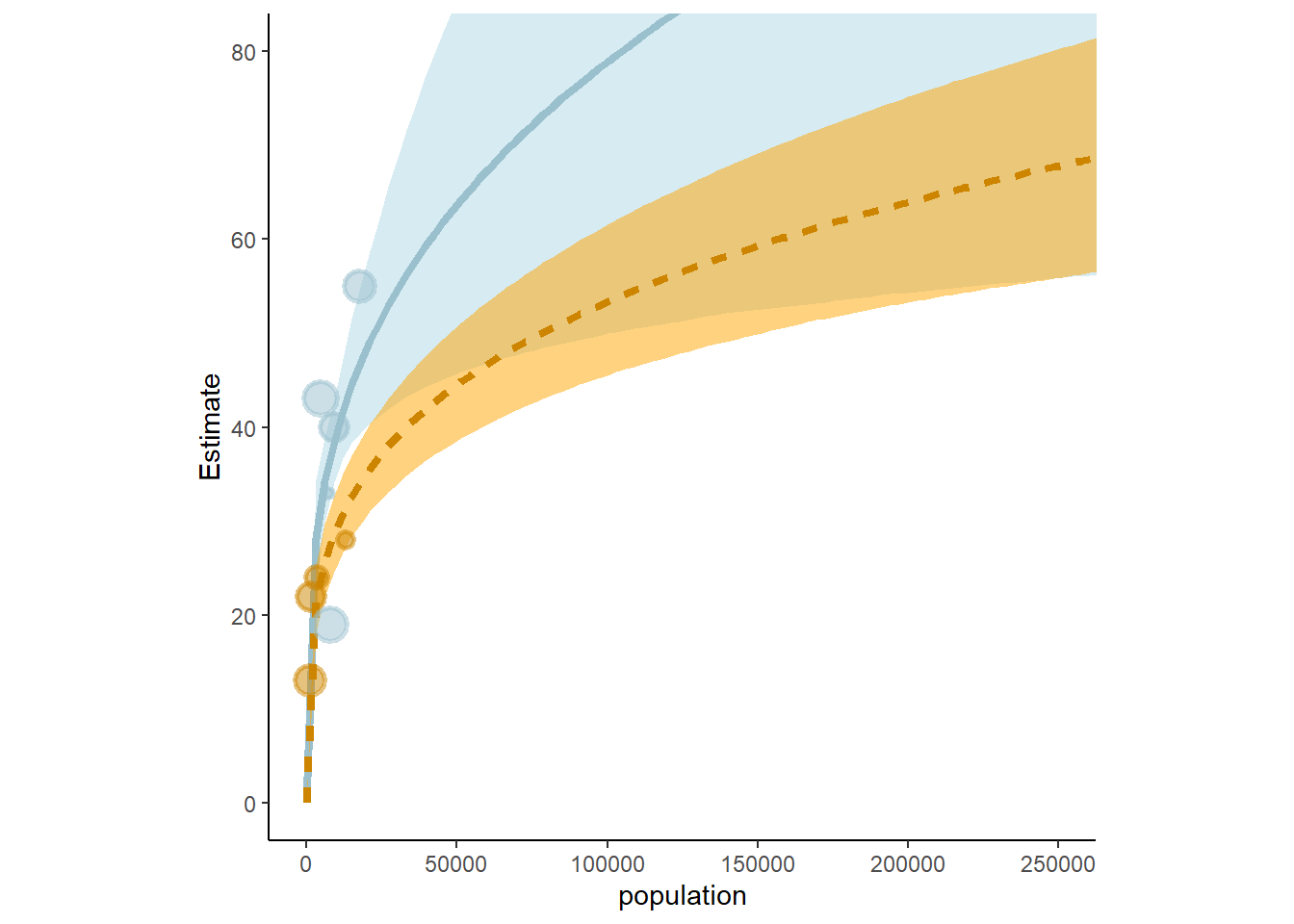
図11.18: オセアニア諸国の道具数に関するモデルb11.11の事後分布を用いた予測。水色は周辺諸国との交流頻度が高かった国を、オレンジは低かった国を表す。また、点の大きさはpareto-kの値を表す。
11.3.2 Negative binomial (Gamma-Poisson) models.
ポワソン回帰では、ときどき過分散が生じることがありうる。このとき、負の二項分布(またはガンマポワソン分布)を用いるとうまくいくことがある。負の二項分布は異なるポワソン分布を混合したものである。
11.3.3 Example: Exposure and the offset
オフセット項を用いることで割合データを扱うことができる。
例として、\(\lambda\)がある事象の回数\(\mu\)を時間または距離\(\tau\)で割った値だとする。
\[
\begin{aligned}
y_{i} &\sim Poisoon(\lambda_{i})\\
log \lambda_{i} &= log \frac{\mu_{i}}{\tau_{i}}= \alpha + \beta x_{i}
\end{aligned}
\]
このとき、以下のように書くことができる。
\[
\begin{aligned}
y_{i} &\sim Poisoon(\mu_{i})\\
log \mu_{i} &= log \tau_{i} + \alpha + \beta x_{i}
\end{aligned}
\]
もちろん\(log\tau_{i}\)にパラメータを書けることもできる。 教科書のシミュレーションデータに対してこのモデルを回してみる。2つの修道院があり、それぞれ何かの製品を作っているのだが、修道院Aでは1日当たりの製造個数を記録している一方で、修道院Bでは1週間当たりの製造個数しか記録していない。このとき、オフセット項を用いることでそれぞれの修道院の製造効率に違いがあるかを検討する。
set.seed(11)

## 修道院A架空データ
num_days <- 70
y        <- rpois(num_days, lambda = 1.5)

##修道院B架空データ
num_weeks <- 10
y_new     <- rpois(num_weeks, lambda = 0.5 * 7)

(
  d5 <-
  tibble(y  = c(y, y_new),
         days= rep(c(1, 7), times = c(num_days, num_weeks)),
         monastery = rep(c("A","B"),
                         times = c(num_days, num_weeks)))%>%
  mutate(log_days = log(days))
)
## # A tibble: 80 × 4
## y days monastery log_days
## <int> <dbl> <chr> <dbl>
## 1 1 1 A 0
## 2 0 1 A 0
## 3 1 1 A 0
## 4 0 1 A 0
## 5 0 1 A 0
## 6 4 1 A 0
## 7 0 1 A 0
## 8 1 1 A 0
## 9 3 1 A 0
## 10 0 1 A 0
## # … with 70 more rowsモデルを回してみる。
b11.12 <-
  brm(data = d5,
      family = poisson,
      y ~ 1 + offset(log_days) + monastery,
      prior = c(prior(normal(0, 1), class = Intercept),
                prior(normal(0, 1), class = b)),
      iter = 2000, warmup = 1000, cores = 4, chains = 4,
      seed = 11,
      backend = "cmdstanr",
      file = "output/Chapter11/b11.12")
それぞれ修道院Aと修道院Bの製造速度を比較すると…。 真の\(\lambda\)(1.5と0.5)とは違っているものの、推定はできた。
posterior_samples(b11.12) %>%
  mutate(lambda_A = exp(b_Intercept),
         lambda_B = exp(b_Intercept + b_monasteryB)) %>%
  pivot_longer(contains("lambda")) %>%
  group_by(name) %>%
  mean_qi(value) %>%
  kable(digits=2,booktabs = TRUE) %>%
kable_styling(latex_options = "striped")| name | value | .lower | .upper | .width | .point | .interval |
|---|---|---|---|---|---|---|
| lambda_A | 1.08 | 0.84 | 1.32 | 0.95 | mean | qi |
| lambda_B | 0.47 | 0.32 | 0.64 | 0.95 | mean | qi |
11.4 Multinomial and categorical models
3つ以上の事象が起きうるとき、最大エントロピー分布は多項分布になる。多項分布のリンク関数にはソフトマックス関数(長さKのベクトルを各要素が(0,1)の範囲をとり、合計1で長さKのベクトルに変換する関数)を使用することが多い。ソフトマックス関数は以下の式の通り。なお、\(s_{1} \ldots s_{K}\)は各事象に対応する長さ\(k\)のベクトル\(scores\)を表す。
ある事象Kが生じる確率は、
\[
Pr(k|s_{1},s_{2},s_{3},\ldots, s_{K}) = \frac{exp(s_{k})}{\sum_{i=1}^K exp(s_{i})}
\]
多項回帰では、K種類の事象があるとき、K-1個の線形モデルを作成する。それぞれのモデルで用いる説明変数やパラメータは必ずしも同じでなくてよい。
多項ロジスティック回帰には大きく分けて二つの場合がある。
11.4.1 Predictors matched to outcomes
若者が職業を選択する際に期待される収入が影響しているかを調べたい。このとき、それぞれのモデルで共通のパラメータ\(\beta_{INCOME}\)が用いられるが、それぞれのモデルで異なる説明変数の値(ここでは収入)がパラメータにかけられる。
ここでは、3つの職業の選択に関するシミュレーションデータを用いる。ここでは、収入に0.5をかけた値をscoreとし、scoreの値をsoftmax関数に与えることによって各カテゴリーの職業が選ばれる確率が得られるものとする。職業ごとに収入は決まっている。
n      <- 500           # number of individuals
income <- c(1, 2, 5)    # expected income of each career
score  <- 0.5 * income  # scores for each career, based on income

# next line converts scores to probabilities
p <- softmax(score[1], score[2], score[3])

# now simulate choice
# outcome career holds event type values, not counts
career <- rep(NA, n)  # empty vector of choices for each individual

# sample chosen career for each individual
set.seed(34302)
# sample chosen career for each individual
for(i in 1:n) career[i] <- sample(1:3, size = 1, prob = p)シミュレーションによって各職業が選ばれた回数は図11.19の通り。
d6 <-
  tibble(career = career) %>%
  mutate(career_income = ifelse(career ==3,5,career))

d6 %>%
  ggplot(aes(x=career))+
  geom_bar(size=0, fill="orange2")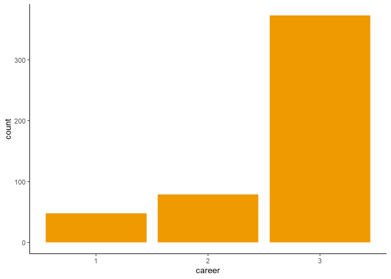
図11.19: シミュレーションデータで各職業が選ばれた回
それでは、モデリングを行う。まずは切片だけのモデルを交わしてみる。brmsでは、refcatで基準とするカテゴリーを指定する(しなければ最初のカテゴリーが0になる)。
b11.13io <- brm(data = d6,
      family = categorical(link = logit, refcat = 3),
      career ~ 1,
      prior = c(prior(normal(0, 1),
                      class = Intercept, dpar = mu1),
                prior(normal(0, 1),
                      class = Intercept, dpar = mu2)),
      iter = 2000, warmup = 1000, cores = 4, chains = 4,
      seed = 11,
      backend = "cmdstanr",
      file = "output/Chapter11/b11.13io")
基準にした3以外のカテゴリーのパラメータが結果として出力される(‘mu1’,‘mu2’)。
posterior_summary(b11.13io) %>%
  data.frame() %>%
  rownames_to_column(var = "parameter") %>%
  filter(parameter != "lp__") %>%
  kable(digits=2, caption = "b11.13ioの結果",
        booktabs = TRUE) %>%
kable_styling(latex_options = "striped")| parameter | Estimate | Est.Error | Q2.5 | Q97.5 |
|---|---|---|---|---|
| b_mu1_Intercept | -2.01 | 0.15 | -2.32 | -1.73 |
| b_mu2_Intercept | -1.53 | 0.12 | -1.78 | -1.29 |
| lprior | -5.05 | 0.38 | -5.82 | -4.36 |
’mu1’と’mu2’はそれぞれ-2と-1.5だが、これは3つめのカテゴリーのscoreを0にしたときの、1つめと2つめのカテゴリーのscoreの値に一致する。つまり、モデルの推定結果の’mu1’と’mu2’はscoreの値を返している。
tibble(income = c(1, 2, 5)) %>%
  mutate(score = 0.5 * income) %>%
  mutate(rescaled_score = score - 2.5) %>%
  kable(caption = "元データのscore",
        booktabs = TRUE) %>%
kable_styling(latex_options = "striped")| income | score | rescaled_score |
|---|---|---|
| 1 | 0.5 | -2.0 |
| 2 | 1.0 | -1.5 |
| 5 | 2.5 | 0.0 |
実際の確率はこれらをsoftmax関数に入れれば得られるので、モデルによって推定された確率は以下のように求められる。
posterior_samples(b11.13io) %>%
  mutate(b_mu3_Intercept = 0) %>%
  mutate(p1 = exp(b_mu1_Intercept) / (exp(b_mu1_Intercept) + exp(b_mu2_Intercept) + exp(b_mu3_Intercept)),
         p2 = exp(b_mu2_Intercept) / (exp(b_mu1_Intercept) + exp(b_mu2_Intercept) + exp(b_mu3_Intercept)),
         p3 = exp(b_mu3_Intercept) / (exp(b_mu1_Intercept) + exp(b_mu2_Intercept) + exp(b_mu3_Intercept))) %>%
  pivot_longer(p1:p3) %>%
  group_by(name) %>%
  mean_qi(value) %>%
  mutate_if(is.double, round, digits = 2) %>%
  kable(caption = "モデルb11.13ioによって推定された各職業が選ばれる確率",
        booktabs = TRUE) %>%
kable_styling(latex_options = "striped")| name | value | .lower | .upper | .width | .point | .interval |
|---|---|---|---|---|---|---|
| p1 | 0.10 | 0.08 | 0.13 | 0.95 | mean | qi |
| p2 | 0.16 | 0.13 | 0.19 | 0.95 | mean | qi |
| p3 | 0.74 | 0.70 | 0.78 | 0.95 | mean | qi |
これは、シミュレーションに使用した真の値とよく一致している。
tibble(income = c(1,2,5)) %>%
  mutate(score =0.5*income) %>%
  mutate(p = exp(score)/sum(exp(score)))
## # A tibble: 3 × 3
## income score p
## <dbl> <dbl> <dbl>
## 1 1 0.5 0.0996
## 2 2 1 0.164
## 3 5 2.5 0.736それでは、収入を説明変数に入れたモデルを回してみる。収入にかかる係数を職業ごとに変えるか、パラメータの範囲に制限を設けるかによって4種類のモデルが考えられる。
crossing(b  = factor(c("b1 & b2", "b"), levels = c("b1 & b2", "b")),
         lb = factor(c("NA", 0), levels = c("NA", 0))) %>%
  mutate(fit = str_c("b11.13", letters[1:n()])) %>%
  dplyr::select(fit, everything()) %>%
  kable(booktabs = TRUE) %>%
kable_styling(latex_options = "stripe")| fit | b | lb |
|---|---|---|
| b11.13a | b1 & b2 | NA |
| b11.13b | b1 & b2 | 0 |
| b11.13c | b | NA |
| b11.13d | b | 0 |
それでは、4つモデルを回す。
b11.13a <-
  brm(data = d6,
      family = categorical(link = logit, refcat = 3),
      bf(career ~ 1,
         nlf(mu1 ~ a1 + b1 * 1),
         nlf(mu2 ~ a2 + b2 * 2),
         a1 + a2 + b1 + b2 ~ 1),
      prior = c(prior(normal(0, 1), class = b, nlpar = a1),
                prior(normal(0, 1), class = b, nlpar = a2),
                prior(normal(0, 0.5), class = b,
                      nlpar = b1),
                prior(normal(0, 0.5), class = b,
                      nlpar = b2)),
      iter = 2000, warmup = 1000, cores = 4, chains = 4,
      seed = 11,
      backend = "cmdstanr",
      file = "output/Chapter11/b11.13a")


b11.13b <-
  brm(data = d6,
      family = categorical(link = logit, refcat = 3),
      bf(career ~ 1,
         nlf(mu1 ~ a1 + b1 * 1),
         nlf(mu2 ~ a2 + b2 * 2),
         a1 + a2 + b1 + b2 ~ 1),
      prior = c(prior(normal(0, 1), class = b, nlpar = a1),
                prior(normal(0, 1), class = b, nlpar = a2),
                prior(normal(0, 0.5), class = b,
                      nlpar = b1, lb = 0),
                prior(normal(0, 0.5), class = b,
                      nlpar = b2, lb = 0)),
      iter = 2000, warmup = 1000, cores = 4, chains = 4,
      seed = 11,
      control = list(adapt_delta = .99),
      backend = "cmdstanr",
      file = "output/Chapter11/b11.13b")

b11.13c <-
  brm(data = d6,
      family = categorical(link = logit, refcat = 3),
      bf(career ~ 1,
         nlf(mu1 ~ a1 + b * 1),
         nlf(mu2 ~ a2 + b * 2),
         a1 + a2 + b ~ 1),
      prior = c(prior(normal(0, 1), class = b, nlpar = a1),
                prior(normal(0, 1), class = b, nlpar = a2),
                prior(normal(0, 0.5), class = b, nlpar = b)),
      iter = 2000, warmup = 1000, cores = 4, chains = 4,
      seed = 11,
      backend = "cmdstanr",
      file = "output/Chapter11/b11.13c")

b11.13d <-
  brm(data = d6,
      family = categorical(link = logit, refcat = 3),
      bf(career ~ 1,
         nlf(mu1 ~ a1 + b * 1),
         nlf(mu2 ~ a2 + b * 2),
         a1 + a2 + b ~ 1),
      prior = c(prior(normal(0, 1), class = b, nlpar = a1),
                prior(normal(0, 1), class = b, nlpar = a2),
                prior(normal(0, 0.5), class = b, nlpar = b, lb = 0)),
      iter = 2000, warmup = 1000, cores = 4, chains = 4,
      seed = 11,
      control = list(adapt_delta = .99),
      backend = "cmdstanr",
      file = "output/Chapter11/b11.13d")
全てのモデルの推定結果を示す。結果はそれぞれ異なり、どれも教科書とは違う結果…。
tibble(fit = str_c("b11.13", letters[1:4])) %>%
  mutate(fixef = purrr::map(fit, ~get(.) %>%
                              fixef() %>%
                              data.frame() %>% rownames_to_column("parameter"))) %>%
  unnest(fixef) %>%
  mutate(parameter = str_remove(parameter, "_Intercept"),
         fit= factor(fit, levels = str_c("b11.13", letters[4:1]))) %>%

  ggplot(aes(x = Estimate, xmin = Q2.5, xmax = Q97.5, y = fit)) +
  geom_vline(xintercept = 0, color ="black", linetype=2) +
  geom_pointrange(fatten = 3/2, color ="navy") +
  ylab(NULL) +
  theme(axis.ticks.y = element_blank(),
        strip.background = element_blank()) +
  facet_wrap(~ parameter, nrow = 1)+
  theme(aspect.ratio=0.8)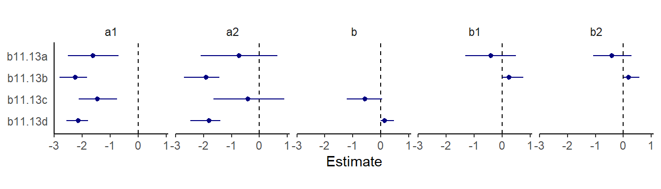
図11.20: モデル11.13a~dの推定結果。
モデル比較をすると、ほとんど差はないことが分かる。
b11.13a <- add_criterion(b11.13a, "loo")
b11.13b <- add_criterion(b11.13b, "loo")
b11.13c <- add_criterion(b11.13c, "loo")
b11.13d <- add_criterion(b11.13d, "loo")

loo_compare(b11.13a, b11.13b, b11.13c, b11.13d, criterion = "loo") %>%
  print(simplify = F) %>%
  kable(caption = "b11.13a ~ b11.13dのモデル比較",
        booktabs = TRUE) %>%
   kable_styling(latex_options = "striped")
## elpd_diff se_diff elpd_loo se_elpd_loo p_loo se_p_loo looic se_looic
## b11.13c 0.0 0.0 -369.5 17.1 1.9 0.1 739.0 34.2
## b11.13d 0.0 0.2 -369.6 16.9 1.9 0.1 739.1 33.8
## b11.13a 0.0 0.1 -369.6 17.1 2.0 0.1 739.1 34.1
## b11.13b -0.1 0.2 -369.6 16.9 2.0 0.1 739.2 33.8| elpd_diff | se_diff | elpd_loo | se_elpd_loo | p_loo | se_p_loo | looic | se_looic | |
|---|---|---|---|---|---|---|---|---|
| b11.13c | 0.0000000 | 0.0000000 | -369.5104 | 17.10985 | 1.935502 | 0.1311694 | 739.0208 | 34.21970 |
| b11.13d | -0.0435284 | 0.2212151 | -369.5539 | 16.90255 | 1.922417 | 0.1286941 | 739.1079 | 33.80509 |
| b11.13a | -0.0456842 | 0.0542677 | -369.5561 | 17.05629 | 1.970180 | 0.1312604 | 739.1122 | 34.11259 |
| b11.13b | -0.0984991 | 0.2155251 | -369.6089 | 16.89454 | 1.969123 | 0.1318588 | 739.2178 | 33.78908 |
切片だけのモデルもPSISに違いはない。
b11.13io <- add_criterion(b11.13io, "loo")

loo_compare(b11.13io, b11.13a, b11.13b, b11.13c, b11.13d, criterion = "loo") %>%
  print(simplify = F) %>%
  kable(caption = "b11.13a ~ b11.13dと切片のみモデルの比較",
        booktabs = TRUE) %>%
   kable_styling(latex_options = "striped")
## elpd_diff se_diff elpd_loo se_elpd_loo p_loo se_p_loo looic se_looic
## b11.13c 0.0 0.0 -369.5 17.1 1.9 0.1 739.0 34.2
## b11.13d 0.0 0.2 -369.6 16.9 1.9 0.1 739.1 33.8
## b11.13a 0.0 0.1 -369.6 17.1 2.0 0.1 739.1 34.1
## b11.13io -0.1 0.2 -369.6 16.9 2.0 0.1 739.2 33.9
## b11.13b -0.1 0.2 -369.6 16.9 2.0 0.1 739.2 33.8| elpd_diff | se_diff | elpd_loo | se_elpd_loo | p_loo | se_p_loo | looic | se_looic | |
|---|---|---|---|---|---|---|---|---|
| b11.13c | 0.0000000 | 0.0000000 | -369.5104 | 17.10985 | 1.935502 | 0.1311694 | 739.0208 | 34.21970 |
| b11.13d | -0.0435284 | 0.2212151 | -369.5539 | 16.90255 | 1.922417 | 0.1286941 | 739.1079 | 33.80509 |
| b11.13a | -0.0456842 | 0.0542677 | -369.5561 | 17.05629 | 1.970180 | 0.1312604 | 739.1122 | 34.11259 |
| b11.13io | -0.0830380 | 0.1724640 | -369.5935 | 16.94163 | 1.974698 | 0.1304070 | 739.1869 | 33.88327 |
| b11.13b | -0.0984991 | 0.2155251 | -369.6089 | 16.89454 | 1.969123 | 0.1318588 | 739.2178 | 33.78908 |
モデルb11.13dの結果から、職業2の収入が2倍になった時に選択確率を調べる。5%程度上昇することが示唆された。
posterior_samples(b11.13d) %>%
  transmute(s1= b_a1_Intercept + b_b_Intercept * income[1],
            s2_orig =
              b_a2_Intercept+b_b_Intercept*income[2],
            s2_new  =
              b_a2_Intercept + b_b_Intercept * income[2]*2) %>%
  mutate(p_orig = purrr::map2_dbl(s1, s2_orig, ~softmax(.x, .y, 0)[2]),
         p_new  = purrr::map2_dbl(s1, s2_new, ~softmax(.x, .y, 0)[2])) %>%
  mutate(p_diff = p_new - p_orig) %>%
  mean_qi(p_diff) %>%
  mutate_if(is.double, round, digits = 2)
## # A tibble: 1 × 6
## p_diff .lower .upper .width .point .interval
## <dbl> <dbl> <dbl> <dbl> <chr> <chr>
## 1 0.04 0 0.17 0.95 mean qi11.4.2 Predictor matched to observations
以下の過程でscore1~3が生成されるデータをシミュレーションする。家庭の収入によって職業選択に影響がでると考える。今度は
\[
\begin{aligned}
s_{1} &= 0.5 -2 × family \ income\\
s_{2} &= 1.0 +0 × family\ income\\
s_{3} &= 1.5 +2 × family\ income\\
\end{aligned}
\]
n <- 500
set.seed(11)

family_income <- runif(n)
b      <- c(-2, 0, 2)
career <- rep(NA, n)

for (i in 1:n) {
    score     <- 0.5 * (1:3) + b * family_income[i]
    p         <- softmax(score[1], score[2], score[3])
    career[i] <- sample(1:3, size = 1, prob = p)
}
得られたシミュレーションの結果を可視化する。
d7 <-
  tibble(career = career) %>%
  mutate(family_income = family_income)

d7 %>%
  mutate(career = as.factor(career)) %>%
  ggplot(aes(x=family_income, fill=career))+
  geom_density(alpha=3/4, color=NA)+
  scale_fill_manual(values =c("grey4","lightblue","orange"))+
  theme(legend.position="none",
        aspect.ratio=1)->p7

d7 %>%
  mutate(career = as.factor(career)) %>%
  mutate(fi = santoku::chop_width(family_income, width = .1, start = 0, labels = 1:10)) %>%
  count(fi, career) %>%
  group_by(fi) %>%
  mutate(proportion = n / sum(n)) %>%
  mutate(f = as.double(fi)) %>%
  ggplot(aes(x = (f - 1) / 9, y = proportion,
             fill = career)) +
  geom_area() +
  scale_fill_manual(values =c("grey4","lightblue","orange"))+
  theme(legend.position="none",
        aspect.ratio=1) +
xlab("family_income, descritized") ->p8p7+p8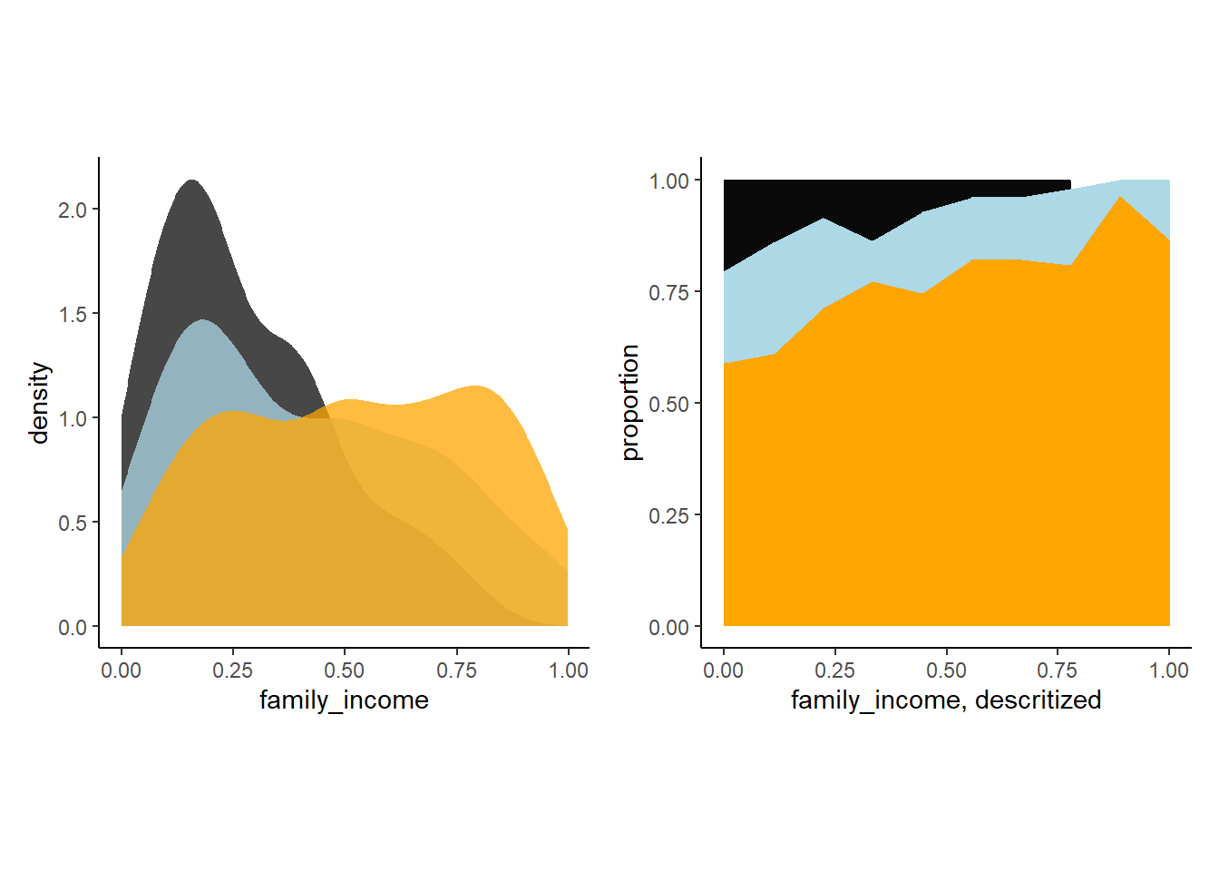
図11.21: シミュレーションによって得られた収入ごとに選択される職業。
それでは、モデルを回してみる。
b11.14 <-
  brm(data = d7,
      family = categorical(link = "logit", refcat =3),
      bf(career ~ 1,
         nlf(mu1 ~ a1 + b1*family_income),
         nlf(mu2 ~ a2 + b2*family_income),
         a1 + a2 + b1 + b2 ~1),
      prior = c(prior(normal(0, 1.5),class = b,nlpar = a1),
                prior(normal(0, 1.5), class= b, nlpar = a2),
                prior(normal(0, 1), class = b, nlpar = b1),
                prior(normal(0, 1), class = b, nlpar = b2)),
      iter = 2000, warmup = 1000, cores = 4, chains = 4,
      seed = 11,
      backend = "cmdstanr",
      file = "output/Chapter11/b11.14")
モデルの推定結果は以下の通り。
fixef(b11.14) %>%
  kable(digits=2, caption = "モデルb11.14の結果。家庭の収入によってそれぞれの職業を選択する確率。",
        booktabs = TRUE) %>%
kable_styling(latex_options = "striped")| Estimate | Est.Error | Q2.5 | Q97.5 | |
|---|---|---|---|---|
| a1_Intercept | -1.28 | 0.26 | -1.81 | -0.78 |
| a2_Intercept | -1.01 | 0.22 | -1.45 | -0.60 |
| b1_Intercept | -2.52 | 0.57 | -3.61 | -1.39 |
| b2_Intercept | -1.22 | 0.42 | -2.03 | -0.40 |
モデル結果を可視化する。
nd <- tibble(family_income = seq(0,1,length.out=100))

fit11.14 <- fitted(b11.14,newdata=nd)

rbind(fit11.14[,,1],
      fit11.14[,,2],
      fit11.14[,,3]) %>%
  data.frame() %>%
  bind_cols(nd %>%
              tidyr::expand(career = 1:3, family_income)) %>%
  mutate(career = str_c("career: ", career)) %>%
  ggplot(aes(x = family_income, y = Estimate,
             ymin = Q2.5, ymax = Q97.5))+
  geom_smooth(aes(fill=career, color = career),
              stat = "identity")+
  scale_fill_manual(values =c("grey4","lightblue","orange"))+
  scale_color_manual(values =c("grey4","lightblue","orange"))+
  scale_x_continuous(breaks = seq(0,1,by=0.5))+
   scale_y_continuous("probability", limits = c(0, 1),
                     breaks = 0:3 / 3, labels = c("0", ".33", ".67", "1"))+
  theme(aspect.ratio=1)+
  facet_wrap(~career)+
  theme(strip.background = element_blank(),
        axis.text.y = element_text(hjust = 0),
        legend.position = "none")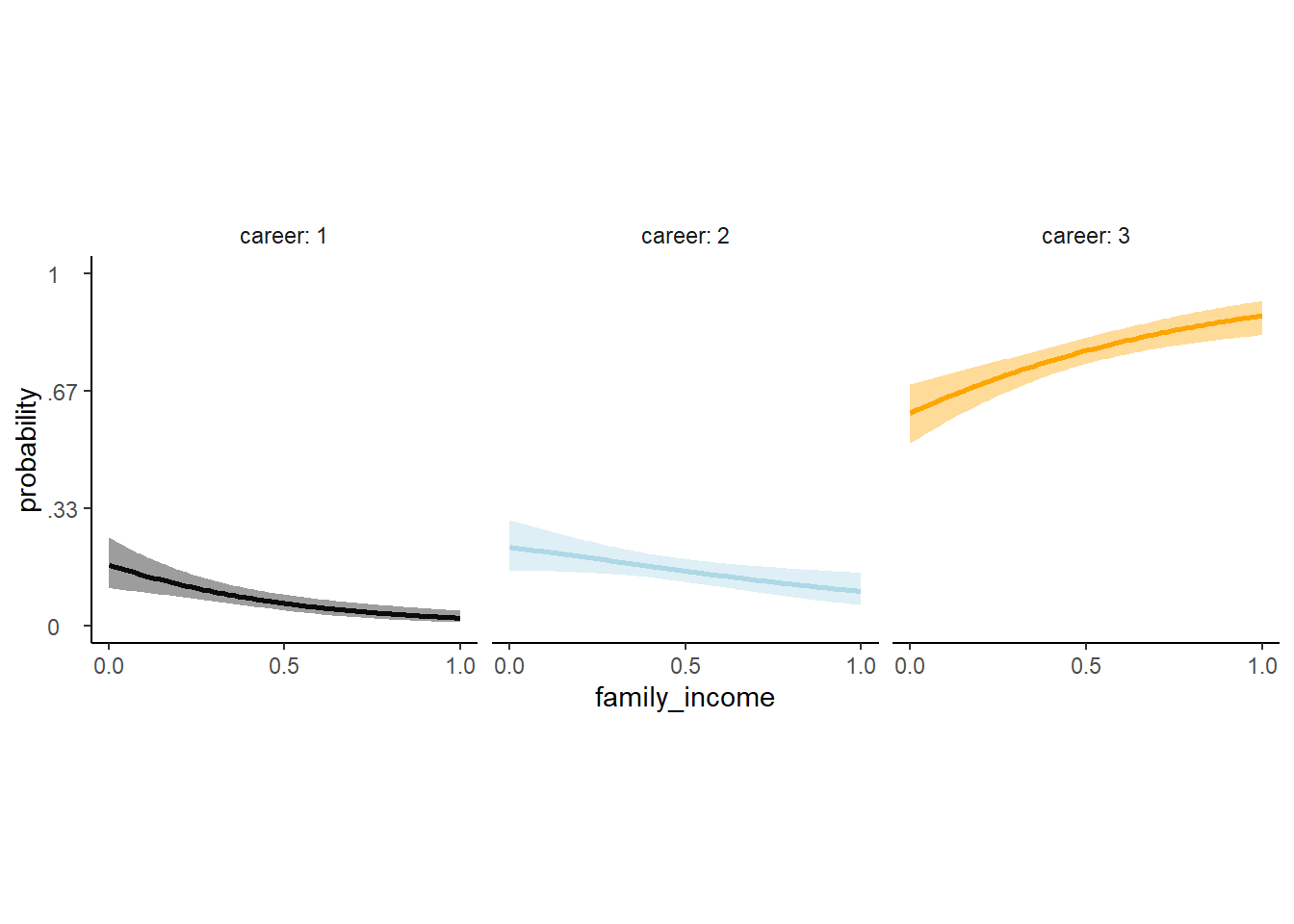
図11.22: モデルb11.14の推定結果。家庭の収入によって各職業を選ぶ確率。
全体に占める割合についてもグラフを書いてみる。 元データ(図11.23の右)と似ているので、うまく推定できてそう。
text <-
  tibble(family_income = c(.45, .3, .15),
         proportion    = c(.65, .8, .95),
         label         = str_c("career: ", 3:1),
         color         = c("a", "a", "b"))

rbind(fit11.14[, , 1],
      fit11.14[, , 2],
      fit11.14[, , 3]) %>%
  data.frame() %>%
  bind_cols(nd %>% tidyr::expand(career = 1:3, family_income)) %>%
  group_by(family_income) %>%
  mutate(proportion = Estimate / sum(Estimate),
         career     = factor(career)) %>%
  ggplot(aes(x = family_income, y = proportion)) +
  geom_area(aes(fill = career)) +
  geom_text(data = text,
            aes(label = label, color = color),size = 4.25) +
  scale_color_manual(values =c("grey4","lightblue","orange")) +
  scale_fill_manual(values = c("grey4","lightblue","orange")) +
  theme(legend.position = "none",
aspect.ratio=1) 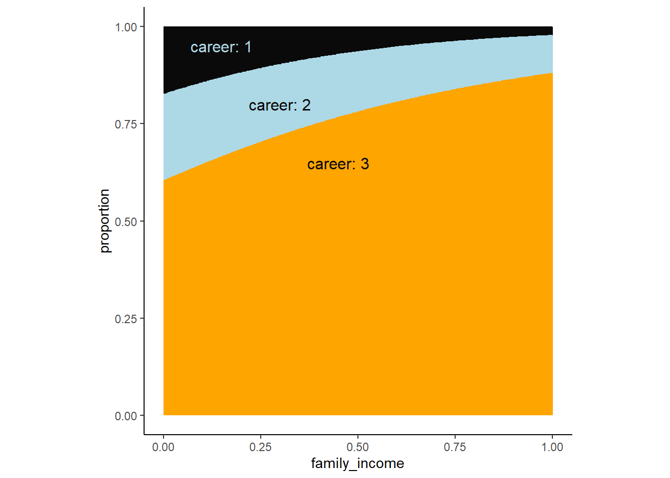
図11.23: モデルb11.14の推定結果。収入ごとに各職業を選択する割合。
11.4.3 Multinomial in disguise as Poisson
多項分布をポワソン分布に変換することもできる。ロジスティック回帰の章で用いたUCバークレーの例をポワソン分布で回帰してみよう。合格者数と不合格者数がそれぞれポワソン分布から得られると考える。’brm’で’mvbind’は多変量が応答変数になるときに用いることができるオプションである。二項分布でもモデリングして比較する。
b11.binom <-
  brm(data = d3,
      family = binomial,
      admit | trials(applications) ~ 1,
      prior(normal(0, 1.5), class = Intercept),
      iter = 2000, warmup = 1000, cores = 3, chains = 3,
      seed = 11,
      backend = "cmdstanr",
      file = "output/Chapter11/b11.binom")

b11.pois <-
  brm(data = d3 %>%
        mutate(rej = reject),
      family = poisson,
      mvbind(admit, rej) ~ 1,
      prior(normal(0, 1.5), class = Intercept),
      iter = 2000, warmup = 1000, cores = 3, chains = 3,
      seed = 11,
      backend = "cmdstanr",
      file = "output/Chapter11/b11.pois")
モデルから推定された合格者数と不合格者数。
post <- posterior_samples(b11.pois)

post %>%
  mutate(admit  = exp(b_admit_Intercept),
         reject = exp(b_rej_Intercept)) %>%
  pivot_longer(admit:reject) %>%
  ggplot(aes(x = value, y = name, fill = name)) +
  stat_halfeye(point_interval = median_qi, .width = .95) +
  scale_fill_manual(values = c("lightblue","orange")) +
  labs(title = " Mean admit/reject rates across departments",
       x = "# applications",
       y = NULL) +
  theme(axis.ticks.y = element_blank(),
        legend.position = "none")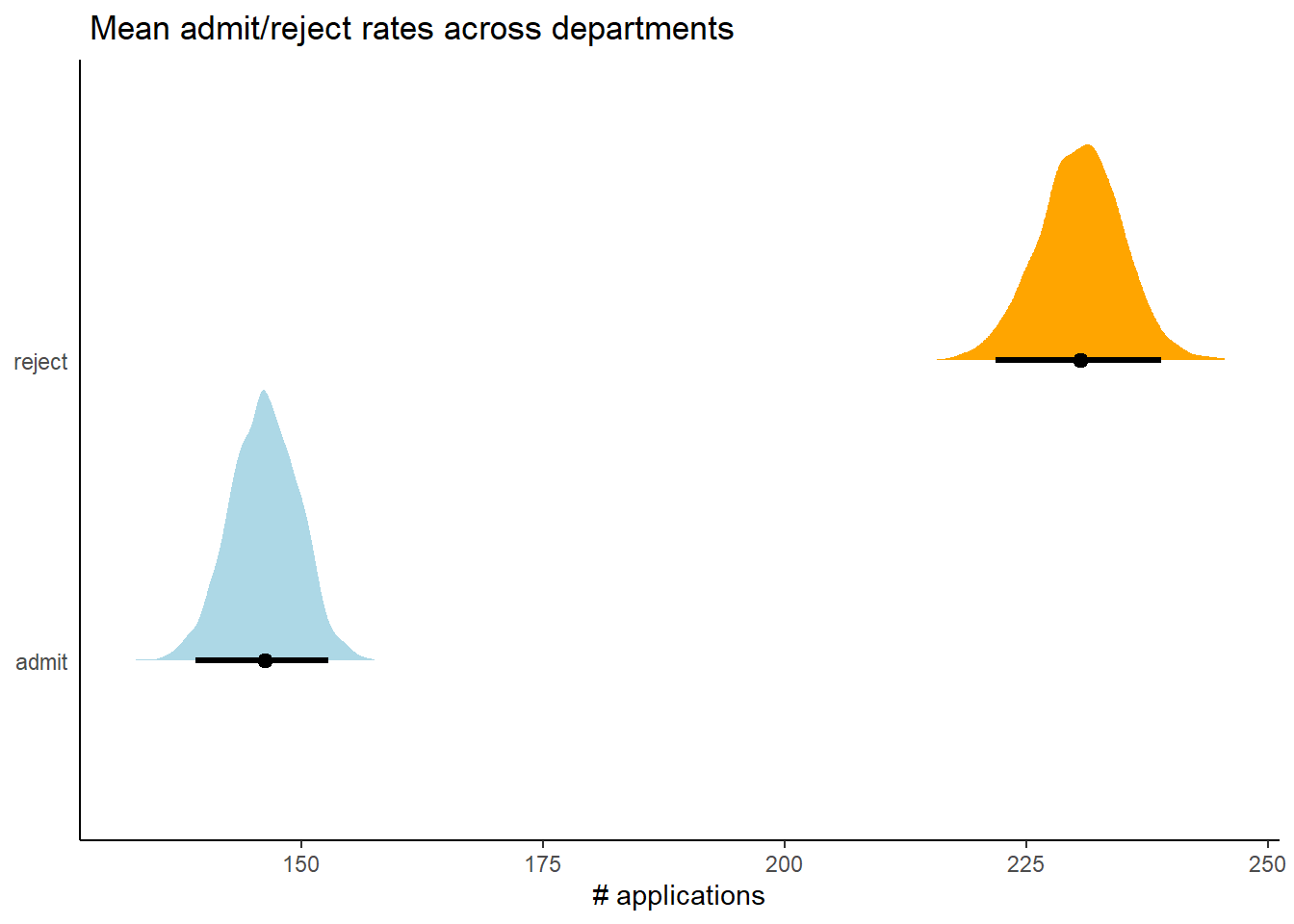
図11.24: b11.poisから推定された同格者数とふ不合格者数
それぞれのモデルの結果から、合格する確率の事後平均を求める。 ほとんど一致することが分かる。
## 二項分布
fixef(b11.binom)[,1] %>%
  inv_logit_scaled()
## [1] 0.3880132## ポワソン分布
fixef(b11.pois) %>%
as.numeric() ->k
exp(k[1])/(exp(k[1])+exp(k[2]))## [1] 0.3879595合格確率の事後分布もほとんど同じになる。このことからも、カテゴリカル回帰(ロジスティック回帰)はポワソン回帰でも可能であることが分かった。
bind_cols(
  posterior_samples(b11.pois) %>%
    mutate(`the Poisson`  = exp(b_admit_Intercept) / (exp(b_admit_Intercept) + exp(b_rej_Intercept))),
  posterior_samples(b11.binom) %>%
    mutate(`the binomial`=inv_logit_scaled(b_Intercept))
  ) %>%
  pivot_longer(starts_with("the")) %>%
  ggplot(aes(x = value, y = name, fill = name)) +
  stat_halfeye(point_interval = median_qi,
               .width =c(.95, .5)) +
  scale_fill_manual(values = c("lightblue","orange")) +
  labs(title = "Two models, same marginal posterior",
       x = "admissions probability",
       y = NULL) +
  coord_cartesian(ylim = c(1.5, 2.25)) +
  theme(axis.text.y = element_text(hjust = 0),
        axis.ticks.y = element_blank(),
        legend.position = "none",
        aspect.ratio=1)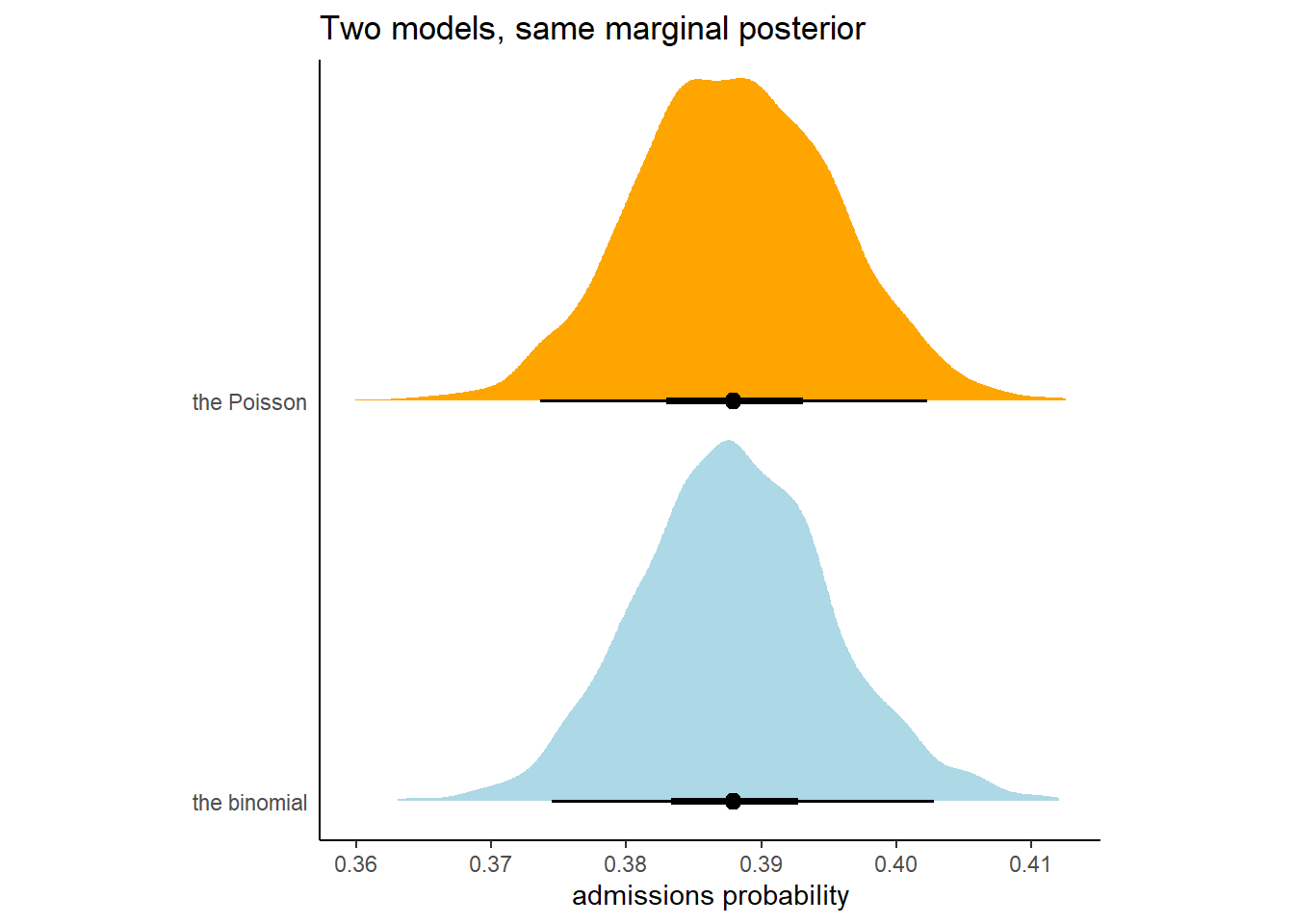
図11.25: b11.binomとb11.poisによる合格確率の事後分布。
11.5 Practice
11.5.1 11E1
11E1. If an event has probability 0.35, what are the log-odds of this event?
log(0.35 / (1 - 0.35))## [1] -0.619039211.5.2 11E2
If an event has log-odds 3.2, what is the probability of this event?
exp(3.2) / (exp(3.2) + 1)## [1] 0.960834311.5.3 11E3
Suppose that a coefficient in a logistic regression has value 1.7. What does this imply about the proportional change in odds of the outcome?
exp(1.7)## [1] 5.47394711.5.4 11E4
Why do Poisson regressions sometimes require the use of an offset? Provide an example.
観察ごとに観察時間が異なる場合に必要になる(e.g., 頻度データなど)。
11.5.5 11M7
Use quap to construct a quadratic approximate posterior distribution for the chimpanzee model that includes a unique intercept for each action, m11.4 (page 330). Compare the quadratic approximation to the posterior distribution produced instead from MCMC. Can you explain both the differences and the similarities between the approximate and the MCMC distributions? Relax the prior on the actor intercepts to Normal(0,10). Re-estimate the posterior using both ulam and quap. Do the difference increase or decrease? Why?
二次近似によるモデルの結果と比較する。
m11.4quap <- quap(
  alist(
    pulled_left ~ dbinom(1, p),
    logit(p) <- a[actor] + b[treatment],
    a[actor] ~ dnorm(0, 1.5),
    b[treatment] ~ dnorm(0, 0.5)
  ),
  data = d
)
大きな違いはないことが分かる。
precis(m11.4quap, depth=2) %>%
  data.frame() %>%
  rownames_to_column(var = "parameter") %>%
  kable(digits =2, caption = "二次近似による推定結果",
        booktabs = TRUE) %>%
kable_styling(latex_options = "striped")| parameter | mean | sd | X5.5. | X94.5. |
|---|---|---|---|---|
| a[1] | -0.44 | 0.33 | -0.96 | 0.08 |
| a[2] | 3.71 | 0.72 | 2.55 | 4.86 |
| a[3] | -0.73 | 0.33 | -1.26 | -0.20 |
| a[4] | -0.73 | 0.33 | -1.26 | -0.20 |
| a[5] | -0.44 | 0.33 | -0.96 | 0.08 |
| a[6] | 0.47 | 0.33 | -0.06 | 1.00 |
| a[7] | 1.91 | 0.41 | 1.24 | 2.57 |
| b[1] | -0.04 | 0.28 | -0.49 | 0.41 |
| b[2] | 0.47 | 0.28 | 0.02 | 0.93 |
| b[3] | -0.38 | 0.29 | -0.83 | 0.08 |
| b[4] | 0.36 | 0.28 | -0.09 | 0.82 |
posterior_summary(b11.4, probs = c(0.045, 0.955)) %>%
  data.frame() %>%
  rownames_to_column(var = "parameter") %>%
  filter(!str_detect(parameter,c("prior"))) %>%
  filter(parameter!= "lp__") %>%
  kable(digits =2 , caption = "MCMCによる推定結果",
        booktabs = TRUE) %>%
kable_styling(latex_options = "striped")| parameter | Estimate | Est.Error | Q4.5 | Q95.5 |
|---|---|---|---|---|
| b_a_actor1 | -0.46 | 0.32 | -1.01 | 0.07 |
| b_a_actor2 | 3.89 | 0.74 | 2.73 | 5.26 |
| b_a_actor3 | -0.76 | 0.33 | -1.33 | -0.19 |
| b_a_actor4 | -0.76 | 0.33 | -1.30 | -0.20 |
| b_a_actor5 | -0.47 | 0.33 | -1.02 | 0.09 |
| b_a_actor6 | 0.47 | 0.33 | -0.08 | 1.01 |
| b_a_actor7 | 1.94 | 0.43 | 1.25 | 2.69 |
| b_b_treatment1 | -0.03 | 0.28 | -0.49 | 0.44 |
| b_b_treatment2 | 0.49 | 0.29 | 0.00 | 0.98 |
| b_b_treatment3 | -0.37 | 0.29 | -0.86 | 0.11 |
| b_b_treatment4 | 0.38 | 0.28 | -0.10 | 0.86 |
続いて、切片の事前分布が\(Normal(0,10)\)のときを考える。
# quap
m11.4quap_2 <- quap(
  alist(
    pulled_left ~ dbinom(1, p),
    logit(p) <- a[actor] + b[treatment],
    a[actor] ~ dnorm(0, 10),
    b[treatment] ~ dnorm(0, 0.5)
  ),
  data = d
)

## MCMC
b11.4_2 <- brm(data = d,
      family = binomial,
      bf(pulled_left | trials(1) ~ a + b ,
         a ~ 0+ actor,
         b ~ 0+ treatment,
         nl = TRUE),
      prior=c(prior(normal(0, 10), nlpar = a),
              prior(normal(0, 0.5), nlpar = b)),
      seed = 11,
      sample_prior = TRUE,
      backend = "cmdstanr",
      file = "output/Chapter11/b11.4_2")
個体2の推定結果が大きく異なるが、それ以外はあまり変わらない。
precis(m11.4quap_2, depth=2) %>%
  data.frame() %>%
  rownames_to_column(var = "parameter") %>%
  kable(digits =2, caption = "二次近似による推定結果(Normal(0,10))",
        booktabs = TRUE) %>%
kable_styling(latex_options = "striped")| parameter | mean | sd | X5.5. | X94.5. |
|---|---|---|---|---|
| a[1] | -0.35 | 0.35 | -0.91 | 0.20 |
| a[2] | 6.99 | 3.55 | 1.33 | 12.66 |
| a[3] | -0.65 | 0.35 | -1.22 | -0.09 |
| a[4] | -0.65 | 0.35 | -1.22 | -0.09 |
| a[5] | -0.35 | 0.35 | -0.91 | 0.20 |
| a[6] | 0.58 | 0.35 | 0.02 | 1.14 |
| a[7] | 2.12 | 0.45 | 1.40 | 2.84 |
| b[1] | -0.14 | 0.30 | -0.62 | 0.34 |
| b[2] | 0.38 | 0.30 | -0.10 | 0.86 |
| b[3] | -0.49 | 0.30 | -0.97 | -0.01 |
| b[4] | 0.27 | 0.30 | -0.21 | 0.75 |
posterior_summary(b11.4_2, probs = c(0.045, 0.955)) %>%
  data.frame() %>%
  rownames_to_column(var = "parameter") %>%
  filter(!str_detect(parameter,c("prior"))) %>%
  filter(parameter!= "lp__") %>%
  kable(digits =2 , caption = "MCMCによる推定結果(Normal(1,10))",
        booktabs = TRUE) %>%
kable_styling(latex_options = "striped")| parameter | Estimate | Est.Error | Q4.5 | Q95.5 |
|---|---|---|---|---|
| b_a_actor1 | -0.39 | 0.34 | -0.97 | 0.19 |
| b_a_actor2 | 11.10 | 5.36 | 4.65 | 21.87 |
| b_a_actor3 | -0.69 | 0.35 | -1.29 | -0.11 |
| b_a_actor4 | -0.70 | 0.35 | -1.30 | -0.09 |
| b_a_actor5 | -0.39 | 0.35 | -1.01 | 0.20 |
| b_a_actor6 | 0.56 | 0.36 | -0.06 | 1.16 |
| b_a_actor7 | 2.15 | 0.46 | 1.41 | 2.97 |
| b_b_treatment1 | -0.12 | 0.30 | -0.64 | 0.39 |
| b_b_treatment2 | 0.42 | 0.30 | -0.11 | 0.92 |
| b_b_treatment3 | -0.47 | 0.30 | -0.99 | 0.03 |
| b_b_treatment4 | 0.30 | 0.30 | -0.21 | 0.81 |
11.5.6 11M8
Revisit the data(Kline) islands example. This time drop Hawaii from the sample and refit the models. What changes do you observe?
d4 %>%
  filter(culture != "Hawaii") -> d4_2

b11.10_2 <- brm(
  data = d4_2,
  family = poisson,
  formula = bf(total_tools ~ 0 + a + b * P,
         a ~ 0 + cid,
         b ~ 0 + cid,
         nl = TRUE),
  prior = c(prior(normal(3, 0.5), nlpar=a),
            prior(normal(0, 0.2), nlpar=b)),
  seed=8,
  backend = "cmdstanr",
  file = "output/Chapter11/b11.10_2"
)
ハワイを除いたとき、contactが低い国の傾きが半分程度になっていることが分かる。
posterior_summary(b11.10, probs = c(0.045, 0.955)) %>%
  data.frame() %>%
  rownames_to_column(var = "parameter") %>%
  filter(!str_detect(parameter,c("prior"))) %>%
  filter(parameter!= "lp__") %>%
  kable(digits =2 , caption = "ハワイありの推定結果",
        booktabs = TRUE) %>%
kable_styling(latex_options = "striped")| parameter | Estimate | Est.Error | Q4.5 | Q95.5 |
|---|---|---|---|---|
| b_a_cidhigh | 3.61 | 0.07 | 3.48 | 3.73 |
| b_a_cidlow | 3.32 | 0.09 | 3.16 | 3.47 |
| b_b_cidhigh | 0.20 | 0.16 | -0.08 | 0.46 |
| b_b_cidlow | 0.38 | 0.05 | 0.29 | 0.47 |
posterior_summary(b11.10_2, probs = c(0.045, 0.955)) %>%
  data.frame() %>%
  rownames_to_column(var = "parameter") %>%
  filter(!str_detect(parameter,c("prior"))) %>%
  filter(parameter!= "lp__") %>%
  kable(digits =2 , caption = "ハワイなしの推定結果",
        booktabs = TRUE) %>%
kable_styling(latex_options = "striped")| parameter | Estimate | Est.Error | Q4.5 | Q95.5 |
|---|---|---|---|---|
| b_a_cidhigh | 3.61 | 0.07 | 3.48 | 3.74 |
| b_a_cidlow | 3.18 | 0.13 | 2.95 | 3.40 |
| b_b_cidhigh | 0.19 | 0.16 | -0.07 | 0.47 |
| b_b_cidlow | 0.19 | 0.13 | -0.03 | 0.41 |
推定結果を図示してみても、違いは明らか。
nd <- crossing(cid = c("low","high"),
               P = seq(-1.5, 2.5, length.out=100))

fit11.10_2 <- fitted(b11.10_2, newdata = nd) %>%
  data.frame() %>%
  bind_cols(nd)

b11.10_2 <- add_criterion(b11.10_2,"loo")

fit11.10_2 %>%
  mutate(population = exp(P*sd(log(d4$population))+mean(log(d4$population)))) %>%
  ggplot(aes(x = population, group = cid))+
  geom_smooth(aes(y = Estimate, ymin = Q2.5,
                  ymax = Q97.5,
                  linetype = cid,
                  fill = cid,
                  color = cid),
              stat = "identity",
              size=1.5, alpha=1/2)+
  geom_point(data = bind_cols(d4_2, b11.10_2$criteria$loo$diagnostics),
             aes(y = total_tools, size = pareto_k,
                 color = cid),stroke = 1.5, alpha=1/2)+
  scale_shape_manual(values = c(16,1))+
  scale_color_manual(values = c("lightblue3","orange3"))+
  scale_fill_manual(values = c("lightblue", "orange"))+
  scale_x_continuous(breaks = seq(0,250000,by=50000))+
  coord_cartesian(xlim = c(0,250000),
                  ylim = c(0, 80))+
  theme(legend.position = "none",
        aspect.ratio=1,
        plot.title = element_text(family ="Japan1GothicBBB"))+
  labs(title = "ハワイを除いたモデル") ->p9

p6 +
  labs(title="ハワイを含めたモデル")+
  theme(plot.title =element_text(family ="Japan1GothicBBB"))-> p6

p6 + p9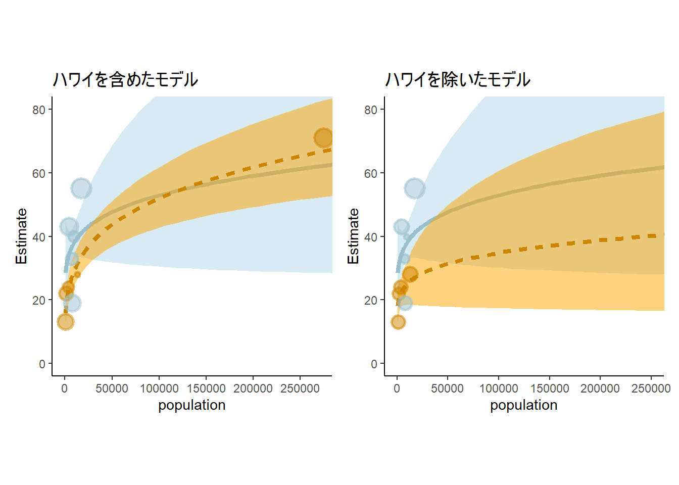
図11.26: ハワイがある場合と除いた場合のモデルの推定結果
11.5.7 11H1
Use WAIC or PSIS to compare the chimpanzee model that includes a unique intercept for each actor, m11.4 (page 330), to the simpler models fit in the same section. Interpret the results.
b11.1~b11\2までのモデルを比較する。
b11.1 <- add_criterion(b11.1, criterion = "loo")
b11.2 <- add_criterion(b11.2, criterion = "loo")
b11.3 <- add_criterion(b11.3, criterion = "loo")
b11.4 <- add_criterion(b11.4, criterion = "loo")

loo_compare(b11.1, b11.2, b11.3, b11.4)
## elpd_diff se_diff
## b11.4 0.0 0.0
## b11.3 -75.1 9.2
## b11.2 -75.6 9.2
## b11.1 -77.9 9.511.5.8 11H2
The data contained in library(MASS);
data(eagles)are records of salmon pirating attempts by Bald Eagles in Washington State. See ?eaglesfor details. While one eagle feeds, sometime another will swoop in and try to steal the salmon from it. Call the feeding eagle the “victim” and the thief the “pirate.” Use the available data to build a binomial GLM of successful pirating attempts.
11.5.8.1 a
Consider the following model:
where y is the number of successful attempts, n is the total number of attempts, P is a dummy variable indicating whether or not the pirate had large body size, V is a dummy variable indicating whether or not the victim had large body size, and finally A is a dummy variable indicating whether or not the pirate was an adult. Fit the model above to the eagles data, using both quap and ulam. Is the quadratic approximation okay?
鷲が他の個体から餌を横取りできる確率をモデリングする。なお、Pは盗む個体(pirates)の身体が大きいか否か、Vはとられる個体(victim)の身体が大きいか否か、Aはpiratesがオトナか否かを表す。
\[
\begin{aligned}
y_{i} &\sim Binomial(n_{i}, p_{i})\\
logit(p_{i}) &= \alpha + \beta_{P}P_{i} + \beta_{V}V_{i} +
\beta_{A}A_{i}\\
\alpha &\sim Normal(0,1.5)\\
\beta_{j} &\sim Normal(0,0.5)\\
\end{aligned}
\]
library(MASS)
data("eagles")
dat <- eagles
kable(dat, caption = "データ'eagle'",
      booktabs = TRUE) %>%
kable_styling(latex_options = "striped")| y | n | P | A | V |
|---|---|---|---|---|
| 17 | 24 | L | A | L |
| 29 | 29 | L | A | S |
| 17 | 27 | L | I | L |
| 20 | 20 | L | I | S |
| 1 | 12 | S | A | L |
| 15 | 16 | S | A | S |
| 0 | 28 | S | I | L |
| 1 | 4 | S | I | S |
それでは、モデリングしてみる。
b11H2 <-
  brm(data = dat,
      family = binomial,
      y|trials(n) ~ 1 + P + A + V,
      prior = c(prior(normal(0,1.5), class = Intercept),
                prior(normal(0,0.5), class=b)),
      backend = "cmdstanr",
      file = "output/Chapter11/b11H2")
推定結果は以下の通り。
posterior_summary(b11H2, probs = c(0.045, 0.955)) %>%
  data.frame() %>%
  rownames_to_column(var = "parameter") %>%
  filter(!str_detect(parameter,c("prior"))) %>%
  filter(parameter!= "lp__") %>%
  kable(digits =2 , caption = "b11H2の推定結果",
        booktabs = T) %>%
kable_styling(latex_options = "striped")| parameter | Estimate | Est.Error | Q4.5 | Q95.5 |
|---|---|---|---|---|
| b_Intercept | 0.89 | 0.31 | 0.38 | 1.43 |
| b_PS | -1.64 | 0.32 | -2.17 | -1.10 |
| b_AI | -0.65 | 0.32 | -1.19 | -0.10 |
| b_VS | 1.71 | 0.32 | 1.17 | 2.26 |
11.5.8.2 b
Now interpret the estimates. If the quadratic approximation turned out okay, then it’s okay to use the quap estimates. Otherwise stick to ulam estimates. Then plot the posterior predictions. Compute and display both (1) the predicted probability of success and its 89% interval for each row (i) in the data, as well as (2) the predicted success count and its 89% interval. What different information does each type of posterior prediction provide?
# 回数スケール
fitted(b11H2) %>%
  data.frame() %>%
  bind_cols(dat) %>%
  mutate(cond = c("L,L,A","L,S,A","L,L,I","L,S,I","S,L,A","S,S,A","S,L,I","S,S,I")) -> fit11H2

dat %>%
  mutate(cond = c("L,L,A","L,S,A","L,L,I","L,S,I","S,L,A","S,S,A","S,L,I","S,S,I")) %>%
  ggplot(aes(x=cond))+
  geom_point(aes(y=y),size=4,color = "navy",
             alpha = 1/2)+
  geom_pointinterval(data = fit11H2,
                     aes(y=Estimate, ymin=Q2.5, ymax=Q97.5),
                     shape = 1,point_size=3)+
  theme(aspect.ratio=0.7,
        axis.title.y = element_text(family ="Japan1GothicBBB"),
        text = element_text(size=10))+
  labs(y="成功数")  -> p11

## 成功確率
fitted(b11H2, scale = "linear") %>%
  data.frame() %>%
  bind_cols(dat) %>%
  mutate(cond = c("L,L,A","L,S,A","L,L,I","L,S,I","S,L,A","S,S,A","S,L,I","S,S,I")) %>%
  mutate(prob_est = inv_logit_scaled(Estimate),
         lb = inv_logit_scaled(Q2.5),
         ub = inv_logit_scaled(Q97.5)) -> fit11H2_2

fit11H2_2 %>%
  mutate(prob = y/n) %>%
  ggplot(aes(x=cond))+
  geom_point(aes(y=prob),size=4,color = "navy",
             alpha = 1/2)+
  geom_pointinterval(data = fit11H2_2,
                     aes(y=prob_est, ymin=lb, ymax=ub),
                     shape = 1,point_size=3)+
  labs(y="成功確率")+
  theme(aspect.ratio=0.7,
        axis.title.y = element_text(family ="Japan1GothicBBB"),
        text = element_text(size=10))-> p12

p11 + p12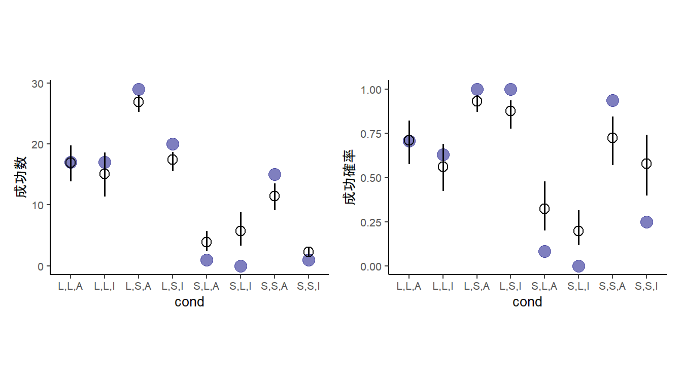
図11.27: モデルb11H2による推定結果。青丸は実測値、エラーバー付きの点はモデルによる予測値を表す。左は成功回数、右は成功確率を示す。
11.5.8.3 c
Now try to improve the model. Consider an interaction between the pirate’s size and age (immature or adult). Compare this model to the previous one, using WAIC. Interpret.
piratesの大きさと年齢の交互作用を入れたモデルを作成する。
b11H2c <-
  brm(data = dat,
      family = binomial,
      y|trials(n) ~ 1 + P + A + V + P:A,
      prior = c(prior(normal(0,1.5), class = Intercept),
                prior(normal(0,0.5), class=b)),
      backend = "cmdstanr",
      file = "output/Chapter11/b11H2c")
先ほどのモデルと比較すると、交互作用モデルの方がよい。
b11H2 <- add_criterion(b11H2, "loo")
b11H2c <- add_criterion(b11H2c,"loo")

loo_compare(b11H2,b11H2c)
## elpd_diff se_diff
## b11H2c 0.0 0.0
## b11H2 -3.3 3.5交互作用を入れたモデルの方がより実データにマッチしている。
# 回数スケール
fitted(b11H2c) %>%
  data.frame() %>%
  bind_cols(dat) %>%
  mutate(cond = c("L,L,A","L,S,A","L,L,I","L,S,I","S,L,A","S,S,A","S,L,I","S,S,I")) -> fit11H2c

dat %>%
  mutate(cond = c("L,L,A","L,S,A","L,L,I","L,S,I","S,L,A","S,S,A","S,L,I","S,S,I")) %>%
  ggplot(aes(x=cond))+
  geom_point(aes(y=y),size=4,color = "navy",
             alpha = 1/2)+
  geom_pointinterval(data = fit11H2c,
                     aes(y=Estimate, ymin=Q2.5, ymax=Q97.5),
                     shape = 1,point_size=3)+
  labs(y="成功数")+
  theme(aspect.ratio=0.7,
        axis.title.y = element_text(family ="Japan1GothicBBB"),
        text = element_text(size = 10))  -> p13

## 成功確率
fitted(b11H2c, scale = "linear") %>%
  data.frame() %>%
  bind_cols(dat) %>%
  mutate(cond = c("L,L,A","L,S,A","L,L,I","L,S,I","S,L,A","S,S,A","S,L,I","S,S,I")) %>%
  mutate(prob_est = inv_logit_scaled(Estimate),
         lb = inv_logit_scaled(Q2.5),
         ub = inv_logit_scaled(Q97.5)) -> fit11H2_2c

fit11H2_2c %>%
  mutate(prob = y/n) %>%
  ggplot(aes(x=cond))+
  geom_point(aes(y=prob),size=4,color = "navy",
             alpha = 1/2)+
  geom_pointinterval(data = fit11H2_2c,
                     aes(y=prob_est, ymin=lb, ymax=ub),
                     shape = 1,point_size=3)+
  labs(y="成功確率")+
  theme(aspect.ratio=0.7,
        axis.title.y = element_text(family ="Japan1GothicBBB"),
        text = element_text(size = 10))-> p14

p13 + p14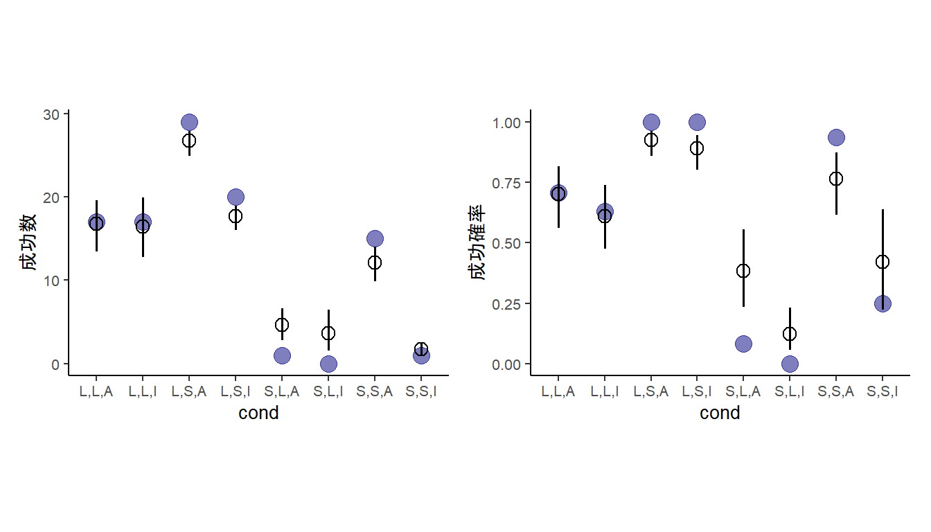
図11.28: モデルb11H2cによる推定結果。青丸は実測値、エラーバー付きの点はモデルによる予測値を表す。左は成功回数、右は成功確率を示す。
11.5.9 11H3
The data contained in data(salamanders) are counts of salamanders (Plethodon elongatus) from 47 different 49-m2 plots in northern California. The column SALAMAN is the count in each plot, and the columns PCTCOVER and FORESTAGE are percent of ground cover and age of trees in the plot, respectively. You will model SALAMAN as a Poisson variable.
11.5.9.1 a
Model the relationship between density and percent cover, using a log-link (same as the example in the book and lecture). Use weakly informative priors of your choosing. Check the quadratic approximation again, by comparing quap to ulam. Then plot the expected counts and their 89% interval against percent cover. In which ways does the model do a good job? A bad job?
サラマンダーの数(SALAMAN)と地面に覆われた割合?(PCTCOVER)の関係をポワソン回帰で調べる(表 11.29)。ひとまず、事前分布は\(\alpha \sim Normal(0,1.5)\)、\(\beta \sim Normal(0,0.5)\)とする。
data("salamanders")
dat2 <- salamanders

head(salamanders) %>%
  kable(booktabs = TRUE,
        caption = "データsalamanderの中身") %>%
kable_styling(latex_options = "stripe")| SITE | SALAMAN | PCTCOVER | FORESTAGE |
|---|---|---|---|
| 1 | 13 | 85 | 316 |
| 2 | 11 | 86 | 88 |
| 3 | 11 | 90 | 548 |
| 4 | 9 | 88 | 64 |
| 5 | 8 | 89 | 43 |
| 6 | 7 | 83 | 368 |
分析の結果、強い影響がみられた(表 11.30)。
dat2 %>%
  mutate(P = standardize(PCTCOVER)) -> dat2

fit11H3 <- brm(
  data = dat2,
  family=poisson,
  formula = SALAMAN ~ 1 + P,
  prior = c(prior(normal(0,1.5), class = Intercept),
            prior(normal(0,0.5), class = b)),
  sample_prior = TRUE,
  backend = "cmdstanr",
  seed=4, file = "output/Chapter11/fit11H3"
)

fixef(fit11H3, probs = c(0.025,0.975)) %>%
  data.frame() %>%
  rownames_to_column(var = "parameter") %>%
  kable(booktabs = TRUE,
        caption = "fit11H3の結果。",
        digits=2) %>%
kable_styling(latex_options = "stripe") | parameter | Estimate | Est.Error | Q2.5 | Q97.5 |
|---|---|---|---|---|
| Intercept | 0.49 | 0.14 | 0.23 | 0.75 |
| P | 1.05 | 0.16 | 0.74 | 1.37 |
モデル’fit11H3’の結果を図示すると、以下の通り(図 11.29)。
nd <- tibble(P = seq(-2,1,length.out=100))

fitted(fit11H3, newdata = nd, probs = c(0.055, 0.945)) %>%
  data.frame() %>%
  bind_cols(nd) -> fitH3

dat2 %>%
  ggplot(aes(x = P))+
  geom_point(aes(y = SALAMAN), color = "navy",
             size = 4, alpha =2/3,
             shape = 16)+
  geom_smooth(data = fitH3,
              aes(y = Estimate, ymin = Q5.5,
                  ymax = Q94.5),
              color = "black",fill="grey",
              alpha = 2/3,
              stat = "identity")+
  theme(aspect.ratio=1)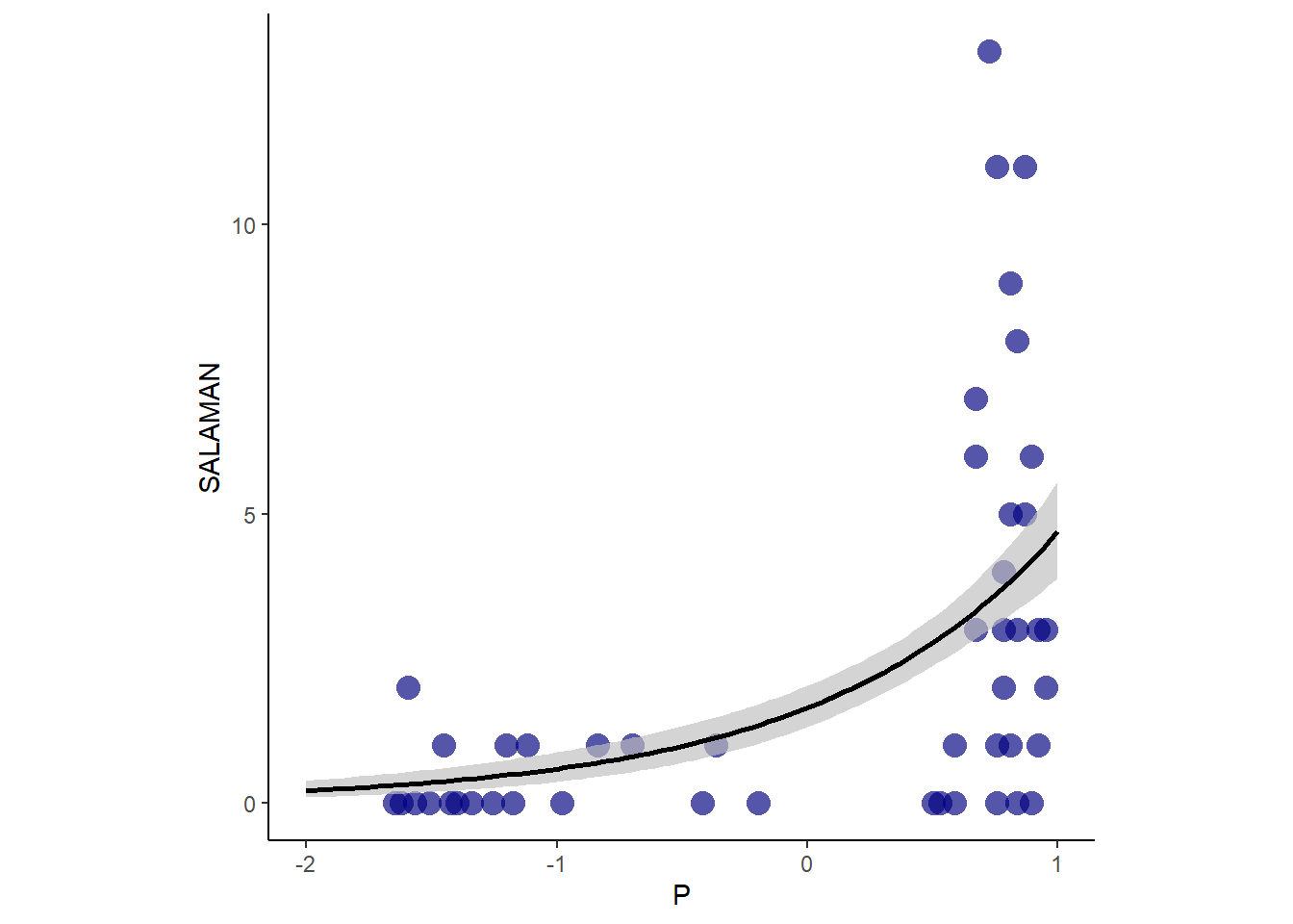
図11.29: fit11H3による推定結果
11.5.9.2 b
Can you improve the model by using the other predictor, FORESTAGE? Try any models you think useful. Can you explain why FORESTAGE helps or does not help with prediction?
FORESTAGE(樹齢?)も入れたモデルを考える。初めに、交互作用がないモデルを立てる。結果は以下の通り。樹齢はほとんど影響を与えていないよう(表11.31)。
dat2 <- dat2 %>%
  mutate(F = standardize(FORESTAGE))

fit11H3_2  <- brm(
  data = dat2,
  family=poisson,
  formula = SALAMAN ~ 1 + P + F,
  prior = c(prior(normal(0,1.5), class = Intercept),
            prior(normal(0,0.5), class = b)),
  sample_prior = TRUE,
  backend = "cmdstanr",
  seed=4, file = "output/Chapter11/fit11H3_2"
)fixef(fit11H3_2, probs = c(0.025,0.975)) %>%
data.frame() %>%
rownames_to_column(var = "parameter") %>%
kable(booktabs = TRUE,
digits =2,
caption = "fit11H3_2の結果") %>%
kable_styling(latex_options = "stripe") | parameter | Estimate | Est.Error | Q2.5 | Q97.5 |
|---|---|---|---|---|
| Intercept | 0.49 | 0.14 | 0.19 | 0.76 |
| P | 1.03 | 0.17 | 0.71 | 1.39 |
| F | 0.02 | 0.09 | -0.16 | 0.20 |
結果を図示しても、ほとんど効果はないよう(図11.30)。
nd <- crossing(P = 0, F = seq(-1,3,length.out=100))

fitted(fit11H3_2, nd, probs = c(0.055, 0.945)) %>%
  data.frame() %>%
  bind_cols(nd) -> fitH3_2

dat2 %>%
  ggplot(aes(x = F))+
  geom_point(aes(y = SALAMAN), color = "navy",
             size = 4, alpha =2/3,
             shape = 16)+
  geom_smooth(data = fitH3_2,
              aes(y = Estimate, ymin = Q5.5,
                  ymax = Q94.5),
              color = "black",fill="grey",
              alpha = 2/3,
              stat = "identity")+
  theme(aspect.ratio=1)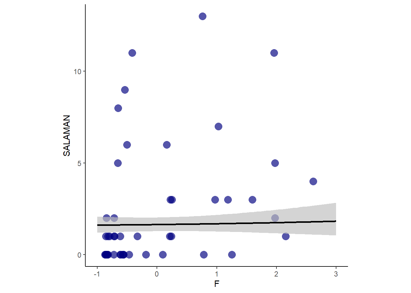
図11.30: fit11H4_2の推定結果
一応、交互作用のあるモデルも考える。
fit11H3_3  <- brm(
  data = dat2,
  family=poisson,
  formula = SALAMAN ~ 1 + P + F + P:F,
  prior = c(prior(normal(0,1.5), class = Intercept),
            prior(normal(0,0.5), class = b)),
  sample_prior = TRUE,
  backend = "cmdstanr",
  seed=4, file = "output/Chapter11/fit11H3_3"
)
結果はほとんど変わらないよう。
fixef(fit11H3_3, probs = c(0.025,0.975)) %>%
  data.frame() %>%
  rownames_to_column(var = "parameter") %>%
  kable(booktabs = TRUE,
        digits=2) %>%
kable_styling(latex_options = "stripe") | parameter | Estimate | Est.Error | Q2.5 | Q97.5 |
|---|---|---|---|---|
| Intercept | 0.58 | 0.20 | 0.18 | 0.96 |
| P | 0.92 | 0.24 | 0.44 | 1.41 |
| F | 0.15 | 0.24 | -0.31 | 0.64 |
| P:F | -0.17 | 0.29 | -0.76 | 0.38 |
結果は以下の通り(図11.31)。
# F = 0
nd_1 <- crossing(P = seq(-2,1,length.out=50), F = -0.5)

fitted(fit11H3_3, nd_1, probs = c(0.055, 0.945)) %>%
  data.frame() %>%
  bind_cols(nd_1)-> fitH3_3

dat2 %>%
  filter(F>-1, F <0) %>%
  ggplot(aes(x = P, group=1))+
  geom_point(aes(y = SALAMAN), color = "navy",
             size = 4, alpha =2/3,
             shape = 16)+
  geom_smooth(data = fitH3_3,
              aes(y = Estimate, ymin = Q5.5,
                  ymax = Q94.5),
              color = "black",fill="grey",
              alpha = 2/3,
              stat = "identity")+
  theme(aspect.ratio=1)+
  labs(subtitle = "A: F = -0.5 (-1<F<0)") -> p17

# F = 1
nd_2 <- crossing(P = seq(-2,1,length.out=50), F = 0.5)

fitted(fit11H3_3, nd_2, probs = c(0.055, 0.945)) %>%
  data.frame() %>%
  bind_cols(nd_1)-> fitH3_3_2

dat2 %>%
  filter(F>0, F<1) %>%
  ggplot(aes(x = P, group=1))+
  geom_point(aes(y = SALAMAN), color = "navy",
             size = 4, alpha =2/3,
             shape = 16)+
  geom_smooth(data = fitH3_3_2,
              aes(y = Estimate, ymin = Q5.5,
                  ymax = Q94.5),
              color = "black",fill="grey",
              alpha = 2/3,
              stat = "identity")+
  theme(aspect.ratio=1)+
  labs(subtitle = "B: F = 0.5(0<F<1)") -> p18

# F = 2
nd_3 <- crossing(P = seq(-2,1,length.out=50), F = 1.5)

fitted(fit11H3_3, nd_3, probs = c(0.055, 0.945)) %>%
  data.frame() %>%
  bind_cols(nd_1)-> fitH3_3_3

dat2 %>%
  filter(F>1) %>%
  ggplot(aes(x = P, group=1))+
  geom_point(aes(y = SALAMAN), color = "navy",
             size = 4, alpha =2/3,
             shape = 16)+
  geom_smooth(data = fitH3_3_3,
              aes(y = Estimate, ymin = Q5.5,
                  ymax = Q94.5),
              color = "black",fill="grey",
              alpha = 2/3,
              stat = "identity")+
  theme(aspect.ratio=1)+
  labs(subtitle = "C: F = 1.5(F>1)") -> p19

p17 + p18 + p19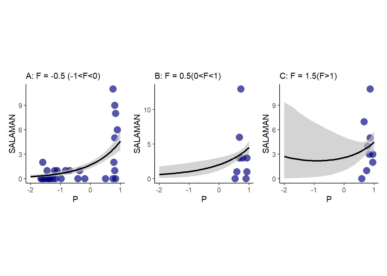
図11.31: fit11H3_3の推定結果を図示したもの。AはFが-1<F<0のデータを示し、F=-0.5の結果を示したもの。BはFが0<F<1のデータを示し、F=0.5の結果を示したもの。CはFが1<Fのデータを示し、F=1.5の結果を示したもの。
11.5.10 11H4
he data in data(NWOGrants) are outcomes for scientific funding applications for the Netherlands Organization for Scientific Research (NWO) from 2010–2012 (see van der Lee & Ellemers, 2015, for data and context). These data have a very similar structure to the UCBAdmit data discussed in the chapter. I want you to consider a similar question: What are the total and direct causal effects of gender on grant awards? Consider a mediation path (a pipe) through discipline. Draw the corresponding DAG and then use one or more binomial GLMs to answer the question. What is your causal interpretation? If NWO’s goal is to equalize rates of funding between men and women, what type of intervention would be most effective?
オランダ科学協会における研究費の応募結果をしてしたデータセットを用いる(Van der Lee and Ellemers 2015)。分野(discipline)と性別(gender)ごとに応募数(applications)と採用数(awards)が収められている(表 11.32。年齢と分野が採用率にどのように影響するかを確認する。
data(NWOGrants)
dat3 <- NWOGrants
head(dat3) %>%
  kable(booktabs=TRUE,
        caption = "NWOGrantsデータの中身") %>%
kable_styling(latex_options = "stripe")| discipline | gender | applications | awards |
|---|---|---|---|
| Chemical sciences | m | 83 | 22 |
| Chemical sciences | f | 39 | 10 |
| Physical sciences | m | 135 | 26 |
| Physical sciences | f | 39 | 9 |
| Physics | m | 67 | 18 |
| Physics | f | 9 | 2 |
設問で想定されているDAGは以下のようになる(gender: D, discipline: D, awards: A)。
dagify(A ~ G + D,
       D ~ G) %>%
  ggdag()+
  theme_dag()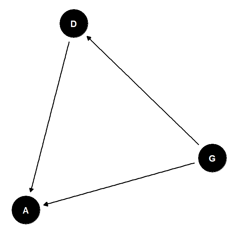
まず、性別だけを入れたときのGLMを行う。これは、分野(D)を介した影響も含む総合効果の推定にあたる。分野を考慮しなければ、性別間で大きな違いはない。
fit11H4_1 <-
  brm(data = dat3,
      family = binomial,
      formula = awards|trials(applications) ~ 0 + gender,
      prior = c(prior(normal(0,1.5), class=b)),
      backend = "cmdstanr",
      seed=11, file = "output/Chapter11/fit11H4_1")

fixef(fit11H4_1) %>%
  data.frame() %>%
  rownames_to_column(var = "parameter") %>%
  kable(booktabs = T,
        digits=2) %>%
kable_styling(latex_options = "stripe") | parameter | Estimate | Est.Error | Q2.5 | Q97.5 |
|---|---|---|---|---|
| genderf | -1.74 | 0.08 | -1.90 | -1.58 |
| genderm | -1.53 | 0.06 | -1.66 | -1.41 |
結果を図示する(図11.32)。実際のデータには全くマッチしていない。それぞれの性別が採用される期待値は、女性は0.15、男性は0.18である。
cond <-  c("che M","che F","phcl M","phcl F",
                  "phcs M","phcs F","hum M","hum F",
                  "tech M", "tech F", "inter M", "inter F",
           "earth M", "earth F", "social M", "social F",
           "med M", "med F")

fitted(fit11H4_1, probs = c(0.055, 0.945)) %>%
  data.frame() %>%
  bind_cols(dat3) %>%
  mutate(n = 1:n()) %>%
  mutate(cond = cond) %>%
  mutate(prop = awards/applications,
         prop_est = Estimate/applications,
         ub = Q5.5/applications,
         lb = Q94.5/applications) %>%
  ggplot(aes(x=cond))+
  geom_point(aes(y = prop),
             color = "navy",
             size=4)+
  geom_pointinterval(aes(y = prop_est,
                         ymin = lb,
                         ymax = ub),
                     shape =1, point_size=3)+
  labs(y = "採用率",
       x = NULL)+
    theme(axis.title.y = element_text(family ="Yu Mincho"),
        axis.title = element_text(family ="Yu Mincho"),
        axis.text.x = element_text(size = 8))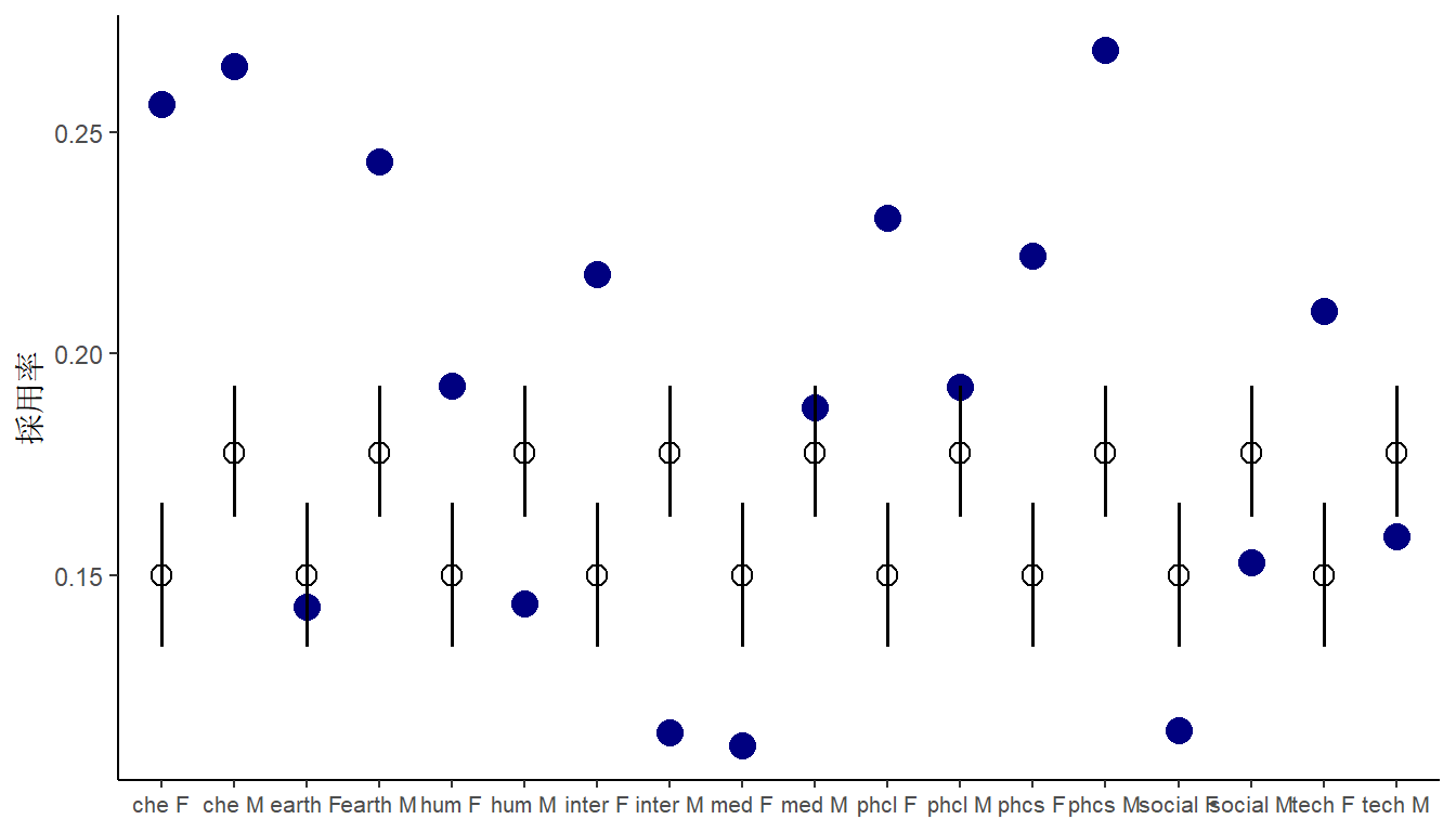
図11.32: 性別だけ考慮したモデルfit11H4_1の結果
続いて、分野も説明変数に入れたモデルを考える。分析結果は以下の通り。やはり性別はそこまで影響していない。
fit11H4_2 <-
  brm(data = dat3,
      family = binomial,
      formula = awards|trials(applications) ~ 0 + gender + discipline,
      prior = c(prior(normal(0,1.5), class=b)),
      backend = "cmdstanr",
seed=11, file = "output/Chapter11/fit11H4_2")fixef(fit11H4_2) %>%
data.frame() %>%
rownames_to_column(var = "parameter") %>%
kable(booktabs = T,
digits=2) %>%
kable_styling(latex_options = "stripe") | parameter | Estimate | Est.Error | Q2.5 | Q97.5 |
|---|---|---|---|---|
| genderf | -1.15 | 0.20 | -1.54 | -0.77 |
| genderm | -1.01 | 0.19 | -1.39 | -0.65 |
| disciplineEarthDlifesciences | -0.33 | 0.24 | -0.79 | 0.14 |
| disciplineHumanities | -0.56 | 0.23 | -1.01 | -0.12 |
| disciplineInterdisciplinary | -0.60 | 0.27 | -1.14 | -0.07 |
| disciplineMedicalsciences | -0.66 | 0.23 | -1.10 | -0.22 |
| disciplinePhysicalsciences | -0.34 | 0.27 | -0.86 | 0.19 |
| disciplinePhysics | -0.02 | 0.32 | -0.67 | 0.58 |
| disciplineSocialsciences | -0.79 | 0.21 | -1.20 | -0.38 |
| disciplineTechnicalsciences | -0.54 | 0.25 | -1.02 | -0.05 |
結果を図示すると以下の通り(図11.33)。データへの当てはまりは良くなったが、分野によっては男女の採用率は逆転している。
fitted(fit11H4_2, probs = c(0.055, 0.945)) %>%
  data.frame() %>%
  bind_cols(dat3) %>%
  mutate(n = 1:n()) %>%
  mutate(cond = cond) %>%
  mutate(prop = awards/applications,
         prop_est = Estimate/applications,
         ub = Q5.5/applications,
         lb = Q94.5/applications) %>%
  ggplot(aes(x=cond))+
  geom_point(aes(y = prop),
             color = "navy",
             size=4)+
  geom_pointinterval(aes(y = prop_est,
                         ymin = lb,
                         ymax = ub),
                     shape =1, point_size=5)+
  labs(y = "採用率",
       x = NULL)+
  theme(axis.title.y = element_text(family ="Yu Mincho"),
        axis.title = element_text(family ="Yu Mincho"),
        axis.text.x = element_text(size = 8))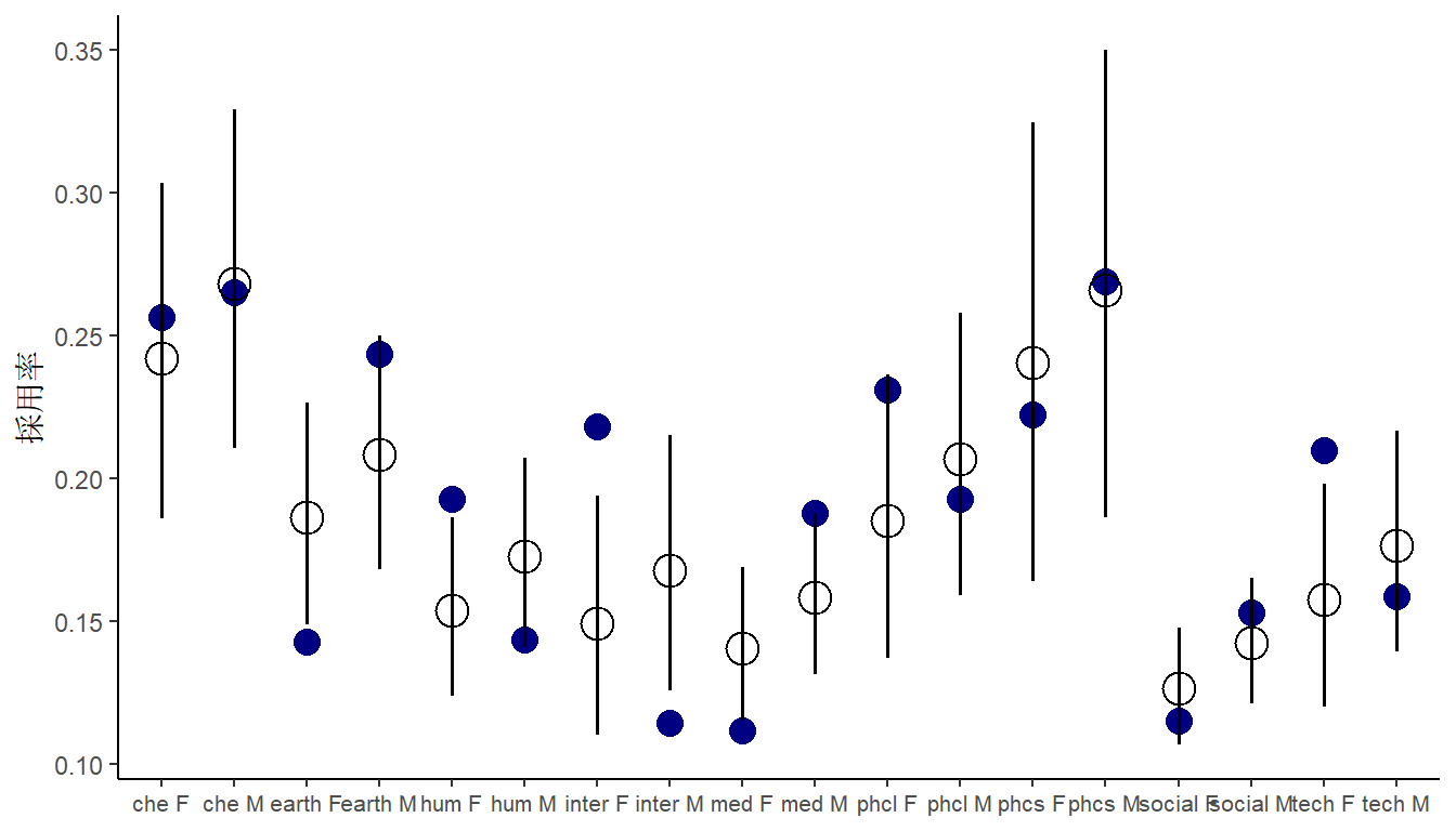
図11.33: 性別と分野を考慮したモデルfit11H4_2の結果
最後に交互作用を考えたモデルを回す。結果は以下の通り。
fit11H4_3 <-
  brm(data = dat3,
      family = binomial,
      formula = awards|trials(applications) ~ 0 + gender*discipline,
      prior = c(prior(normal(0,1.5), class=b)),
      backend = "cmdstanr",
      seed=11, file = "output/Chapter11/fit11H4_3")

fixef(fit11H4_3) %>%
  data.frame() %>%
  rownames_to_column(var = "parameter") %>%
  kable(booktabs = T,
        digits=2) %>%
kable_styling(latex_options = "stripe") | parameter | Estimate | Est.Error | Q2.5 | Q97.5 |
|---|---|---|---|---|
| genderf | -1.16 | 0.28 | -1.71 | -0.63 |
| genderm | -1.02 | 0.23 | -1.49 | -0.58 |
| disciplineEarthDlifesciences | -0.62 | 0.36 | -1.33 | 0.11 |
| disciplineHumanities | -0.29 | 0.34 | -0.93 | 0.37 |
| disciplineInterdisciplinary | -0.16 | 0.38 | -0.92 | 0.59 |
| disciplineMedicalsciences | -0.91 | 0.33 | -1.54 | -0.26 |
| disciplinePhysicalsciences | -0.09 | 0.44 | -0.97 | 0.74 |
| disciplinePhysics | -0.12 | 0.67 | -1.48 | 1.18 |
| disciplineSocialsciences | -0.88 | 0.31 | -1.48 | -0.26 |
| disciplineTechnicalsciences | -0.21 | 0.39 | -0.96 | 0.55 |
| genderm:disciplineEarthDlifesciences | 0.49 | 0.44 | -0.37 | 1.35 |
| genderm:disciplineHumanities | -0.48 | 0.42 | -1.29 | 0.32 |
| genderm:disciplineInterdisciplinary | -0.86 | 0.50 | -1.86 | 0.09 |
| genderm:disciplineMedicalsciences | 0.45 | 0.40 | -0.34 | 1.23 |
| genderm:disciplinePhysicalsciences | -0.34 | 0.51 | -1.29 | 0.65 |
| genderm:disciplinePhysics | 0.11 | 0.71 | -1.23 | 1.59 |
| genderm:disciplineSocialsciences | 0.18 | 0.37 | -0.55 | 0.93 |
| genderm:disciplineTechnicalsciences | -0.45 | 0.46 | -1.36 | 0.44 |
結果を図示すると以下の通り(図11.34)。やはり分野によって男女のどちらかが有利なのかは一致しない。
fitted(fit11H4_3, probs = c(0.055, 0.945)) %>%
  data.frame() %>%
  bind_cols(dat3) %>%
  mutate(n = 1:n()) %>%
  mutate(cond = cond) %>%
  mutate(prop = awards/applications,
         prop_est = Estimate/applications,
         ub = Q5.5/applications,
         lb = Q94.5/applications) %>%
  ggplot(aes(x=cond))+
  geom_point(aes(y = prop),
             color = "navy",
             size=4)+
  geom_pointinterval(aes(y = prop_est,
                         ymin = lb,
                         ymax = ub),
                     shape =1, point_size=5)+
  labs(y = "採用率",
       x = NULL)+
  theme(axis.title.y = element_text(family ="Yu Mincho"),
        axis.title = element_text(family ="Yu Mincho"),
        axis.text.x = element_text(size = 8))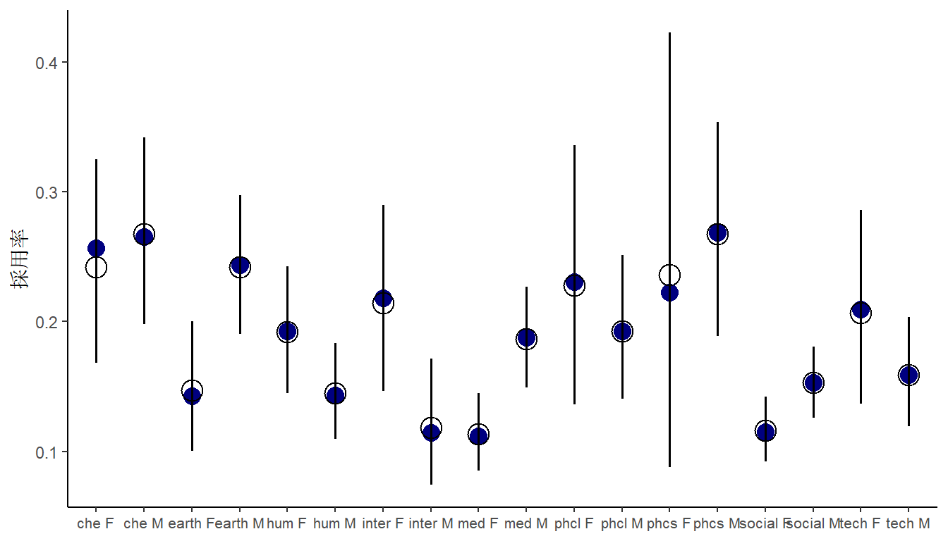
図11.34: 交互作用を考慮したモデルfit11H4_3の結果
以上の結果を総合すると、性別よりも分野が大きく影響していると考えられる。
11.5.11 11H5
Suppose that the NWO Grants sample has an unobserved confound that influences both choice of discipline and the probability of an award. One example of such a confound could be the career stage of each applicant. Suppose that in some disciplines, junior scholars apply for most of the grants. In other disciplines, scholars from all career stages compete. As a result, career stage influences discipline as well as the probability of being awarded a grant. Add these influences to your DAG from the previous problem. What happens now when you condition on discipline? Does it provide an un-confounded estimate of the direct path from gender to an award? Why or why not? Justify your answer with the backdoor criterion. If you have trouble thinking this though, try simulating fake data, assuming your DAG is true. Then analyze it using the model from the previous problem. What do you conclude? Is it possible for gender to have a real direct causal influence but for a regression conditioning on both gender and discipline to suggest zero influence?
このとき、DAGは以下のようになる(\(S\)を未観測のcareer stageとする)。
このときDは合流点になるので、これを説明変数に加えると新たに\(G \rightarrow D \leftarrow S \rightarrow A\)というバックドアパスが生じてしまう。よって、このDAGでGからAへの直接因果効果を正確に推定することはできない。
dagify(A ~ G + D + S,
       D ~ G,
       D ~ S) %>%
  ggdag()+
  theme_dag()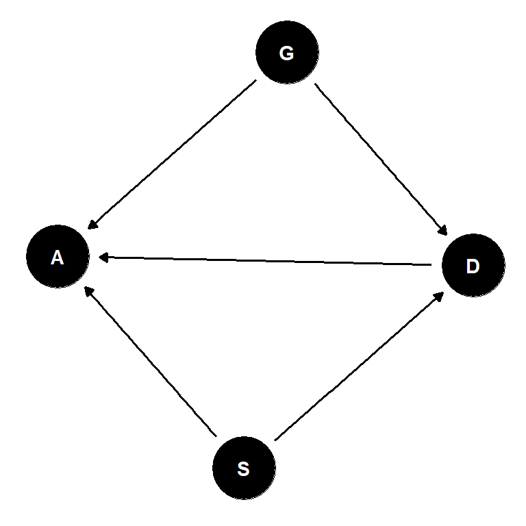
これはシミュレーションからも明らかになる。たとえ性別の影響が0であるという仮定の下でデータをシミュレートしても、Dで条件づけるとGの影響がある(係数が正になる)と推定されてしまう。
n <- 1000
g <- rbernoulli(n, p = 0.5)
s <- rbernoulli(n, p = 0.5)
d <- rbernoulli(n, p = inv_logit_scaled(2 * g - s))

## 性別の影響は0であるというシミュレーションを行う
a <- rbernoulli(n, p = inv_logit_scaled(0 * g + d + s - 2))

dat <- tibble(g, d, a) %>%
  mutate(across(everything(), as.integer),
         across(everything(), as.factor))

b11H5 <- brm(a ~ 1 + d + g, data = dat, family = bernoulli,
           prior = c(prior(normal(0, 1), class = Intercept),
                     prior(normal(0, 1), class = b)),
           iter = 4000, warmup = 2000, chains = 4, cores = 4,
           backend = "cmdstanr",
           file = "output/Chapter11/b11H5")

as_draws_df(b11H5, variable = "b_g1") %>%
  mean_hdi(b_g1, .width = 0.89)
## # A tibble: 1 × 6
## b_g1 .lower .upper .width .point .interval
## <dbl> <dbl> <dbl> <dbl> <chr> <chr>
## 1 0.127 -0.132 0.372 0.89 mean hdi11.5.12 11H6
The data in data(Primates301) are 301 primate species and associated measures. In this problem, you will consider how brain size is associated with social learning. There are three parts.
301種の霊長類で、脳サイズが社会学習とどのように関連しているかを考える(表11.33)。データは Street et al. (2017) を用いている。
data("Primates301")
dat4 <- Primates301

head(Primates301) %>%
  data.frame() %>%
  dplyr::select(social_learning,brain, research_effort) %>%
  kable(digits=2,
        booktabs = T,
        caption = "data'Primates301'の内容") %>%
kable_styling(latex_options = "stripe")| social_learning | brain | research_effort |
|---|---|---|
| 0 | 58.02 | 6 |
| 0 | NA | 6 |
| 0 | 52.84 | 15 |
| 0 | 52.63 | 45 |
| 0 | 51.70 | 37 |
| 3 | 49.88 | 79 |
11.5.12.1 a
Model the number of observations of social_learning for each species as a function of the log brain size. Use a Poisson distribution for the social_learning outcome variable. Interpret the resulting posterior.
社会学習と脳容量(logをとる)の関係をモデリングする。
dat4_2 <- dat4 %>%
  mutate(B = log(brain)) %>%
  dplyr::select(social_learning, B)

ggplot(dat4_2 %>% na.omit(), aes(x=B, y=social_learning))+
  geom_point()+
  labs(x = "log(brain size)")+
  theme(aspect.ratio=1)
図11.35: log(脳サイズ)と社会学習の関連
結果は以下の通り。脳容量が影響を与えていることが分かる。
fit11H6_a <-
  brm(data = dat4_2,
      family = poisson,
      formula = social_learning ~ 1 + B,
      prior = c(prior(normal(0,1.5), class = Intercept),
            prior(normal(0,0.5), class = b)),
      seed = 4, file = "output/Chapter11/fit11H6_a")

fixef(fit11H6_a) %>%
  data.frame() %>%
  rownames_to_column(var = "parameter") %>%
  kable(booktabs = T,
        digits=2) %>%
kable_styling(latex_options = "stripe") | parameter | Estimate | Est.Error | Q2.5 | Q97.5 |
|---|---|---|---|---|
| Intercept | -9.51 | 0.33 | -10.18 | -8.87 |
| B | 2.29 | 0.06 | 2.17 | 2.41 |
結果を図示する(図11.36)。データとよく合っている。
nd <- tibble(B = seq(0,6.5, length.out=50))

fitted(fit11H6_a, nd) %>%
  data.frame() %>%
  bind_cols(nd) -> h6a

dat4_2 %>%
  ggplot(aes(x=B))+
  geom_point(aes(y = social_learning),
             size= 3,
             color = "navy")+
  geom_smooth(data = h6a,
              aes(y=Estimate,
                  ymin = Q2.5,
                  ymax = Q97.5),
              alpha = 2/3,
              color = "black",
    stat = "identity")+
  theme(aspect.ratio=1)+
  labs(x = "log(brain size)")
図11.36: fit11H6_aの推定結果
11.5.12.2 b
Some species are studied much more than others. So the number of reported instances of
social_learningcould be a product of research effort. Use theresearch_effortvariable, specifically its logarithm, as an additional predictor variable. Interpret the coefficient for logresearch_effort. How does this model differ from the previous one?
研究努力(research_effort)が影響している可能性もあるため、それも対数変換して説明変数に加える。分析の結果、脳容量の効果はあるものの、小さくなった。また、研究努力がかなり影響していることが分かった。
dat4_3 <- dat4 %>%
  mutate(R = log(research_effort),
         B = log(brain)) %>%
  dplyr::select(social_learning, B, R)

fit11H6_b <-
  brm(data = dat4_3,
      family = poisson,
      formula = social_learning ~ 1 + B +R,
      prior = c(prior(normal(0,1.5), class = Intercept),
            prior(normal(0,0.5), class = b)),
      seed = 4, file = "output/Chapter11/fit11H6_b")

fixef(fit11H6_b) %>%
  data.frame() %>%
  rownames_to_column(var = "parameter") %>%
  kable(booktabs = T,
        digits=2) %>%
kable_styling(latex_options = "stripe") | parameter | Estimate | Est.Error | Q2.5 | Q97.5 |
|---|---|---|---|---|
| Intercept | -7.72 | 0.30 | -8.32 | -7.14 |
| B | 0.32 | 0.07 | 0.19 | 0.46 |
| R | 1.65 | 0.07 | 1.51 | 1.79 |
結果を図示すると以下の通り(図11.37)。
## 脳容量
nd_1 <- crossing(R = mean(dat4_3$B, na.rm =T),
               B = seq(0,6.5, length.out=50))

fitted(fit11H6_b, nd_1) %>%
  data.frame() %>%
  bind_cols(nd_1) -> h6b_1

dat4_3 %>%
  ggplot(aes(x=B))+
  geom_point(aes(y = social_learning),
             size= 3,
             color = "navy")+
  geom_smooth(data = h6b_1,
              aes(y=Estimate,
                  ymin = Q2.5,
                  ymax = Q97.5),
              alpha = 2/3,
              color = "black",
    stat = "identity")+
  theme(aspect.ratio=1)+
  labs(x = "log(brain size)")+
  coord_cartesian(ylim=c(0,50)) ->p20


## 研究努力
nd <- crossing(B = mean(dat4_3$B, na.rm =T),
               R = seq(0,6.5, length.out=50))

fitted(fit11H6_b, nd) %>%
  data.frame() %>%
  bind_cols(nd) -> h6b_2

dat4_3 %>%
  ggplot(aes(x=R))+
  geom_point(aes(y = social_learning),
             size= 3,
             color = "navy")+
  geom_smooth(data = h6b_2,
              aes(y=Estimate,
                  ymin = Q2.5,
                  ymax = Q97.5),
              alpha = 2/3,
              color = "black",
    stat = "identity")+
  theme(aspect.ratio=1)+
  labs(x = "log(research effort)") -> p21

p20+p21
図11.37: fit11H6_aの推定結果